Chicago. A man is about to get on a routine flight. Suddenly he pauses and decides to walk away. He doesn't know why. An hour later the plane goes down in flames. It's dismissed as chance … Britain. A woman has an image of a black mountain that's moving, with children underneath it. Two hours later, a Welsh schoolhouse is buried in an avalanche of coal slag. It's dismissed as coincidence.1 New York. A book designer named Chip Kidd begins to read his New York Times. On the cover is a photo of new Russian President Dmitry Medvedev, a suspected puppet of former president Vladimir Putin. The photo has been torn across Medvedev's midsection to reveal a word: Trickery. It's dismissed as something that could only happen to a famous book designer who has been known to use this sort of graphic element. But really, was it all in his mind, or was it much more than that? You decide.
1 If you were a TV-watcher in the 80's, you probably saw a commercial for the Time-Life books commercial for a series called Mysteries of the Unknown. This was my favorite: "The Midwest. A mother feels a sharp pain in her right hand. Far away at that exact same moment, her daughter screams as she touches a hot pan. Just chance?" Check it out, for old times sake [YouTube].
Category: visual
Anything that can be seen. Stuff with in this category is generally somehow interesting to look at, beautiful, stunning, provocative, silly, crrrrraaaaaazy, intriguing, or inspirational.
See, I criticize Flickr, and then this thing comes along to demonstrate once and for all its inherent goodness. No Flickr stylez or post-processing necessary. Via Sorry I Missed Your Party and BuzzFeed.
It's hard to ignore the fact that Flickr promotes a distinct style of photography; I say "promotes" because Flickr's "Explore" tab displays photos that are deemed "interesting" by Flickr's "interestingness" algorithm, and the photos in this area are generally characterized by what many are now calling "Flickr style." This is shorthand for "extensively post-processed" — color-corrected, cropped, montaged, and so on — techniques that turn simple pastoral landscapes into vivid, science-fantasy dreamscapes like the example below.
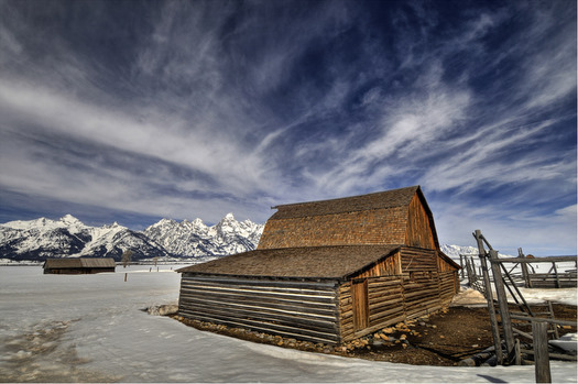 This was in Sunday's interesting pool, and it's a pretty strong example of the "Flickr style," i.e. heavy-handed, post-processed and much-adored by like-minded members of the community. Photo: James Neely
I don't patently dislike post-processing, but I find that the photos deemed "interesting" frequently have a creepy unreality about them, a flatness, an obsessive visual "perfection." The result is that many of these photos seem like scenes from Dune, or Lewis Carroll, or a Bjork video, or a Thomas Kinkade landscape. Everything is in focus, perfectly lit, tightly composed. In short, I dislike "interestingness" because it feels like a sort of Pixar-ization of photography. (I love Pixar). But I don't like that CG-esque feel creeping into a medium that, for me, derives its essence from its simplicity and imperfection.
Don't get me wrong, I'm down with post-processing and unreality
I just appreciate when post-processing supports the natural aspects of the photo, when it adds layers to the scene. The photo below is called "The Flooded Grave," and the photographer is Jeff Wall. It's a montage of 75 separate photographs from two separate graveyards and Wall's studio. Why all the cutting, pasting and blending? Well, If you look closely, you'll see that there's actually a small coral reef growing at the bottom of the grave.
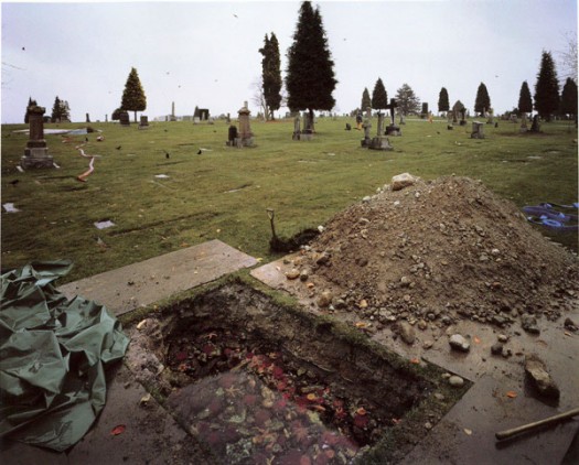 Wall says, "I worked with oceanographers to create a momentary fragment of a real undersea corner. I didn't want an aquarium display, a cross-section of sea-life from the area, or anything like that. I wanted it to be a snapshot of everyday life at a certain depth of sea water." Read more at the Tate Modern's online catalog.
So where does the Flickr style come from?
I've been excited to talk about Virginia Heffernan's article in last week's New York Times, Sepia No More. She addresses the disconcerting popularity of high-dynamic range cheesiness in the Flickr style, and she strikes at the heart of what is emerging as a formula for popularity on Flickr. She discusses Rebekka Gudleifsdóttir, one of the Flickr style's "leading proponents:"
[Gudleifsdóttir] discovered … how to create images that would look good shrunk, in "thumbnail†form; and how to flirt with the site's visitors in the comments area to keep them coming back. As perhaps is always the case with artists, Gudleifsdottir's evolution as a photographer was bound up in the evolution of her modus operandi, a way of navigating the institutions and social systems that might gain her a following and a living.
Creating images that look good shrunk
I'm intrigued by the interpretation of the UI's effect on the Flickr style, i.e. that the Flickr interface for browsing thumbnails informs the way in which people compose and upload photos. It makes sense to me. The browsing mechanism is tightly-tiled matrix, so photographers are going to want to craft individual elements that look good when they're (a) cropped to be square, (b) shrunk down small, and © snugly packed together.
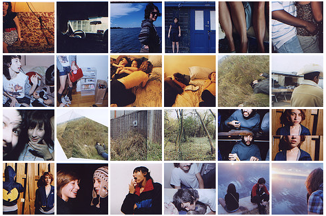
Here's an example from a photographer I like, a nicely differentiated matrix with some intriguing juxtapositions. Photos: Feedbacklove.
Is "Flickr style" a self-fulfilling prophecy?
Maybe the early users and founders were graphic designers? Maybe they really liked glossy, vivid stuff that often looks like the background of beer billboards? Whatever it is, I feel like the "Flickr style" is much less free-form than most may think. The formula behind "interestingness," as stated on the site: "Where the clickthroughs are coming from; who comments on it and when; who marks it as a favorite; its tags and many more things which are constantly changing." Interestingness as a function of the community actions makes sense. Tagging, assigning photos to groups, favoriting, commenting — all of these things seem like useful vehicles. But my sense is that everything that's being folded into "interestingness" is coming from a fairly closed system, a group of like-minded people with similar tastes promoting the same stuff again and again. Back and forth, forever. ))>((
Un-interestingness
I've got a list of my own "un-interesting" photographers, mostly gleaned from the group I Shoot Film. I also follow the feeds of a few Flickr photographers — This Is a Wakeup Call, Feedbacklove, and Last Leaf, to name a few. Still, it seems like most interesting stuff still lives outside of Flickr. I look at SUCKAPANTS and The Constant Siege pretty often, both of which can be NSFW, by the way.
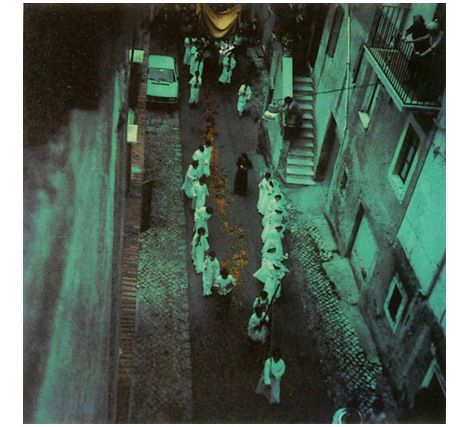
Back when the Berkeley Public Library was the hub of my social universe, I spent a lot of time in its video room — in the mid-90's, it occupied a little corner of the basement — working my way through its extensive collection of foreign VHS movies. I had plenty of time on my hands, (also, no money), and I quickly exhausted the canon — Metropolis, The Seven Sumarai, Jules & Jim, Breathless and a lot of Godard. At some desperate point, I explored what were to me, at the time, the margins — Fassbinder, Jacques Tati, Andrei Tarkovsky, all of which were astounding, like gold, but Tarkovsky was the most revelatory. The library had Solaris, Nostalghia and Stalker, all of which twisted my noodle with their bizzare, dream-like, surreal sequences. I just discovered that Thames & Hudson has published a stunning collection of Tarkovsky's polaroids, taken of his family and travels. The Guardian displays of number of them here.
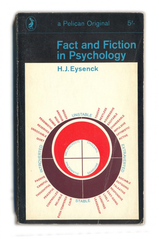
Books / Pelican covers
things magazine has amassed an incredible index of Pelican book covers from the 1930s through the 80s. The one above is from 1968. Check it.
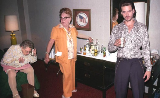
Last Friday night was just another night in the penthouse of the Fairmont Hotel for Mara and I. We relaxed in seal-skin robes, shuffled around in baby polar bear ear fur slippers, snorted the finest powdered snow leopard pancreas, fed Kobe beef to the pigeons who delivered the New York Times piecemeal in tiny scrolls tied to their feet, and generally killed time. (While enjoying the Cooper holiday party). When we emerged from a blissful reverie, we noticed that the walls were covered with an unusual world map.
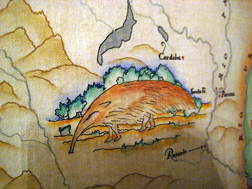 It was painted in 1927, by a guy named Robert Boardman Howard. A little poking around on the Internet reveals that his work is scattered across Northern California — sketches at the Merced post office, a design for the phoenix on Coit Tower, a relief in front of the Livermore post office.
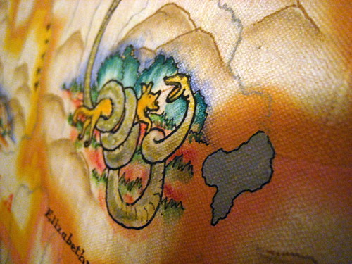 The Smithsonian did an interview with him in 1964, where he talks about another good NorCal project. "Then there was a small theatre up at Guerneville that I decorated. They gave me a free hand. I painted all the natives of Guerneville, their portraits, including the village dog. That was quite interesting. Good experience." Amen, brother.
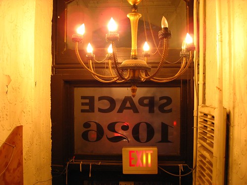
I was in Philadelphia last Thursday evening, and I discovered that I was staying near Space 1026, a studio/gallery near downtown. Some artists from 1026 had some cool work in a show at Yerba Buena a while ago, I walked over and spent a few minutes walking around as the residents were setting up for the place's 10th anniversary party.
It's got a pretty great vibe; part punk club, part workshop, part hobo village. Situated above some retail space near the bus station, there's a nice open space in the front, but the majority is sectioned off into seven or eight (or more) mostly small studios densely packed with art supplies, knick-knacks, bikes, and other crap. I didn't get to see much, but I took some pictures of the various hallways and spaces so check em out.
The NYT book blog Paper Cuts recently published a nice entry about William Faulkner's late-in-life visit to West Point. It reminded me of one of my favorite moments from the (apparently out-of-print) Faulkner Reader: his acceptance speech for the 1949 Nobel Prize.Reading it again this afternoon, this portion of his speech seems especially timely and eerie …
Our tragedy today is a general and universal physical fear so long sustained by now that we can even bear it. There are no longer problems of the spirit. There is only the question: When will I be blown up? Because of this, the young man or woman writing today has forgotten the problems of the human heart in conflict with itself which alone can make good writing because only that is worth writing about, worth the agony and the sweat.He must learn them again. He must teach himself that the basest of all things is to be afraid; and, teaching himself that, forget it forever, leaving no room in his workshop for anything but the old verities and truths of the heart, the old universal truths lacking which any story is ephemeral and doomed — love and honor and pity and pride and compassion and sacrifice.
The rest is here, on the Nobel Prize site. You can also listen to Faulkner's speech from the Nobel archives [requires Real Player].
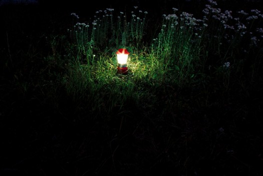
A few weeks ago, I subscribed to an arty Portland blog called Urban Honking. Every couple of days, a photographer who goes by the name of "Owl" posts a few quiet, dark photos. This is one of them. As with Faulkner, I'm both jealous and inspired. Check out more Owl photos; it's totally worth it.
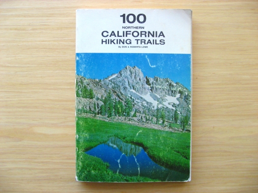
I stumbled upon a treasure trove of old outdoors books at Iconoclast Books in Ketchum, Idaho this weekend; this one's from 1970.
 If only hiking through sun cups like these was as serene and lovely as the photo implies. Also, the introductory text instructs Yosemite visitors, "DO NOT FEED, TEASE OR MOLEST THE BEARS." Noted.
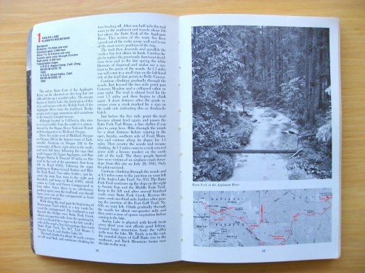 The page layout is classy, and the book is simple to navigate — each set of facing pages describes one hike. Also, the map is intended as a thumbnail overview, not as the actual guide for use during the hike. (In 1970, maps could be acquired by sending $0.50 to the USGS.)
 How do you know which map to purchase from the USGS for $0.50? The relevant USGS map ID information is in the top left corner of each page! Each hike has a summary that contains all the important stuff — distance, elevation change, estimated time, and so on, ordered from most broad (and important) to most specific.
