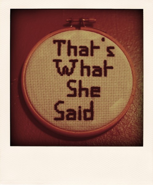
 Genius stitching and polaroid by: That Kate.
 Genius stitching and polaroid by: That Kate.
 Genius stitching and polaroid by: That Kate.
What we have here is both a failure to communicate and an ingenious workaround. To Kristen & Rob: Kudos.
See, I criticize Flickr, and then this thing comes along to demonstrate once and for all its inherent goodness. No Flickr stylez or post-processing necessary. Via Sorry I Missed Your Party and BuzzFeed.
It's hard to ignore the fact that Flickr promotes a distinct style of photography; I say "promotes" because Flickr's "Explore" tab displays photos that are deemed "interesting" by Flickr's "interestingness" algorithm, and the photos in this area are generally characterized by what many are now calling "Flickr style." This is shorthand for "extensively post-processed" — color-corrected, cropped, montaged, and so on — techniques that turn simple pastoral landscapes into vivid, science-fantasy dreamscapes like the example below.
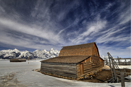 This was in Sunday's interesting pool, and it's a pretty strong example of the "Flickr style," i.e. heavy-handed, post-processed and much-adored by like-minded members of the community. Photo: James Neely
I don't patently dislike post-processing, but I find that the photos deemed "interesting" frequently have a creepy unreality about them, a flatness, an obsessive visual "perfection." The result is that many of these photos seem like scenes from Dune, or Lewis Carroll, or a Bjork video, or a Thomas Kinkade landscape. Everything is in focus, perfectly lit, tightly composed. In short, I dislike "interestingness" because it feels like a sort of Pixar-ization of photography. (I love Pixar). But I don't like that CG-esque feel creeping into a medium that, for me, derives its essence from its simplicity and imperfection.
I just appreciate when post-processing supports the natural aspects of the photo, when it adds layers to the scene. The photo below is called "The Flooded Grave," and the photographer is Jeff Wall. It's a montage of 75 separate photographs from two separate graveyards and Wall's studio. Why all the cutting, pasting and blending? Well, If you look closely, you'll see that there's actually a small coral reef growing at the bottom of the grave.
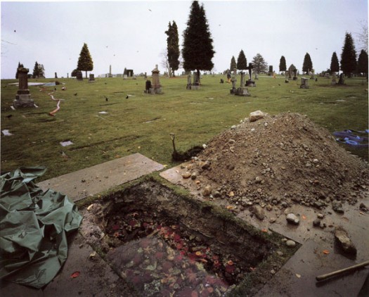 Wall says, "I worked with oceanographers to create a momentary fragment of a real undersea corner. I didn't want an aquarium display, a cross-section of sea-life from the area, or anything like that. I wanted it to be a snapshot of everyday life at a certain depth of sea water." Read more at the Tate Modern's online catalog.
I've been excited to talk about Virginia Heffernan's article in last week's New York Times, Sepia No More. She addresses the disconcerting popularity of high-dynamic range cheesiness in the Flickr style, and she strikes at the heart of what is emerging as a formula for popularity on Flickr. She discusses Rebekka Gudleifsdóttir, one of the Flickr style's "leading proponents:"
[Gudleifsdóttir] discovered … how to create images that would look good shrunk, in "thumbnail†form; and how to flirt with the site's visitors in the comments area to keep them coming back. As perhaps is always the case with artists, Gudleifsdottir's evolution as a photographer was bound up in the evolution of her modus operandi, a way of navigating the institutions and social systems that might gain her a following and a living.
I'm intrigued by the interpretation of the UI's effect on the Flickr style, i.e. that the Flickr interface for browsing thumbnails informs the way in which people compose and upload photos. It makes sense to me. The browsing mechanism is tightly-tiled matrix, so photographers are going to want to craft individual elements that look good when they're (a) cropped to be square, (b) shrunk down small, and © snugly packed together.
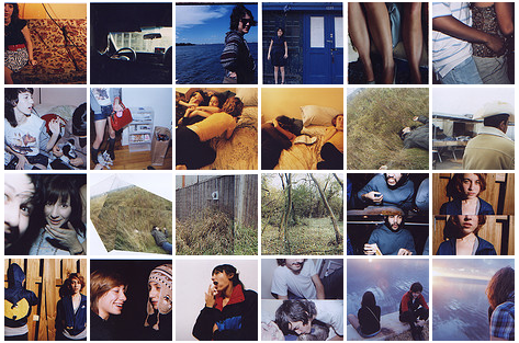
Maybe the early users and founders were graphic designers? Maybe they really liked glossy, vivid stuff that often looks like the background of beer billboards? Whatever it is, I feel like the "Flickr style" is much less free-form than most may think. The formula behind "interestingness," as stated on the site: "Where the clickthroughs are coming from; who comments on it and when; who marks it as a favorite; its tags and many more things which are constantly changing." Interestingness as a function of the community actions makes sense. Tagging, assigning photos to groups, favoriting, commenting — all of these things seem like useful vehicles. But my sense is that everything that's being folded into "interestingness" is coming from a fairly closed system, a group of like-minded people with similar tastes promoting the same stuff again and again. Back and forth, forever. ))>((
I've got a list of my own "un-interesting" photographers, mostly gleaned from the group I Shoot Film. I also follow the feeds of a few Flickr photographers — This Is a Wakeup Call, Feedbacklove, and Last Leaf, to name a few. Still, it seems like most interesting stuff still lives outside of Flickr. I look at SUCKAPANTS and The Constant Siege pretty often, both of which can be NSFW, by the way.
Earlier this week, I noticed that there had been a lot of activity on my Flickr photos. Someone named "furgurl" had commented roughly 50 times, and the comments themselves were pretty unusual. Most were lengthy, not the standard "OMG!" or "nice shot!" or whatever. They were also all lower-case, filled with misspellings and weird punctuation, and in almost every instance, pretty cruel. Cruel comments! On Flickr photos! Weird, huh?The examples above are the only halfway clever comments, and they were the only ones I kept. (Apologies to Nathaniel, Adlai, and my mom's sausage fondue).The rest focussed on just a few themes: the absence of make-up ("try wearing eye-liner!" was a common refrain when women were in the picture), out-of-date clothing ("was this picture taken in the 70's?" or "who wears THAT?"), beards ("that one is clearly a member of the Taliban"), receding hairlines ("take some of the hair from your face and put it on your head!" appeared in a few places), hair in general (people with curly hair were criticized for curling their hair too much; I was often advised to wash my hair) and the overall perception that no one in any of the pictures had ever been on a date. Lots of them were unintentionally funny in that (a) no rational person would have ever noticed whatever "furgurl" was pointing out, (b) the criticism often betrayed, let's say, a misplaced fixation on superficial stuff, and © each included all the makings for a sarcastic comment except the sarcastic tone, which actually kind of made it even more funny.I didn't really want to delete "furgurl's" comments. On the other hand, I didn't want the heckling to go unanswered. But the problem was that "furgurl" had no Flickr profile, no public photos, and didn't respond to the Flickrmail that I sent. I could handle anonymous public cruelty, really, but only if the playing field was level. She never responded to my message, so I took them down.Here's where it gets weird, though. When I Googled "furgurl," many of the results involved the same person, one Anne Bartee. (Behold, she has a website). When I clicked around the site, I found this, a letter she wrote to a hypnotherapist/advice columnist in the Tolucan Times. In it, she describes herself as an "international pop artist," and asks some provocative questions:
I've been on TV and radio all over the world, and also in "Billboard" magazine. Can you tell me if there is a link between "bad culture" and public misperception of what is truly good? Rap and hip hop and simplistic drum and bass beats have dominated music for far too long, encouraging the public to embrace yet lower standards. But surely the public cannot believe that this is good music. I wonder; is this an example of the saying, "You can sell them garbage if you paint it gold?"
The tone, not to mention the reasoning, sounds familiar. Here's a tip for all you hip-hop stars: Wash your hair! Try some eyeliner! And wear some fashionable clothes once in a while, for crying out loud! Anne, if you ever read and comment on this, I'm expecting your A‑game. Don't pull any punches.