Categories
ixd music web

Muxtape / Non-interface interface excellence

Mux­tape has blown up — just a mat­ter of time, I guess — but I hope this doesn't mean that they'll add a bunch of "fea­tures" to it. It's basi­cal­ly two things — the home­page where you pick a mix, and the play­er where you lis­ten — and it doesn't need much more. Real­ly! Please! 

Muxtape - home

Part one of two: The home page. It's where the "nav­i­ga­tion" is. There's no key­word search, no "cat­e­gories." Just you, the name of each mix like a stick­er on a cas­sette tape, and the sense of root­ing around in a cryp­tic vir­tu­al shoe­box, pop­ping a mix in, lis­ten­ing for a lit­tle while, strik­ing gold, or not, and mov­ing on. It's a real­ly love­ly and evoca­tive of the sim­pler, more mys­te­ri­ous times.

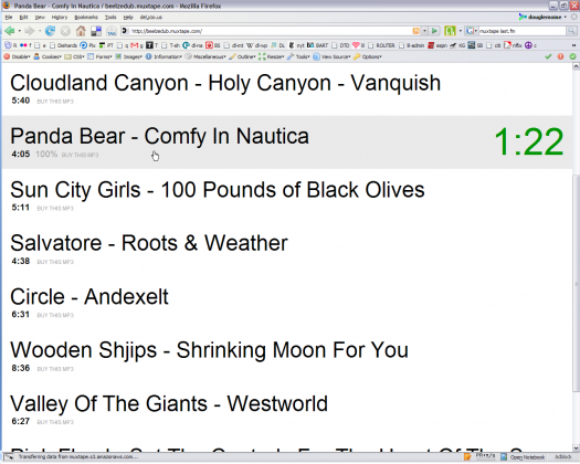
Muxtape - play

Part two of two: The "play­er." It's genius. No "friends" or "peo­ple who are also lis­ten­ing to this" or "mes­sag­ing" or "you may also like." Just the songs, links to buy them, and an indi­ca­tion of which track is playing.For the record, I don't think it needs much else. What­ev­er hap­pens, I real­ly hope this stuff is NOT added:

  • Search. Please, no search. Of course search would make it eas­i­er to find mix­es that "match" your key­words, but who wants that? Well, I did, at first, but after I poked around I real­ized that I was hav­ing way more fun explor­ing, let­ting go of the way that I nor­mal­ly explore. We need more non-key­word-ori­ent­ed ways of explor­ing! Seri­ous­ly! It's way more fun to roll the dice than to look for what you think that you want, and it's some­how more appro­pri­ate to music
  • Any kind of "pro­file-gen­er­at­ing." The mad­ness must be stopped some­where, some­time. A way to con­nect with mix-mak­ers would be nice, but no names, birth­days, pic­tures, blogs, or any of that.
  • Any kind of more "pre­dictable" home­page. Please. Just show the ran­dom stuff. Let peo­ple start here. It's scary and frus­trat­ing and annoy­ing at first, but it becomes fun, mag­i­cal. Per­fect! Done!
Categories
flickr photo visual web

Flickr / Okay, I take it all back.

Sorry I missed your party

See, I crit­i­cize Flickr, and then this thing comes along to demon­strate once and for all its inher­ent good­ness. No Flickr stylez or post-pro­cess­ing nec­es­sary. Via Sor­ry I Missed Your Par­ty and Buz­zFeed.

Categories
flickr ixd photo visual web

The Flickr style / Ugh

It's hard to ignore the fact that Flickr pro­motes a dis­tinct style of pho­tog­ra­phy; I say "pro­motes" because Flickr's "Explore" tab dis­plays pho­tos that are deemed "inter­est­ing" by Flickr's "inter­est­ing­ness" algo­rithm, and the pho­tos in this area are gen­er­al­ly char­ac­ter­ized by what many are now call­ing "Flickr style." This is short­hand for "exten­sive­ly post-processed" — col­or-cor­rect­ed, cropped, mon­taged, and so on — tech­niques that turn sim­ple pas­toral land­scapes into vivid, sci­ence-fan­ta­sy dream­scapes like the exam­ple below. 

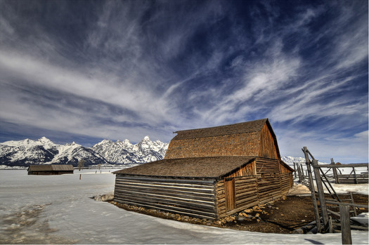
Flickr interesting - sci-fi pastoral sceneThis was in Sunday's inter­est­ing pool, and it's a pret­ty strong exam­ple of the "Flickr style," i.e. heavy-hand­ed, post-processed and much-adored by like-mind­ed mem­bers of the com­mu­ni­ty. Pho­to: James Neely


I don't patent­ly dis­like post-pro­cess­ing, but I find that the pho­tos deemed "inter­est­ing" fre­quent­ly have a creepy unre­al­i­ty about them, a flat­ness, an obses­sive visu­al "per­fec­tion." The result is that many of these pho­tos seem like scenes from Dune, or Lewis Car­roll, or a Bjork video, or a Thomas Kinkade land­scape. Every­thing is in focus, per­fect­ly lit, tight­ly com­posed. In short, I dis­like "inter­est­ing­ness" because it feels like a sort of Pixar-iza­tion of pho­tog­ra­phy. (I love Pixar). But I don't like that CG-esque feel creep­ing into a medi­um that, for me, derives its essence from its sim­plic­i­ty and imperfection. 

Don't get me wrong, I'm down with post-processing and unreality

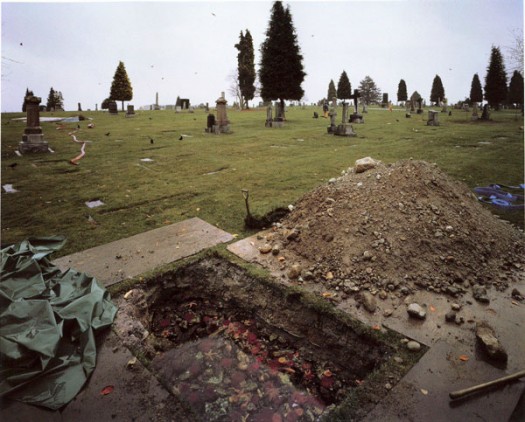
I just appre­ci­ate when post-pro­cess­ing sup­ports the nat­ur­al aspects of the pho­to, when it adds lay­ers to the scene. The pho­to below is called "The Flood­ed Grave," and the pho­tog­ra­ph­er is Jeff Wall. It's a mon­tage of 75 sep­a­rate pho­tographs from two sep­a­rate grave­yards and Wall's stu­dio. Why all the cut­ting, past­ing and blend­ing? Well, If you look close­ly, you'll see that there's actu­al­ly a small coral reef grow­ing at the bot­tom of the grave. 

Jeff Wall - Flooded GraveWall says, "I worked with oceanog­ra­phers to cre­ate a momen­tary frag­ment of a real under­sea cor­ner. I didn't want an aquar­i­um dis­play, a cross-sec­tion of sea-life from the area, or any­thing like that. I want­ed it to be a snap­shot of every­day life at a cer­tain depth of sea water." Read more at the Tate Modern's online cat­a­log.


So where does the Flickr style come from?

I've been excit­ed to talk about Vir­ginia Heffernan's arti­cle in last week's New York Times, Sepia No More. She address­es the dis­con­cert­ing pop­u­lar­i­ty of high-dynam­ic range cheesi­ness in the Flickr style, and she strikes at the heart of what is emerg­ing as a for­mu­la for pop­u­lar­i­ty on Flickr. She dis­cuss­es Rebek­ka Gudleifs­dót­tir, one of the Flickr style's "lead­ing proponents:"

[Gudleifs­dót­tir] dis­cov­ered … how to cre­ate images that would look good shrunk, in "thumb­nail†form; and how to flirt with the site's vis­i­tors in the com­ments area to keep them com­ing back. As per­haps is always the case with artists, Gudleifsdottir's evo­lu­tion as a pho­tog­ra­ph­er was bound up in the evo­lu­tion of her modus operan­di, a way of nav­i­gat­ing the insti­tu­tions and social sys­tems that might gain her a fol­low­ing and a living.

Creating images that look good shrunk

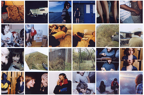
I'm intrigued by the inter­pre­ta­tion of the UI's effect on the Flickr style, i.e. that the Flickr inter­face for brows­ing thumb­nails informs the way in which peo­ple com­pose and upload pho­tos. It makes sense to me. The brows­ing mech­a­nism is tight­ly-tiled matrix, so pho­tog­ra­phers are going to want to craft indi­vid­ual ele­ments that look good when they're (a) cropped to be square, (b) shrunk down small, and © snug­ly packed together.

Feedbacklove matrix
Here's an exam­ple from a pho­tog­ra­ph­er I like, a nice­ly dif­fer­en­ti­at­ed matrix with some intrigu­ing jux­ta­po­si­tions. Pho­tos: Feed­backlove.


Is "Flickr style" a self-fulfilling prophecy?

Maybe the ear­ly users and founders were graph­ic design­ers? Maybe they real­ly liked glossy, vivid stuff that often looks like the back­ground of beer bill­boards? What­ev­er it is, I feel like the "Flickr style" is much less free-form than most may think. The for­mu­la behind "inter­est­ing­ness," as stat­ed on the site: "Where the click­throughs are com­ing from; who com­ments on it and when; who marks it as a favorite; its tags and many more things which are con­stant­ly chang­ing." Inter­est­ing­ness as a func­tion of the com­mu­ni­ty actions makes sense. Tag­ging, assign­ing pho­tos to groups, favorit­ing, com­ment­ing — all of these things seem like use­ful vehi­cles. But my sense is that every­thing that's being fold­ed into "inter­est­ing­ness" is com­ing from a fair­ly closed sys­tem, a group of like-mind­ed peo­ple with sim­i­lar tastes pro­mot­ing the same stuff again and again. Back and forth, for­ev­er. ))>((

Un-interestingness

I've got a list of my own "un-inter­est­ing" pho­tog­ra­phers, most­ly gleaned from the group I Shoot Film. I also fol­low the feeds of a few Flickr pho­tog­ra­phers — This Is a Wake­up Call, Feed­backlove, and Last Leaf, to name a few. Still, it seems like most inter­est­ing stuff still lives out­side of Flickr. I look at SUCKAPANTS and The Con­stant Siege pret­ty often, both of which can be NSFW, by the way.

Categories
ideas ixd web

Idols / Khoi Vinh of NYT.com

I've fol­lowed Khoi Vinh's excel­lent blog, Sub­trac­tion, for a long time. A cou­ple of years ago, he became the Design Direc­tor of the New York Times web­site, and in the mean­time the site has real­ly changed, for the bet­ter, most­ly, I'd say. This week he's doing a Q&A about his work, the NYT, design, and all of that.As I've always been curi­ous about what he does in his role, and the struc­ture of the NYT.com UX depart­ment, I was glad to see that some­one went there right off the bat:

As the design direc­tor, my respon­si­bil­i­ty is to over­see the cre­ative aspects of these con­tin­u­al improve­ments. Each one is a project of its own with some range in scope, from very short and dis­crete to long and drawn out over many months. And each project requires one or more of the mem­bers on my team: infor­ma­tion archi­tects (who are charged with orga­niz­ing the fea­tures and the flow of infor­ma­tion so that peo­ple can make use of them most intu­itive­ly), design tech­nol­o­gists (who do the actu­al cod­ing of many of these sites, using HTML, CSS, JavaScript, Flash, etc.) and/or visu­al design­ers (who han­dle the over­all look and feel, includ­ing lay­out, typog­ra­phy, col­or, pro­por­tion, etc.).You could say that all put togeth­er, the final prod­uct of our efforts is the user expe­ri­ence, or the sum total of the con­tent and the frame­work as it's used by vis­i­tors to the site. Of course, it's not true that my design group is the only team respon­si­ble for cre­at­ing this expe­ri­ence; it's real­ly the result of con­tri­bu­tions across the board, from edi­tors and reporters to project man­agers and soft­ware engi­neers and many more.

More here.

Categories
inside art lit visual web

Books / Pelican covers

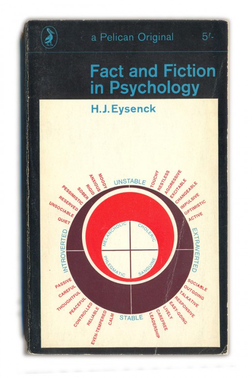
things mag­a­zine has amassed an incred­i­ble index of Pel­i­can book cov­ers from the 1930s through the 80s. The one above is from 1968. Check it.

Categories
photo tip visual web

Photos / Found on FFFFOUND

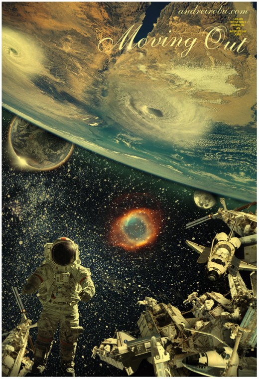
Some great stuff on FFFFOUND, a social book­mark­ing ser­vice for images. It's in pri­vate beta, and I'll be curi­ous how they main­tain the cur­rent, con­tin­u­al high qual­i­ty, as in images like this …

Andrei Robu
Like this stuff by Andrei Robu.


Via kot­tke.

Categories
flickr ixd tech web

UX / Flickr pisses me off

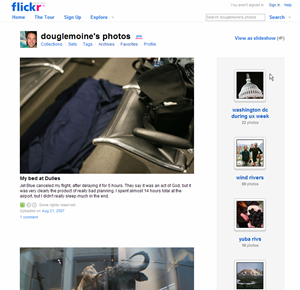
My Flickr page

Yes, I appre­ci­ate Flickr. After all, it allows me to store my pho­tos online, share them with oth­ers, and dis­play them on my web­site. Yay. Thanks for that. Still, it frus­trates me dai­ly. Here's why:

Sequence of photo display is set in stone

If I drag a dozen pic­tures into the Flickr Uploadr, God only knows the order in which they'll appear on the site. But I care about the order in which they appear on the site, because the LAST pho­to uploaded ends up being at the top of my Flickr home­page, and in that posi­tion of promi­nence it says some­thing about me. It annoys me that I can't con­trol this more.1

Little control over homepage layout; no way to make stuff sticky

So, if I can't con­trol the order of upload­ing, can I con­trol what's dis­played on my Flickr page? No. Can I make a set sticky, so that it stays at the top of the list? No. Can I dis­play only sets? No. Of course, Flickr has intro­duced new lay­outs, but all of them are sim­ply ways of arrang­ing the most recent stuff. Not help­ful to me.

No concept of new-to-a-user

I'm think­ing of my grand­par­ents here. Wouldn't it be nice if a meta-set (or some­thing) was cre­at­ed of stuff that's new to the view­er? I could just cre­ate a book­mark here, and they could check for new stuff.

Tagging is a royal nightmare.

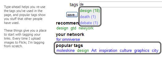
Maybe no one has total­ly solved this yet, but here's some­thing that would work for me: I usu­al­ly upload mul­ti­ple relat­ed pic­tures at a time, and these pic­tures tend to share a lot of the same tags. So I'd like to cre­ate small groups of tags for a groups of pic­tures, and then quick­ly drag and drop, or mul­ti-select and apply, a tag to a sub­set of those pic­tures. del.icio.us's tag­ging inter­face is rudi­men­ta­ry, but it's vast­ly more help­ful than Flickr's:

What del.icio.us does well in tagging


The navigation confuses everyone except geeks and experts

Col­lec­tions? Sets? Archives? What's the diff? As my mom once asked me, "Where are the albums?" At the risk of sound­ing irre­triev­ably old-school, this par­tic­u­lar set of group­ing con­cepts is a frus­tra­tion to cog­ni­tion. (Also, if the dis­tinc­tion is made in this nav­i­ga­tion area, why aren't the things (sets) in the right col­umn labeled as such?)

Flickr secondary nav


No record of blogged pictures?

When I cre­ate a blog entry from a pic­ture, why isn't there some kind of record that the image has been blogged? A link? This just seems so basic to me. 1 Inter­est­ing side note: I bumped into some Flickr peo­ple at CHI, and I asked them about this. Their ratio­nale: The pho­to­stream is what Flickr is all about, and the strict­ness of the sequence is a use­ful gov­ern­ing prin­ci­ple. Umm, yeah. Flickr peo­ple may think of upload­ing as a con­tin­u­al stream, but I upload pho­tos in clumps — I don't always think about my pho­tos in the terms of the last pho­to uploaded, I often think in terms of the last group. I feel like I should have con­trol over the way those clumps are dis­played. If you force me to always show the most recent­ly uploaded indi­vid­ual pho­to, shouldn't you also give me some con­trol over the order of upload in your Uploadr?

Categories
ixd tech web

Adaptive Path UX Week / One of ux, one of ux1

I attend­ed (and spoke at) my first UX Week last week in Wash­ing­ton DC, and it lived up to its billing as a good ol' time. I met many amaz­ing peo­ple, stayed out too late, and yet was still moti­vat­ed to get up ear­ly every morn­ing to see the keynotes. That's say­ing some­thing. Most con­fer­ences can be con­sid­ered suc­cess­es if just one of those things happens.

UX Week 2007 ProgramThe UX Week pro­gram with my lucky cat.

Breaking it down

The ses­sions came in three vari­eties: (1) prod­ucts and inter­face imple­men­ta­tions; (2) design tools and process­es; and (3) ideas and inspi­ra­tions. Sarah Nel­son at Adap­tive Path orga­nized the con­fer­ence, and she recruit­ed speak­ers who were not the usu­al talk­ing heads.2 The mix of back­grounds, expe­ri­ence, and sub­ject mat­ter kept things live­ly. I espe­cial­ly appre­ci­at­ed the dis­cus­sions of process by AP folks like Indi Young, Kate Rut­ter, and Jesse James Gar­rett dur­ing the pan­el dis­cus­sion of CNN.com. All of these opened my eyes to new design tools and tech­niques, and exposed the fact that there is a lot of inno­va­tion going on out there. In terms of the flashy prod­ucts on dis­play, I'm inher­ent­ly too inquis­i­tive and skep­ti­cal to believe what peo­ple tell me dur­ing prod­uct demoes — I need to get immersed in them myself, and ask: How did you get there? Where did that come from? What need is that address­ing? How did the design evolve? Because I'm a nerd.3

Design is story-telling

As Leisa Reichelt point­ed out dur­ing our pan­el, a lot of speak­ers addressed the top­ic of sto­ry-telling in one way or anoth­er. Kevin Brooks of Motoro­la Labs led a work­shop on sto­ry­telling tech­niques; the folks behind the recent redesign of CNN.com described the way in which they craft­ed the sto­ry that they told their inter­nal stake­hold­ers; peo­ple from BestBuy.com and Sachs dis­cussed the use of video­taped cus­tomer sto­ries to make a case for a redesign. Of course, sto­ry-telling and design are inti­mate­ly inter­twined — two strands of a busi­nessy dou­ble-helix. I was inspired by the vari­ety of ways in which design­ers are telling sto­ries about the prob­lems to be solved, and the tech­niques and nuances involved in their approaches. 

UX is real

I go to few­er con­fer­ences than I should (so I may be a bit shel­tered), but I'll say this any­way: at the con­fer­ence, I got the feel­ing that UX was much fur­ther along to becom­ing an actu­al pro­fes­sion. UX prac­tices are no longer out­posts in the Wild West of dig­i­tal prod­ucts; our work is now iden­ti­fi­able ter­ri­to­ry in the busi­ness land­scape. Not long ago, there were very few things that wouldn't be con­sid­ered with­in the purview of user expe­ri­ence; now, the bound­aries of our prob­lems are a lit­tle more clear, and our expe­ri­ences as prac­ti­tion­ers have more com­mon­al­i­ties than dif­fer­ences. I feel like Tom Han­ks in Big. Now, if only I could explain what I do to my par­ents … 1 From one of my favorite movies of all-time, Freaks, i.e., one of us, one of us, we accept you, one of ux.2 Okay, except Jared Spool, but it's always good to hear what he's think­ing. 3 I admit: The inter­face for One Lap­top Per Child is ele­gant and intrigu­ing, but I'm polit­i­cal­ly ambiva­lent about the project itself. I'm fas­ci­nat­ed by the pos­si­bil­i­ties of cre­at­ing an infor­ma­tion pipeline the devel­op­ing world, but I guess I'm not enough of a tech evan­ge­list to believe in the idea that dis­trib­ut­ing lap­tops is bet­ter than dis­trib­ut­ing more imme­di­ate aid. Maybe I'm not think­ing big enough.

Categories
cinema web

Dream come true / My Simpsons character

Simpson LeMoine

Thanks to a tip from fel­low Simp­sons fanat­ic and Coop­er col­league Chris Noes­sel, I dis­cov­ered that I could gen­er­ate a Simp­sons char­ac­ter with my like­ness on the Simp­sons Movie site. Holy crap. Tru­ly, a dream come true. Now the only thing left is to have my like­ness drawn in the Wall Street Jour­nal "hed­cut" style [a PDF on the Dow Jones site about how pic­tures become WSJ-ready].And it's me, right? Except there were no options for beards, which is strange con­sid­er­ing that there are quite a few beard­ed Simp­sons char­ac­ters. Homer's got a per­pet­u­al five o'clock shad­ow; God has a flow­ing white beard; Hyman Krustof­s­ki has the impres­sive ZZ Top-style beard befit­ting a car­toon rab­bi; Dr. Mar­vin Mon­roe has a beard that is more like mine. So there's got to be lots of exist­ing styles to choose from.When I did a Google search for "simp­sons beard," I dis­cov­ered that Simp­sons cre­ator Matt Groen­ing is a self-described bear­do, as revealed in this email chat from 1993: "I've been mis­tak­en more than once for Stephen King, Leonard Maltin has been mis­tak­en for me, but I think I look more like a beard­ed hip­pie ver­son of Homer Simp­son." (This chat took place on Prodi­gy, of course. Wow. Sim­pler times.)

Categories
web

NFL conundrums / Culpepper or Garcia? Jamarcus Russell or Brady Quinn?

Over­heard on Col­lege Humor's week­ly sports chat, Straight Cash, Homey:

Ethan: Who has the bet­ter NFL career: Rus­sell or Quinn?Amir: That's an impos­si­ble ques­tion. I couldn't even tell you whos hav­ing a bet­ter career: Culpep­per or Gar­cia, and they've had like 15 sea­sons between them. I'll guess for you though: Rus­sell. He's big­ger, faster, and stronger. I'm real­ly curi­ous to see a 6'6" 260 pound quar­ter­back will do in the NFL. Can you imag­ine him and Bran­don Jacobs on the same team?

I'm kin­da just doing this to try out Clip­marks [Ver­dict: Use­ful, but insert­ed a huge amount of HTML crap into the clip­ping], but hey, those Col­lege Humor guys are fun­ny. And I'm skep­ti­cal about Jamar­cus Rus­sell, any­way. Even though he seems like a great guy, and he has a good QB pres­ence, I'm just not sure that a guy his size with­out proven tra­di­tion­al QB skills is such a good bet with the #1 pick. Why not Calvin John­son? The guy is a sure­fire super­star. But a per­fect storm has been cre­at­ed: Rus­sell is in the draft and the Raiders' have the #1 pick. Al Davis is a gam­bler, and he loves any­thing uncon­ven­tion­al. I sus­pect that he'll not be able to resist.Earlier in the chat, they equat­ed Trent Green and Rich Gan­non and, in all seri­ous­ness, I don't know how you can com­pare the two. They were both referred to as slow, which, umm, is just patent­ly untrue for Gan­non, who made his name with his wil­i­ness and speed. The dude had about one-third the arm strength of Joe Mon­tana and still won an MVP. Green is slow, of course, though not as slow as, say, Dirk Nowitzki.