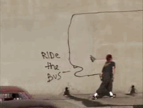
I'm psyched to check out Dirty Hands, a new documentary about artist David Choe. I'm usually skeptical about "street art" films, but the trailer looks pretty great, and I've heard that Choe is kind of a madman. I compare everything in this street/art vein to Video Days — which, by the way, did you know that can watch all of Video Days on Google Video? — and I'm always hoping that new stuff will somehow advance the form that Spike Jonze laid out all those years ago. Maybe this will? Maybe other stuff has? 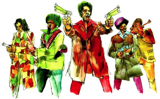 Choe worked some watercolor magic for a movie called Black Dynamite that just made some waves at Sundance.
Category: urban
Stuff having to do with the cit-ay, and things that happen there, on the pavement, in the concrete jungle. As Bob Marley might say, "No sun will shine in my day today. High, yellow moon won't come out to play. Darkness (darkness) has covered my life …"
Last week I picked up a book called Cop in the Hood by a grad student turned cop (turned academic) named Peter Moskos. He's a law professor now [UPDATE: Oops. He's actually an "assistant professor of Law, Police Science, and Criminal Justice Administration." My bad], but he spent a year policing East Baltimore during his PhD work and wrote a part sociological analysis, part police procedural about his experience. If The Wire had a literary analog, this would be it, not only because it takes place in East Baltimore, but because it presents a morally complex view of the relationship between law enforcement and the citizenry with whom they interact (mostly poor people in desperate circumstances). It also adds academic underpinnings and a truly excellent set of footnotes that provide avenues to a variety of interesting sources, one of which led me to one of my all-time favorite New Yorker articles, a 1998 installment of the Cop Diary called "The Word on the Street" about the language of NYC cops. The author, the pseudonymous Marcus Laffey (actual name: Edward Conlon) recently wrote a memoir called Blue Blood, which is going on the list for sure.I really appreciated his discussion of research methods because it puts in high relief some of the challenges that any researcher (e.g., one who is trying to understand how people use high-tech tools) interacts with their interview subjects. So much of it is very un-objective, and Moskos addresses his skeptics early on:
Some will criticize my unscientific methods. I have no real defense. Everything is true, but this book suffers from all the flaws inherent in ethnographic work … Being on the inside, I made little attempt to be objective. I did not pick, much less randomly pick, my research site or research subjects. I researched where I was assigned. To those I policed, I tried to be fair. But my empathy was to my fellow officers. Those nearest to me became my friends and research subjects. My theories emerged from experience, knowledge, and understanding. In academic jargon, my work could be called "front-and-backstage, multisited, participant-observation research using grounded theory rooted in symbolic interactionism from a dramaturgical perspective.
You can read more in an excerpt here [PDF], and he's got a blog that discusses media coverage of the book here.
[Danger: I could only get the video to play in IE. Not sure if it's my particular array of Firefox add-ons that are blocking its mojo, or what.]So every few weeks I sift through the mostly asinine archives of SFist, and today, against all odds, I found something interesting: A llittle blurb about urban beekeeping in San Francisco with a link to a CurrentTV short. The director profiles this guy Jon Ralston, someone I vaguely recall from my time in the bee club. He's younger (in beekeeping age, anyway) and takes a very similar approach to beekeeping that I did: Just get a hive, put it in your backyard, let the bees do what they do until someone complains. Worked for me until my landlord stumbled upon it during a very active day (that turned into a swarm), and became terrified. I also identify with Jon's reasons for getting into beekeeping in the first place — feeling closer to the outdoors, and having a source of cheap gifts. He seems like an interesting guy, and he's got a funny blog, too: My robot is pregnant.
Jan Chipchase seems to be the "it" guy1 of user experience these days. He lives in Tokyo, works at Nokia, and plays this kind of swashbuckling, Indiana-Jones-ish role in researching mobile technologies in developing cultures. He keeps an intriguing blog called Future Perfect, where he documents UX-related nuggets from the shantytowns of Lagos, the markets of Accra, the Singapore airport, and so on. This week's NYT Sunday mag has an article about him — "Can the Cellphone End World Poverty" — which, aside from having a somewhat puzzling title, provides an interesting perspective on the field of UX in general.
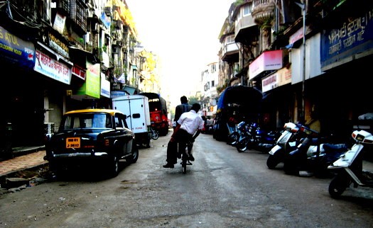
My own person Jan Chipchase experience: Walking through a back alley in Bombay, from my trip there to deliver design training to GE engineers.
First, what's the title all about?
It's called "Can the Cellphone End World Poverty," but it's really a profile of a researcher rather than an economic analysis of the effect of mobile technologies. And Jan's research — if his blog and conference keynotes are any indication — focuses on the ways in which people in developing cultures *use* and *adapt* the technology, not about the ways in mobile technology can effect macroeconomic change. It's a quibble, really, but it seems strange to describe market research as an effort to "end world poverty," and to cast Nokia in an altruistic light when what they're doing is really identifying and understanding a unserved market and potential customers:
… No company churns out phones like Nokia, which manufactures 1.3 million products daily. Forty percent of the mobile phones sold last year were made by Nokia, and the company's $8.4 billion profit in 2007 reflects as much. Chipchase seems distinctly uncomfortable talking about his part as a corporate rainmaker, preferring to see himself as a mostly dispassionate ethnographer …
I also sympathize with Jan. It would be impossible to do the kind of research he does without a higher purpose, and I know I've spent a lot of time rationalizing some our client work (which is always about the benjamins) with what I imagine the greater good to be. It's easy to say that Nokia's stock will benefit from tapping the billions of people below the poverty line, but it also seems possible that mobile technologies and connectedness in general could effect positive change. Nevertheless, I really think that the article should be called something like, "How the developing world sees technology," or "What the developing world tells us about technology," or something way less catchy than ending world poverty.
What methods are used to gather input from folks in developing nations?
I was most curious to hear anecdotes of what exactly he was asking people, how exactly he was gathering information, whether he was simply observing or conducting surveys, or what. (He has a number of interesting entries on "field research" on his blog, but none that give much insight into his methods). The article has an interesting description of the outcome of an exercise in which people around the world were asked to draw their ideal mobile phone:
[Jan's researching cohorts] said they'd found … [that] the phone represents what people are aspiring to. "It's an easy way to see what's important to them, what their challenges are," [a cohort] said. One Liberian refugee wanted to outfit a phone with a land-mine detector so that he could more safely return to his home village. In the Dharavi slum of Mumbai, people sketched phones that could forecast the weather since they had no access to TV or radio. Muslims wanted G.P.S. devices to orient their prayers toward Mecca. Someone else drew a phone shaped like a water bottle, explaining that it could store precious drinking water and also float on the monsoon waters. In Jacarèzinho, a bustling favela in Rio, one designer drew a phone with an air-quality monitor. Several women sketched phones that would monitor cheating boyfriends and husbands. Another designed a "peace button" that would halt gunfire in the neighborhood with a single touch.
Hmm. I can see how some of this stuff could be helpful in aggregate. People see the phone as a platform — and perhaps there's a sense that it's somewhat magical — a "peace" button, a landmine detector, a cheating boyfriend monitor, etc. (Maybe?) But does the person in Liberia really want a phone, or does he want a land-mine detector? I wonder about this.1 Not I.T. guy. It guy, like it girl. It's sort of amusing to me that it's totally clear what is meant by the words "it girl" but that the words "it guy" just seem to relate to the guy who fixes your internets.
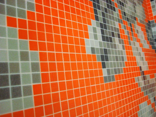 This is an incredible mosaic in the bathroom of the New Museum of Contemporary art in New York. It is also EASILY the most impressive thing in the whole museum.
New York was filled with good times, as usual, but a couple of the things that totally blew my mind (and that are link-friendly) were Jamaican beef patties at a place called Christie's in Flatbush and an offshoot of San Francisco's Blue Bottle juggernaut that recently opened in New York, Abraco [a nice NY mag review]. Yoshi insisted that we stop at Christie's even though we'd just eaten a big brunch, and we got a couple of warm, spicy patties to share on a walk through chilly Prospect Park. The first thing I noticed is that they're not really "patties" in the sense of hamburger patties. They're like hot pockets, but freshly baked, with an amazing crust and filled with super-spicy beef. Pretty much the perfect walking food.
On an unrelated note, last week's This American Life was the best I've heard in a long time. Every segment is good, but the third is about what happens to chimpanzees after they "retire" from movies, and it reveals that Cheeta — the chimp from the 40's‑era Tarzan movies — is still alive, living in Palm Springs, enjoys drinking Diet Iced Tea, and was once quite fond of beer and cigars. There's more in this funny National Geo piece from 2003, awkwardly titled Tarzan's Cheeta's Life as a Retired Movie Star.
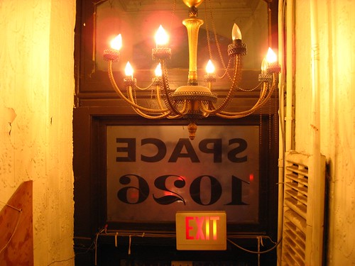
I was in Philadelphia last Thursday evening, and I discovered that I was staying near Space 1026, a studio/gallery near downtown. Some artists from 1026 had some cool work in a show at Yerba Buena a while ago, I walked over and spent a few minutes walking around as the residents were setting up for the place's 10th anniversary party.
It's got a pretty great vibe; part punk club, part workshop, part hobo village. Situated above some retail space near the bus station, there's a nice open space in the front, but the majority is sectioned off into seven or eight (or more) mostly small studios densely packed with art supplies, knick-knacks, bikes, and other crap. I didn't get to see much, but I took some pictures of the various hallways and spaces so check em out.
If the government buildings are any indication, Washington DC is a city bracing for something. Makeshift barriers surround the Capitol; men with automatic weapons stand watch over random governmental doorways and intersections. Sure, this is no different than other "significant†places in the Western world — London and Frankfurt have their share of fortresses and sentries — but as a citizen and idealist I'd hope that Washington would be different. I'd hope that *we* would do it differently.
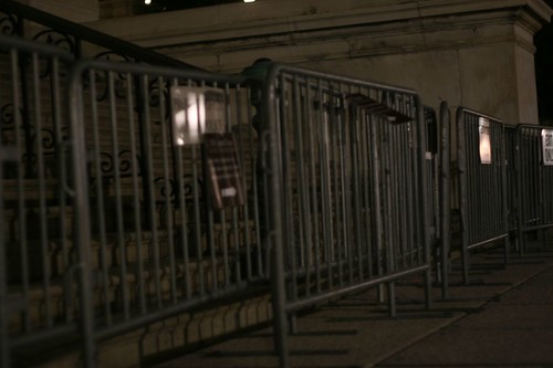 Our lawmaking buildings were designed to be approached: Sitting at the head of the Mall's long runway, the Capitol Building inspires further investigation. Nowadays, if a person (say, me) decides to take a picture of the fences around this beacon of democracy, that person may get reprimanded by a guy with a gun. I'm just saying: It happens.
Anyway, I hope that we'll search for solutions to the problem of security that don't run counter to the ideals of democracy: that lawmakers operate in the open, that anyone can see how it's done (and indeed that everyone should see how it's done), that people are innocent until proven guilty, and that I'm paying for those fences, dammit, so I should be able to take a picture of them without getting harassed.UPDATE: Even the new $50 bill emphasizes the approachability of the Capitol.
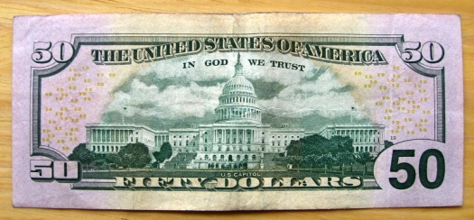 Check out the little white figures climbing the steps on the left-hand side of the Capitol building. This seems to imply, to me, that people can (and should) walk up the stairs to see what's happening within the hallowed halls of democracy.
This weekend I got an incredible book about San Francisco called San Francisco in Maps & Views. I usually avoid glossy coffee-table historical books because they're so often filled with disappointments — bad color, bad printing, messy layout, uninspired writing, PLUS they're really expensive. But THIS ONE. This one is different. The maps are very well-reproduced, high-res and colorful, and all are supported by detailed and surprisingly engaging commentary. After I got over the initial thrill of using it like a flip-book and watching my neighborhood evolve, I started to notice smaller trends in land-use evolution — a plot labeled "orphan asylum" became "hospital;" many things labeled "cemetary" became "park" or "civic center." "Dunes" become "the Sunset." I was also intrigued by the use of public places as refugee camps after the big one hit in 1906. Apparently, SF carpenters sprang into action and built thousands of makeshift cottages for the earthquake/fire refugees, turning many well-known SF public spaces into refugee camps, including South Park, Dolores Park, and Precita Park, and lots of the then-outlying, undeveloped areas, like the Richmond and the Sunset.
 A shack on Bikini Ridge would have been puh-retty sweet. (This is Dolores Park, believe it or not). Photo: Western Neighborhoods Project
As the city began to return to normal a year later, a few of the refugees decided to use the cottages — or, "shacks" as they were commonly known — as more permanent residences. Some industrious people combined multiple shacks into one residence. Incredibly, a few shacks are still around, and naturally folks have organized to preserve them. (Here's a 2002 Chronicle article about efforts to save some shacks in the outer Sunset).
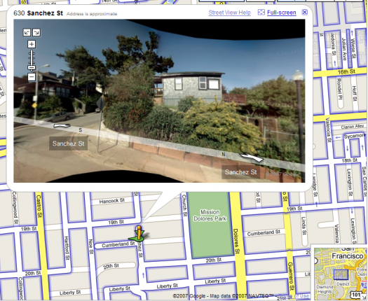 I believe that this is the house that is listed as 300 Cumberland on the Western Neighborhood Project's list of known shacks. The crazy thing is that this is at the top of an insanely steep hill, like un-bike-ably steep and long, so it must have been built there rather than transported from Dolores Park. On the other hand, who knows? People were crafty back then, right?
Finally, here's a map of the locations of the known existing earthquake shacks. Seems like a good project for a weekend afternoon.
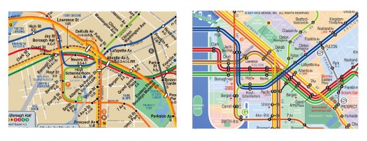
A graphic designer named Eddie Jabbour has proposed an alternative design for NYC subway maps. The New York Times wrote about it last week, and since then blogs have been blowing up over it. 37 signals evaluated it, and applauds the effort to increase usability at the expense of geographic accuracy: "Subway map readers want to know how to get from A to B a lot more than they want to know the exact curve of the tracks along the way. Sometimes truth is less important than knowledge." If points A & B are always subway stations, I wholeheartedly approve. As seen in snippet form below, the redesign much more clearly presents information that is relevant on the subway.
Eddie Jabbour's proposed redesign trades geographical accuracy for readability But a subway trip is always part of a bigger logistical process. You're not just trying to get from Atlantic Avenue Station to Astor Place Station. You're trying to get from an apartment on President Street to the place where your friend cooks near Washington Square Park. And often the optimal subway route is not available to you; the line you want to take is extremely delayed; another line is not running; another is express past 9pm; another only runs to this station on Sundays; etc; etc. The reality is that you need to be able to improvise when you're in the subway system, and a map that is not geographically accurate inhibits your ability to adjust to the realities of the system.Which brings me to the London A‑Z. London can get away with a representative subway map because it has a companion book that allows you to figure out stuff like that. So the Circle line isn't running? Trusting the Tube map to go to the next nearest station may be disastrous, but you can always find your destination in your trusty A‑Z, scan for another station nearby, etc. Moreover, magazines and newspapers often place the A‑Z grid location next to an event listing. Removing geographical context from the NYC map may make it easier to scan, but at this point, I feel like it's perhaps prematurely reductive. On the other hand, a reduction of information on the subway map may simply underscore and highlight (and italicize and capitalize) the need for a NYC A‑Z. Or perhaps the MTA itself just needs to be more predictable. Or maybe everything should stay the same so every traveler can have that special scary feeling of being stranded in Brooklyn at 2am on a weeknight.UPDATE: My friend Jonathan Gabel, a New York resident for the last 13 years, had some interesting thoughts on the matter:
The current map is a total fabrication of geography anyway — Manhattan is made fat and short, and Brooklyn and Queens lose all of their length. In fact, the L line through Williamsburg and Bushwick is actually more accurate in the changed map, as it makes a radical zig-zag through the area. For instance, the L train runs: Lorimer, Graham, Grand, Montrose. From Niki's house, 8 blocks north of the Graham stop, to meet our friends who's live 4 blocks East of the Montrose stop, we often walk to Manhattan Ave, one block West of the Lorimer stop because it is half way between our houses. Figure that one out. I have never seen the London A‑Z but I looked at one of the NFT (not for tourists) guides to New York and found it wasn't really helpful, specifically because it doesn't really help you find addresses. Even the addresses of things it is telling you about — like restaurants. Say you want to find Snacky's in Williamsburg. It shows you a map of the general area, and listings of all the restaurants and other things by street address, next to the map of the area. The map is bullet-riddled with little icons to tell you where all bars/ restaurants/ laundromats/ clubs/ sweatshops/ motorcycle-repair-shops are — but every bar/restaurant/laundromat/club/sweatshop/motorcyclerepairshop is only labeled with the sign for b/r/lc/ds/mrs and no number. So to find your Snacky's you have to look at 20 r's and try to figure out which one it is, and ignore 40 b's, 20 l's, 5 c's 50 s's that are covering all the names of the streets. It's like that interface you described for the New Yorker — it takes all the pleasure out of cartography. I would like to see a guidebook that makes discovering one's way pleasurable.
Amen to pleasure.
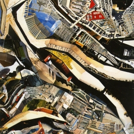
Last night, I saw architect Teddy Cruz deliver a fast-paced, idea-rich presentation at the San Francisco Art Institute. In a little over an hour, he tore through a slide show covering his recent work on the social, cultural, political, and economic forces at work in communities along the US-Mexico border. The slide show itself was pretty impressive — a blend of research photography, simple PowerPoint animation, and photo collages (like the ones shown in this post, courtesy of UCSD, where Cruz teaches) that looked somewhat like maps but also somewhat like actual photos of urban density.I'd first heard of Cruz in the NYT Magazine feature from last spring, Shantytowns as a New Suburban Ideal. It details "Living Rooms at the Border," his proposed project to turn a lot in the border community of San Ysidro into a multi-use dwelling/community center/market. He discusses it in more detail in "Urban acupuncture", an article he wrote for Residential Architect Online:
Housing and density need to be seen not as an amount of units but as dwelling in relationship to the larger infrastructure of the city, which includes transportation, ecological networks, the politics and economics of land use, and particular cultural idiosyncrasies of place … In a parcel where existing zoning allows only three units of housing, the project proposes (through negotiated density bonuses and by sharing kitchens) 12 affordable housing units, a community center resulting from the adaptive reuse of an existing 1927 church, offices for Casa Familiar in the church's new attic, and a garden underpinning the community's nonconforming micro-economies, such as street markets and kiosks. In a place where current regulation allows only one use, we propose five different uses that support each other.
Cruz discusses his architectural mission in this article at the American Institute of Architecture's site: Border Postcard: Chronicles from the Edge.
