Categories
lit

Something which can last

There's a great three-minute account of a meet­ing with Borges. About the life of an artist, he says:

The task of art is to trans­form what is con­tin­u­ous­ly hap­pen­ing to us, to trans­form all these things into sym­bols, into music, into some­thing which can last in man's mem­o­ry … as the years go by, if the stars are on your side, you may dis­cov­er that you are at the cen­ter of a vast cir­cle of invis­i­ble friends whom you will nev­er get to know but who love you. And that is an immense reward.

Categories
dogs the ancient past

Suited to endure long periods of inactivity

Belka and Strelka

Say what you will about the Sovi­ets, but you can't argue with this rea­son­ing for send­ing dogs, rather than mon­keys, into space. If there's one uni­ver­sal truth of dogs, it is that they are "suit­ed to endure long peri­ods of inac­tiv­i­ty." Lynne brought the sub­ject of these Sovi­et cos­mo­naut dog-heroes to my atten­tion, includ­ing those pic­tured at right — Bel­ka (which "most like­ly means 'Whitey,'" accord­ing to Wikipedia's "Sovi­et space dogs" entry) and Strel­ka ("Arrow"). They were the first ani­mals to go into orbit and return alive, spend­ing August 19, 1960 in space before return­ing to Earth. Wikipedia help­ful­ly adds that they were accom­pa­nied by some friends from the ani­mal king­dom: "a grey rab­bit, 42 mice, 2 rats, flies and a num­ber of plants and fun­gi." All pas­sen­gers sur­vived.(Thanks to Dan Mog­ford, who grabbed the image off a com­mem­o­ra­tive Sovi­et matchbox).

Categories
ideas inside art visual

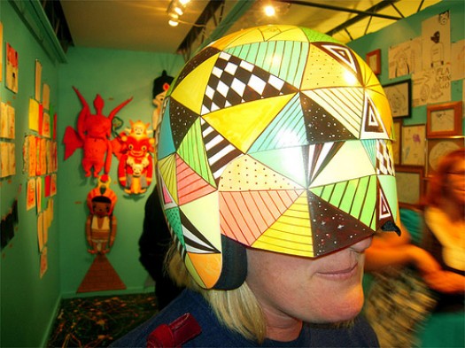
Seek and ye shall find / Enlightenment helmet

Yes, enlightenment

I could use one of these right about now. Via these genius­es.

Categories
architecture ecology urban

Architecture / Teddy Cruz's urban acupuncture

teddy cruz - tijuana river

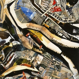
Last night, I saw archi­tect Ted­dy Cruz deliv­er a fast-paced, idea-rich pre­sen­ta­tion at the San Fran­cis­co Art Insti­tute. In a lit­tle over an hour, he tore through a slide show cov­er­ing his recent work on the social, cul­tur­al, polit­i­cal, and eco­nom­ic forces at work in com­mu­ni­ties along the US-Mex­i­co bor­der. The slide show itself was pret­ty impres­sive — a blend of research pho­tog­ra­phy, sim­ple Pow­er­Point ani­ma­tion, and pho­to col­lages (like the ones shown in this post, cour­tesy of UCSD, where Cruz teach­es) that looked some­what like maps but also some­what like actu­al pho­tos of urban density.I'd first heard of Cruz in the NYT Mag­a­zine fea­ture from last spring, Shan­ty­towns as a New Sub­ur­ban Ide­al. It details "Liv­ing Rooms at the Bor­der," his pro­posed project to turn a lot in the bor­der com­mu­ni­ty of San Ysidro into a mul­ti-use dwelling/community center/market. He dis­cuss­es it in more detail in "Urban acupunc­ture", an arti­cle he wrote for Res­i­den­tial Archi­tect Online:

Hous­ing and den­si­ty need to be seen not as an amount of units but as dwelling in rela­tion­ship to the larg­er infra­struc­ture of the city, which includes trans­porta­tion, eco­log­i­cal net­works, the pol­i­tics and eco­nom­ics of land use, and par­tic­u­lar cul­tur­al idio­syn­crasies of place … In a par­cel where exist­ing zon­ing allows only three units of hous­ing, the project pro­pos­es (through nego­ti­at­ed den­si­ty bonus­es and by shar­ing kitchens) 12 afford­able hous­ing units, a com­mu­ni­ty cen­ter result­ing from the adap­tive reuse of an exist­ing 1927 church, offices for Casa Famil­iar in the church's new attic, and a gar­den under­pin­ning the community's non­con­form­ing micro-economies, such as street mar­kets and kiosks. In a place where cur­rent reg­u­la­tion allows only one use, we pro­pose five dif­fer­ent uses that sup­port each other.

Cruz dis­cuss­es his archi­tec­tur­al mis­sion in this arti­cle at the Amer­i­can Insti­tute of Architecture's site: Bor­der Post­card: Chron­i­cles from the Edge.

Categories
inside art san francisco visual

Missed former SF locals / Chris Johanson

Chris Johanson

Once upon a time, a San Fran­cis­co res­i­dent strolling around these chilly city streets could brush by Chris Johan­son pret­ty often. Even before I knew who he was, I'd seen him around the Mis­sion a lot; when I final­ly con­nect­ed the dots, I real­ized that he was the guy who had drawn lit­tle signs and bits that I'd been lov­ing for years. As I recall, he drew a lit­tle guy above the uri­nal at the Uptown (or some­where I peed a lot); either way, his sim­ple fig­ures and their cryp­ti­cal­ly expressed thoughts would be burned into my brain for hours after I saw them. He moved to Port­land a while ago, and San Fran­cis­co has been a lit­tle less visu­al­ly excit­ing ever since. For one thing, his beard is an inspi­ra­tion to any aspir­ing bear­do, and his lead­er­ship in this regard will be sore­ly missed. More: A cool pro­file of Chris from Spark, a local PBS art show.

Categories
inside art reviews visual

Art / Olafur Eliasson in the New Yorker

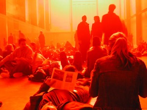
Two win­ters ago, I trav­eled to Lon­don for work. It was cold as hell, as a witch's tit, as the blood that runs in Dwyane Wade's veins dur­ing the fourth quar­ter. The sky was deep gray, hard, heavy and for­bid­ding, and it felt as if it wasn't more than 10 or 12 feet above my head, ready to come crash­ing down at any moment. One after­noon, in a jet-lagged haze, I wan­dered over to the Tate Mod­ern, where it seems they always have some thought-pro­vok­ing instal­la­tion (for instance, Anish Kapoor's gigan­tic lev­i­tat­ing horn which blew my mind for a while), and as I descend­ed the ramp into the muse­um, I was struck by the absolute inver­sion of win­try, out­door Lon­don. I took lots of pho­tos, but none could real­ly com­mu­ni­cate the immer­sive aspect of Ola­fur Elias­son's work, called "The Weath­er Project." It was all reds and oranges, all warmth and mist, envelop­ing you in a hap­py, gauzy glow. Cyn­thia Zarin recent­ly pro­filed Elias­son for the New York­er, and she com­ments that the Weath­er Project cement­ed Eliasson's rep­u­ta­tion in the art world … (Unfor­tu­nate­ly, I can't find a link to the arti­cle online, but by all means dig through back issues of the mag­a­zine at the laun­dro­mat, if you get a chance. The arti­cle pro­vides inter­est­ing insight into Eliasson's process, and includes some fun­ny anec­dotes relat­ing to his impulse to immerse the view­er in an envi­ron­ment. For instance, in mid-long-dis­tance-phone-con­ver­sa­tion with Cyn­thia Zarin, he places his cell phone on the lug­gage con­vey­er belt at the air­port, lets it go around the carousel once, then picks it up and asks her what the expe­ri­ence was like. Hmm.).

Categories
flickr music san francisco street art visual

Music / Peggy Honeywell at Mollusk

Flickr photo

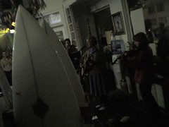
Being car-less keeps me (most­ly) around the south­east­ern neigh­bor­hoods of San Fran­cis­co, but every once in a while I'll ven­ture out to the fron­tiers. Last Fri­day, we went out to Mol­lusk, the arty surf shop on 46th-ish Avenue and Irv­ing, (i.e. WAY Out­er Sun­set), for an art open­ing and a per­for­mance by Peg­gy Hon­ey­well, i.e. local art star and beau­ti­ful los­er Clare Rojas. The surf shop set­ting was infor­mal and cozy; the acoustics actu­al­ly weren't bad; there were dogs walk­ing around; all in all, it makes me wish that I got out there more. This inti­mate set­ting was lots bet­ter than the cav­ernous, loud, obnox­ious-peo­ple-filled place I saw her per­form last, Bar­ry McGee's open­ing in Mel­bourne, Aus­tralia a cou­ple of years ago.