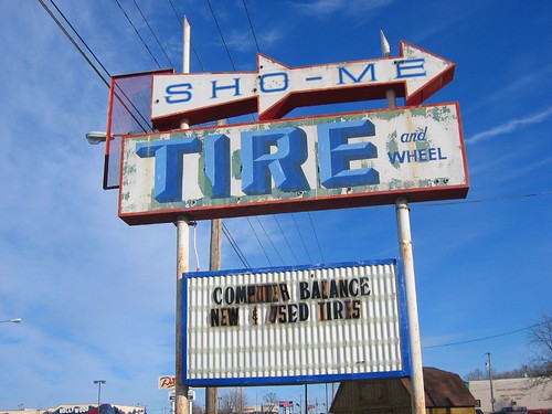
I was in Springfield, Missouri for work last week, and I was really surprised and impressed with the number of old, unique signs. Over on Flickr, you'll be amazed by two shots of some amazing Glo Laundromats signs, and a strip mall called "Country Club Plaza" that has an old orange sign with an analog clock on it. Good stuff.
Category: visual
Anything that can be seen. Stuff with in this category is generally somehow interesting to look at, beautiful, stunning, provocative, silly, crrrrraaaaaazy, intriguing, or inspirational.
Art / Say it isn't so, Gocco.
Nooooo! Print Gocco, the ingenious, addictive Japanese home screen-printing press, is (apparently) being discontinued. Gocco supplies have been scarce lately (at Pearl Paints on Market, anyway), so I called Welsh Products. As I was ordering some bulbs and screens, I commented about the scarcity, and the woman on the other end said, "Well, they have discontinued it, you know."[Sound of phone hitting floor]She said that Riso would continue to manufacture ink, bulbs and screens for three years, but that they're ceasing production of the B6 press (the classic) very soon.Immediately after I hung up, I verified the news on the Internet — because it is so trustworthy in news of this nature — and quickly found a site dedicated to the preservation of Gocco: Save Gocco. I couldn't find any official reference, but MAKE magazine seems to believe the hype as well. Gocco's US site doesn't mention anything about it.
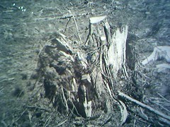
I'd never heard of Robert Adams before I saw his show at SFMOMA. Called "Turning Back," the photos document the destruction of the old-growth forests that Lewis & Clark passed through on their journey westward. The title refers to the implications and complications of westward advancement. When Lewis and Clark reached the West Coast, they turned back and headed east; the vast devastation in Adams's photos conveys the sense that — these days — there's no turning back."Turning Back" is bound to strike a chord with people. It evokes indelible American ideals and icons — the natural beauty of America, the promise inherent in the West, the bravery of Lewis & Clark — and presents it in a format and style eerily reminscent to another photographer named Adams — Ansel. Whereas Ansel's classic photos endeavor to communicate the vastness and beauty of America, the best of Robert's manage to convey an equally vast devastation.While I walked through the show, I thought a lot about my hike on the PCT, which took me through a few of the same forests featured in the show. As I approached the northern part of the west coast, I was pretty curious about the clear cuts. Of course I knew that it would be depressing, but really I had no idea what to expect. I imagined a sort of Lorax‑y landscape of smooth hills dotted with little stumps.As I hiked through the vast clear cuts of Northern California, Oregon and Washington, I was stunned *not* by the absence of trees, but the obvious brutality surrounding their removal. In the newer clear-cut areas, there was upturned earth everywhere, huge mounds of soil, mangled stumps — I've never been on a battlefield, but there's probably more a few similarities between the two. In some places, the dirt mounds and fallen trees completely obliterated the trail, and we had to do some pretty thorough route-finding before we made it through.In the areas that had been clear-cut years before, the trees grew in thick clumps. One didn't so much hike through them as swim, or claw, or climb. The small trees were themselves fighting for space, and their branches were so densely interwoven that the ground was invisible for hundreds of yards around. In the mornings, before the dew evaporated, one could easily get soaked in the space of twenty yards while pushing through the branches.Adams's photos convey the brutality and upheaval well, though I really wished that context had been provided along with each photo — where was it taken? when? what used to be there? I wanted to connect with specifics of geography and fit the pieces together.
Art / LACMA garage RIP
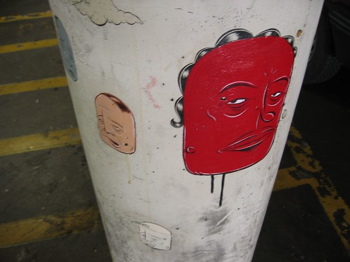
Soon, the garage outside the LA County Museum of Art is getting torn down to make way for some big new building. Unfortunately, it's got some really excellent murals by Barry McGee and Margaret Kilgallen that I checked out when I was there a couple of summers ago.The LA Weekly says:
Now's the time to check out the celebration of street art it has become since October 2000, when husband and wife team Barry McGee and Margaret Kilgallen were commissioned to bomb the second floor of the structure in commemoration of the show "Made in California."Over the last five years, Kilgallen's smoking, trudging, scowling women and McGee's signature sad-sack faces and meticulously drawn messages have inspired uncoerced homages from several locally and internationally known artists: N.Y.-based graffiti trio FAILE's collage stencils; Spanish tagger PEZ's bubbly alien figures, and Obey Giant guru Shepard Fairey's looming wheat-paste policeman.
It wouldn't be as sad if Margaret K. was still around to bomb another garage, but the fact that she's not makes the disappearance of this free and public place even harder to take. Sucks.The whole story: "Oil on Concrete".UPDATE: An excellent critique of LACMA's decision to tear down the garage, written by art critic and blogger Tyler Green.
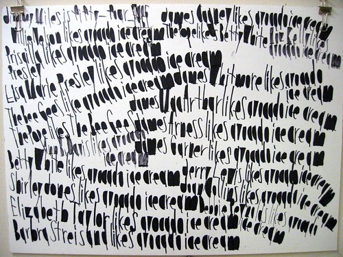
One of my favorite neighborhood art spots is called Creativity Explored, "a nonprofit visual arts center where artists with developmental disabilities create, exhibit, and sell art." Or so it says on its website.At first, I felt conflicted about Creativity Explored. Much of the art is geniunely impressive, and a few of the artists are quite talented and produce truly beautiful work. But the greatness is complicated by the artists' disabilities. So many works seem truly unique, yet you can't shake the feeling that you're admiring the product of the very thing that prevents the artist from living a "normal" life.The fact is that I really like a lot of it, especially the handwriting/drawings of John Patrick McKenzie. John's handwriting is bold and jaunty in a way that, at first, makes it look like a cross between graffiti and first-grade. But then beyond the initial impression, it becomes clear that the page is often organized very precisely. As he tends to color in the enclosed areas of each letter — the interior of an R, D, P, etc — the page takes on a heavier graphic dimension.Content-wise, each work of John's works is thematic, though "thematic" may be too fancy a term for it. Each contains a set of words or phrases that is shuffled in a variety of ways throughout the work, though some others just contain seemingly random individual words written again and again. Humor (probably unintentional) often arises from his selection of the names of stars of the 60's and 70's in his work, as well as fellow Creativity Explored artists.Generally, he'll pick a subject — for instance, the 1964 Chevy Impala — and he'll write a series of statements about how certain people feel about the subject. "Bruce Lee likes the 1964 Chevy Impala. Doris Tokuda likes the 1964 Chevy Impala," etc. The work above has a slightly different arrangement: "Sylvester Stallone likes Chef Boyardee … Muhammad Ali likes soul food."Sometimes, the subject of the work veers away from the literal. John has developed a sort of code for referring to all sorts of subjects, so you'll see phrases like "redneck pizza sheriff," "spring chicken," "cold turkey," "avocado ice cream," and many others used in strange contexts. Sometimes they're code, sometimes they're just what they are. Someone once told me that "avocado ice cream" is code, but recently a teacher at CE theorized that John had recently eaten at Mitchell's.Like much outsider art, John's work is exotic — the and it's hard to admire and discuss it without fetishizing the condition that contributes to it. But you could also say that John's work makes this less of an issue because it is so visually appealing, and often so poetic.The SF Weekly wrote an article about John in 2002: "Osama bin Laden dislikes kelloggs frosted mini wheats"
Photos / Underwater buildings
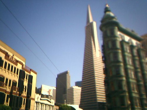
Sometimes, the crappy lens on my Motorola v220 produces interesting effects. Recently, it has started compressing the depth of field, and at the same time, arbitrarily fuzzing out objects. When directed at buildings in full late-afternoon light, it actually makes things look like they're in an aquarium.


 If you're like me, one of your favorite parts of seeing new cities is checking out the logo(s) of their public transit system. Nowadays you don't even need to travel to these cities to appreciate their variety; here's a site with an amazingly thorough catalog.
Fresh Air interview w/ Mike Mills
Mike Mills is a graphic designer, director of many excellent music videos (among them: "Kelly Watch the Stars," by Air, the one with the 70's‑looking slow-motion ping-pong players), and all-around aesthetic bad-ass. Terry Gross interviewed him on Fresh Air a couple of weeks ago, and you can check out the archived version on the NPR website. It includes a funny anecdote about his experience as an apprentice for a well-known Scottish artist — at the risk of giving away the ending, Mills didn't assist in the creation of the work as much as he created the work for the artist, who was too hungover to do it himself. Here's a really comprehensive collection of his video work, including "Kelly Watch the Stars."Incidentally, when I was growing up, a different Mike Mills was the bassist for my favorite rock band c. 1985–88 — REM. You can hear his thin, poignant harmonizing on Murmur, Reckoning, Fables of the Reconstruction, Life's Rich Pageant, Dead Letter Office, and Document. (Don't bother with anything after Document; it's all downhill from there). Let's hear it for all Mike Millses!
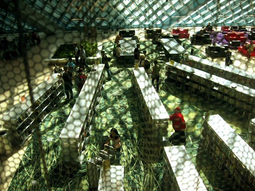
I took this picture in a small atrium overlooking the lobby of the Seattle Library, designed by Rem Koolhaas and opened a year ago. As Mara and I enjoyed the cool, green light, we overheard a conversation that went something like this:Middle-age woman to her husband: I can't believe they spent so much money on this thing.Husband: It's absurd. What's in a library? Books. You don't need all this other stuff.Middle-age woman to Mara: What a waste of money, right?Mara: [Flabbergasted]People raise the same argument when cities build new sports stadiums. Of course, stadiums bring in huge amounts of revenue and, the last time I checked, libraries were free. On the other hand, stadiums house teams owned by zillionaires who, the last time I checked, could probably afford to build the stadiums themselves.In any case, the taxpayers of Seattle have contributed to the construction of an amazing public space where EVERYONE can go, read, hang out FREE OF CHARGE and be inspired by the wisdom of the ages surrounding them. I can't imagine a better environment in which to do this. Citizens of Seattle, I salute you.
