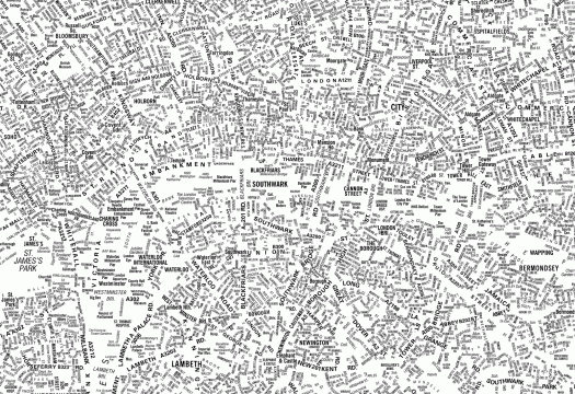
This amazing typographic map, cheekily called "London's Kerning," was designed by NB: Studio, a London graphic design concern. It's a pretty excellent demonstration of type's ability to communicate size, shape, relationship, the list goes on. I also love the homage (via typeface) to the London A‑Z, an indispensable companion, interpreter and guide for any navigator of London. They're taking orders for them. [Thx, kottke].
Category: visual
Anything that can be seen. Stuff with in this category is generally somehow interesting to look at, beautiful, stunning, provocative, silly, crrrrraaaaaazy, intriguing, or inspirational.
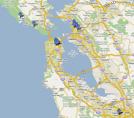
So how come I just now learned that you can create your own Google Maps mark-up? As a lover of both maps and personal documents, the ability to customize an online map has the potential to have a Shabu-like effect on my life. The above map has all the places I've lived in the Bay Area. Check out the complete, interactive thingy here. It has essential, all-important commentary on each place. Maps I want to make: killer runs in SF; fun night-time wanderings in SF; literary locales of SF (from fiction and from real life); TV/movie locales of SF; (this guy already made a cool music-related history of SF); crazy work travel trips of the past few years; places I want to go; a burrito tour of the Mission; the list GOES ON.
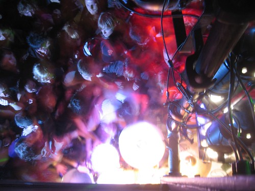
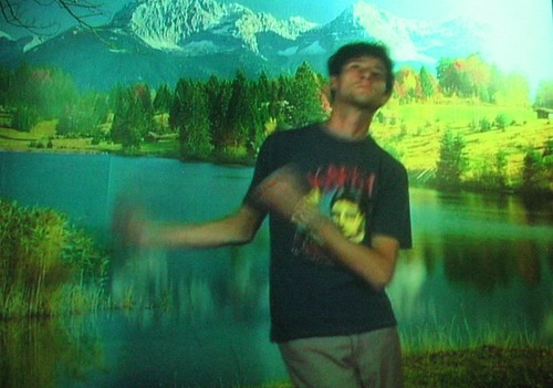
A few years ago, it would have been surprising to see a San Francisco indie crowd move its feet around in a dance-style motion at a live show. Last week, Lightning Bolt got people moving at 12 Galaxies; it wasn't exactly "dancing" but (from my vantage point in the balcony), it appeared kinetic — lots of mass moving back and forth, a little crowd-surfing, a little flailing around. I took a lot of pictures from my perch above the drums.
The weather has been getting nicer, so I've been jumping at any chance to ride my bike. Last Thursday morning, I rode across the Golden Gate Bridge and up into the Marin Headlands as the sun was coming up, and I stopped to take some photos as it was peeking above the horizon. When I was going through the results, I realized that the individual pictures didn't really do justice to the moment, so I poked around the Internet looking for something better than Photoshop's stitching utility. Autostitch to the rescue! It's simple, straightforward, and it instantaneously produces panoramas without discernible seams even with just a few pictures.
(I was so intrigued by the above results that I decided to try it with cellphone pictures). Last Saturday, we had a picnic at Kirby Cove, a little valley on the Marin side of the bridge. It was foggy and cold for the first hour or so, but then it started to burn off and I took some photos with my little cell phone camera. Once again, Autostich worked magic on it. Here's to technology!
I met Phil Collins (the British artist, not the British pop star1) at a bar in Brooklyn in the mid 90's. At the time, I didn't know him as "the British artist," I knew him only as my friend Tom's legendary boyfriend. I remember little of the night, but I do remember a hubbub accompanying Phil Collins's wanderings around the bar; he seemed to create some kind of event wherever he went. At some point, he approached the table with two tall drinks, placed them in front of me, and said something like "These are from an admirer of yours." As it turned out, they were from an admirer of his, and this admirer perceived, shall we say, a lack of gratitude when his drinks were given away. There was a confrontation, as I recall, and Phil said something like, "Well, I'm sorry, I never turn down a drink, but you can't honestly expect me to drink [disbelieving voice] rum & coke?" (Or whatever the drinks were). All of which serves as background to my reaction to Phil Collins's piece, The World Won't Listen, at SFMOMA, which was pretty excellent. The premise is pretty simple: He filmed young Turkish folks singing along to The Smiths best-of compilation "The World Won't Listen." The effect, on the other hand, is deep and resonant. The Smiths' odes to teenagerdom — all vacillating emotions, frustrated inarticulations, piercing moments of understanding, sexual ambiguity — take on a deeper social dimension through the voices of (in many of the cases) non-English speakers. Add to this the fact that the singers are Middle Eastern, and it becomes difficult to avoid a political reading. Songs like "There Is A Light That Never Goes Out" sounds less the over-dramatic nihilism of a Western teenager and more like a very real plea from a teenager caught in an increasingly fundamentalist world:
Take me out tonightBecause I want to see people and IWant to see lifeDriving in your carOh, please don't drop me homeBecause it's not my home, it's theirHome, and I'm welcome no more
Really impressive.Cool: a web posting for the event that he filmed.1 Speaking of the British pop star, here's a classic: The video for "Sussudio" [YouTube]

Once upon a time, a San Francisco resident strolling around these chilly city streets could brush by Chris Johanson pretty often. Even before I knew who he was, I'd seen him around the Mission a lot; when I finally connected the dots, I realized that he was the guy who had drawn little signs and bits that I'd been loving for years. As I recall, he drew a little guy above the urinal at the Uptown (or somewhere I peed a lot); either way, his simple figures and their cryptically expressed thoughts would be burned into my brain for hours after I saw them. He moved to Portland a while ago, and San Francisco has been a little less visually exciting ever since. For one thing, his beard is an inspiration to any aspiring beardo, and his leadership in this regard will be sorely missed. More: A cool profile of Chris from Spark, a local PBS art show.
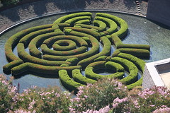
My nomination for All-Time Best Moment In An Art Documentary has to be the "Bullshit!" scene in Concert Of Wills: Making The Getty Center. Abstract-artist-turned-landscape-designer Robert Irwin literally calls bullshit on architect Richard Meier during an important Getty Center planning session. [The object of their disagreement is Irwin's garden design, pictured at right. Thx, brewbooks.] Design Observer's Michael Bierut sums it up nicely in an article called "On (Design) Bullshit:"
The [Getty Foundation], against Meier's advice, has brought in artist Robert Irwin to create the Center's central garden. The filmmakers are there to record the unveiling of Irwin's proposal, and Meier's distaste is evident. The artist's bias for whimsical organic forms, his disregard for the architecture's rigorous orthonography, and perhaps even his Detroit Tigers baseball hat all rub Richard Meier the wrong way, and he and his team of architects begin a reasoned, strongly-felt critique of the proposed plan. Irwin, sensing (correctly, as it turns out) that he has the client in his pocket, listens patiently and then says, "You want my response?"His response is the worst accusation you can lodge against a designer: "Bullshit."
If I recall correctly, Meier is speechless, and the mood of the documentary shifts quite significantly. Meier's personality and viewpoint had dominated (is "domineered" a word?) earlier scenes, he maintains a sort of icy distance in subsequent scenes. (Disclosure: While I respect Meier, I'm not a fan of his work, especially the Getty, and the documentary makes clear that he is, umm, a dick). Irwin, on the other hand, I've always loved, especially his dot paintings. I'm currently reading Lawrence Weschsler's biography of Irwin, Seeing Is Forgetting the Name of the Thing One Sees, and it contains some useful background and context to the "Bullshit!" scene. It also complicates it; the more I read, the more Irwin and Meier seem to have quite a lot in common. I'd always assumed that Irwin's vision was the irrational, organic counterpoint to Meier's rational, geometric forms. The book makes clear that Irwin has quite a lot of the rational geometry on the brain himself. Perhaps they were just too similar to get along.A large portion of the book is dedicated to Irwin's discussion of his own process … My favorite passage involves Irwin's explanations of the fits and starts that characterized his output, especially during the dot painting phase:
"Most of the time, I didn't have any idea where it was going; I had no intellectual clarity as to what it was I thought I was doing … Maybe I was just gradually developing a trust in the act itself, that somehow, if it were pursued legitimately, the questions it would raise would be legitimate and the answers would have to exist somewhere, would be worth pursuing, and would be of consequence."Actually, during those years in the midsixties," he doubled back on his formulation, "the answers seemed to matter less and less: I was becoming much more of a question person than an answer person … The thing that really struck me as I got into developing my interest in the area of questions," Irwin continued, "is the degree to which as a culture we are geared for just the opposite. We are past-minded, in the sense that all of our systems of measure are developed and in a sense dependent upon a kind of physical resolution. We tag our renaissances at the highest level of performance, whereas it's fairly clear to me that once the question is raised, the performance is somewhat inevitable, almost just a mopping-up operation, merely a matter of time."
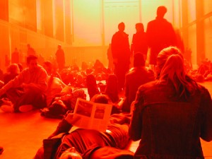
Two winters ago, I traveled to London for work. It was cold as hell, as a witch's tit, as the blood that runs in Dwyane Wade's veins during the fourth quarter. The sky was deep gray, hard, heavy and forbidding, and it felt as if it wasn't more than 10 or 12 feet above my head, ready to come crashing down at any moment. One afternoon, in a jet-lagged haze, I wandered over to the Tate Modern, where it seems they always have some thought-provoking installation (for instance, Anish Kapoor's gigantic levitating horn which blew my mind for a while), and as I descended the ramp into the museum, I was struck by the absolute inversion of wintry, outdoor London. I took lots of photos, but none could really communicate the immersive aspect of Olafur Eliasson's work, called "The Weather Project." It was all reds and oranges, all warmth and mist, enveloping you in a happy, gauzy glow. Cynthia Zarin recently profiled Eliasson for the New Yorker, and she comments that the Weather Project cemented Eliasson's reputation in the art world … (Unfortunately, I can't find a link to the article online, but by all means dig through back issues of the magazine at the laundromat, if you get a chance. The article provides interesting insight into Eliasson's process, and includes some funny anecdotes relating to his impulse to immerse the viewer in an environment. For instance, in mid-long-distance-phone-conversation with Cynthia Zarin, he places his cell phone on the luggage conveyer belt at the airport, lets it go around the carousel once, then picks it up and asks her what the experience was like. Hmm.).
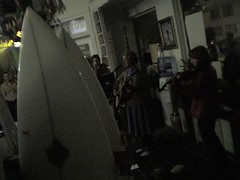
Being car-less keeps me (mostly) around the southeastern neighborhoods of San Francisco, but every once in a while I'll venture out to the frontiers. Last Friday, we went out to Mollusk, the arty surf shop on 46th-ish Avenue and Irving, (i.e. WAY Outer Sunset), for an art opening and a performance by Peggy Honeywell, i.e. local art star and beautiful loser Clare Rojas. The surf shop setting was informal and cozy; the acoustics actually weren't bad; there were dogs walking around; all in all, it makes me wish that I got out there more. This intimate setting was lots better than the cavernous, loud, obnoxious-people-filled place I saw her perform last, Barry McGee's opening in Melbourne, Australia a couple of years ago.
Street art / Swoon
So it seems I'm a couple of years late to this particular artist, but some recent conversation on the Book Arts list turned me on to Swoon, a NYC street artist. Her medium is the cutout — from paper, wood, linoleum — and she attaches these to walls all over NYC. The paper ones are the most amazing to me; they're like those snow flakes you make in grade school, but life-sized and really elaborate and of people. Check out this Flickr cluster to get a sense of the way that the paper ages on the wall, and the way that this fragility and sense of impermanence reacts with the rest of the wall. This interview in the Morning News has some good detail about her process:
There's something particular to the images that make me choose that material … A lot has to do with the limitations of the material. The linoleum you can get so much more detail from. Everything that has more nuances, I use linoleum. The wood is rougher, but a good roughness. The paper is really hard to think about, and so it tends to be simpler. With paper, you'd choose simple subjects because it's hard to create an expression. The challenge is to make the cutout so that it can get on the wall as a solid unit in two minutes or less.
Thanks to howmuchlongerkillmenow for the photo.
