Categories
inside art reviews visual

Foto / Modernity in Central Europe

Foto - Modernity in Central Europe

When I was in Wash­ing­ton DC last month, I saw an incred­i­ble show at the Nation­al Gallery called Foto: Moder­ni­ty in Cen­tral Europe 1918–1945. As you may have guessed by the title, the show is pho­tog­ra­phy-ori­ent­ed, but it's more than that: It's a sto­ry about pho­tog­ra­phy craft, and the way that Euro­pean pho­tog­ra­phers bent, broke and oth­er­wise manip­u­lat­ed pho­tos to express the social, polit­i­cal and cul­tur­al frag­men­ta­tion (and chaos) in the wake of the First World War. Most of the artists were unknown to me; they're all intro­duced and dis­cussed in detail in the excel­lent exhi­bi­tion cat­a­logue. It opens at the Guggen­heim New York in October.

Birth of a robotThis is a pho­tomon­tage by a Pol­ish artist named Janusz Maria Brzes­ki. It's called Twen­ti­eth-Cen­tu­ry Idyll, but the name of the series is even bet­ter: A Robot Is Born. Pho­to: Nation­al Gallery of Art.
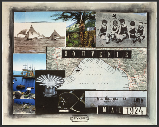
Jindrich Styrsky - SouvenirAnoth­er pho­tomon­tage, this one by Jin­drich Strysky, a Czech artist. Pho­to: Nation­al Gallery of Art


Categories
cinema inside art tip visual

Must-see movies / Killer of Sheep

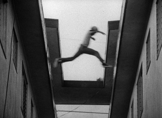
Leaping boy from Killer of SheepA moment from a beau­ti­ful, riv­et­ing scene in Killer of Sheep. Pho­to: Mile­stone Films.

Killer of Sheep is direc­tor Charles Bur­nett's account of life in the LA neigh­bor­hood of Watts in the ear­ly 1970's. It began life as his senior the­sis at UCLA film school and until recent­ly it was nev­er seen out­side art hous­es and muse­ums. Despite all of that, it was among the first 50 films to declared nation­al trea­sures by the Library of Con­gress. I saw it ear­li­er this week at the Cas­tro, and it lived up the hype. Burnett's account of his moti­va­tions in mak­ing the film seems like a good place to start unpack­ing the stuff that makes it so unique:

I want­ed to tell a sto­ry about a man who was try­ing to hold on to some val­ues that were con­stant­ly being erod­ed by oth­er forces, by his plight in the com­mu­ni­ty, and the qual­i­ty of the job that he had. At the same time he want­ed to do right by his fam­i­ly. I didn't want to impose my val­ues on his sit­u­a­tion. I just want­ed to show his life. And I didn't want to resolve his sit­u­a­tion by impos­ing arti­fi­cial solu­tions like him becom­ing a doc­tor or a diplo­mat, when the real­i­ty is that most peo­ple don't get out. I want­ed to show that there is a pos­i­tive ele­ment to his life, and that is that he endures, he's accept­ed it. [From an excel­lent inter­view on Sens­es of Cin­e­ma]

To bring this sto­ry to life, he employs a style that seems impro­vi­sa­tion­al, as much doc­u­men­tary as Ital­ian neo­re­al­ism. But there's also some­thing very new and gen­uine and par­tic­u­lar­ly Amer­i­can about it — iso­la­tion, crum­bling build­ings, explo­sions of cru­el­ty and anger, and the con­stant, chaot­ic motion of kids leap­ing across rooftops and crawl­ing under build­ings — com­bined, these things seem to evoke a very Amer­i­can way of poor, urban life.More than any­thing, the movie makes you won­der at its very improb­a­bil­i­ty: How in the world did he make that? Did he actu­al­ly plan those moments that seem gen­uine­ly serendip­i­tous? Maybe it's that the actors are untrained. The dia­logue seems fresh, sur­pris­ing and authen­tic even when it's forced. Maybe it's the pac­ing of the edit­ing. Scenes start abrupt­ly — chil­dren emerge from a hole, an entire neigh­bor­hood has assem­bled in a stair­well, kids hide behind a scrap of ply­wood. Most scenes also tend to end a cou­ple of sec­onds ear­ly, or linger a few sec­onds longer. Maybe it's the dia­logue — it's all mum­bles or hollers or growls, with jazz and blues tracks adding rhyth­mic, some­times hope­ful coun­ter­points to the imagery. Who knows? What's clear is that it speaks in a true, clear and unique voice. Go see it.

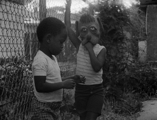
Dog face in Killer of SheepNo dia­logue. Dog mask. Chain link fence. Killer of Sheep. Pho­to: Mile­stone Films.
Categories
inside art visual

Rachell Sumpter / Ethereal, still, and strange

rachell_sumpter_argonautsRachell Sumpter, Arg­onauts. From her col­lec­tion at the Richard Heller Gallery.

Her stuff reminds me of lots of oth­er artists I like — Evah Fan and some aspects of Julian­na Bright, for two. Maybe it's some­thing about the West Coast, but they're all sim­ple and light at first glance, but also deeply still, and it's a still­ness that reveals some­thing sur­pris­ing, impos­si­ble, or dis­com­fort­ing, but in an amus­ing way. Usu­al­ly. Any­way, there's lots more Rachell Sumpter prints and stuff at Lit­tle Paper Planes, and some draw­ings, prints, water­col­ors and more from a 2006 show at Six­space.

Categories
inside art visual

Information art / Typographic map of London

Typographic map of London

This amaz­ing typo­graph­ic map, cheek­i­ly called "London's Kern­ing," was designed by NB: Stu­dio, a Lon­don graph­ic design con­cern. It's a pret­ty excel­lent demon­stra­tion of type's abil­i­ty to com­mu­ni­cate size, shape, rela­tion­ship, the list goes on. I also love the homage (via type­face) to the Lon­don A‑Z, an indis­pens­able com­pan­ion, inter­preter and guide for any nav­i­ga­tor of Lon­don. They're tak­ing orders for them. [Thx, kot­tke].

Categories
inside art san francisco the ancient past visual

Small worlds / Phil Collins, The World Won't Listen

Flickr photo


I met Phil Collins (the British artist, not the British pop star1) at a bar in Brook­lyn in the mid 90's. At the time, I didn't know him as "the British artist," I knew him only as my friend Tom's leg­endary boyfriend. I remem­ber lit­tle of the night, but I do remem­ber a hub­bub accom­pa­ny­ing Phil Collins's wan­der­ings around the bar; he seemed to cre­ate some kind of event wher­ev­er he went. At some point, he approached the table with two tall drinks, placed them in front of me, and said some­thing like "These are from an admir­er of yours." As it turned out, they were from an admir­er of his, and this admir­er per­ceived, shall we say, a lack of grat­i­tude when his drinks were giv­en away. There was a con­fronta­tion, as I recall, and Phil said some­thing like, "Well, I'm sor­ry, I nev­er turn down a drink, but you can't hon­est­ly expect me to drink [dis­be­liev­ing voice] rum & coke?" (Or what­ev­er the drinks were). All of which serves as back­ground to my reac­tion to Phil Collins's piece, The World Won't Lis­ten, at SFMOMA, which was pret­ty excel­lent. The premise is pret­ty sim­ple: He filmed young Turk­ish folks singing along to The Smiths best-of com­pi­la­tion "The World Won't Lis­ten." The effect, on the oth­er hand, is deep and res­o­nant. The Smiths' odes to teenager­dom — all vac­il­lat­ing emo­tions, frus­trat­ed inar­tic­u­la­tions, pierc­ing moments of under­stand­ing, sex­u­al ambi­gu­i­ty — take on a deep­er social dimen­sion through the voic­es of (in many of the cas­es) non-Eng­lish speak­ers. Add to this the fact that the singers are Mid­dle East­ern, and it becomes dif­fi­cult to avoid a polit­i­cal read­ing. Songs like "There Is A Light That Nev­er Goes Out" sounds less the over-dra­mat­ic nihilism of a West­ern teenag­er and more like a very real plea from a teenag­er caught in an increas­ing­ly fun­da­men­tal­ist world:

Take me out tonight­Be­cause I want to see peo­ple and IWant to see lifeDriv­ing in your carOh, please don't drop me home­Be­cause it's not my home, it's theirHome, and I'm wel­come no more 

Real­ly impressive.Cool: a web post­ing for the event that he filmed.1 Speak­ing of the British pop star, here's a clas­sic: The video for "Sus­su­dio" [YouTube]

Categories
inside art san francisco visual

Missed former SF locals / Chris Johanson

Chris Johanson

Once upon a time, a San Fran­cis­co res­i­dent strolling around these chilly city streets could brush by Chris Johan­son pret­ty often. Even before I knew who he was, I'd seen him around the Mis­sion a lot; when I final­ly con­nect­ed the dots, I real­ized that he was the guy who had drawn lit­tle signs and bits that I'd been lov­ing for years. As I recall, he drew a lit­tle guy above the uri­nal at the Uptown (or some­where I peed a lot); either way, his sim­ple fig­ures and their cryp­ti­cal­ly expressed thoughts would be burned into my brain for hours after I saw them. He moved to Port­land a while ago, and San Fran­cis­co has been a lit­tle less visu­al­ly excit­ing ever since. For one thing, his beard is an inspi­ra­tion to any aspir­ing bear­do, and his lead­er­ship in this regard will be sore­ly missed. More: A cool pro­file of Chris from Spark, a local PBS art show.

Categories
architecture inside art visual

Art / Robert Irwin, BS, and the importance of questions

Flickr photo

My nom­i­na­tion for All-Time Best Moment In An Art Doc­u­men­tary has to be the "Bull­shit!" scene in Con­cert Of Wills: Mak­ing The Get­ty Cen­ter. Abstract-artist-turned-land­scape-design­er Robert Irwin lit­er­al­ly calls bull­shit on archi­tect Richard Meier dur­ing an impor­tant Get­ty Cen­ter plan­ning ses­sion. [The object of their dis­agree­ment is Irwin's gar­den design, pic­tured at right. Thx, brew­books.] Design Observ­er's Michael Bierut sums it up nice­ly in an arti­cle called "On (Design) Bullshit:"

The [Get­ty Foun­da­tion], against Meier's advice, has brought in artist Robert Irwin to cre­ate the Center's cen­tral gar­den. The film­mak­ers are there to record the unveil­ing of Irwin's pro­pos­al, and Meier's dis­taste is evi­dent. The artist's bias for whim­si­cal organ­ic forms, his dis­re­gard for the architecture's rig­or­ous orthonog­ra­phy, and per­haps even his Detroit Tigers base­ball hat all rub Richard Meier the wrong way, and he and his team of archi­tects begin a rea­soned, strong­ly-felt cri­tique of the pro­posed plan. Irwin, sens­ing (cor­rect­ly, as it turns out) that he has the client in his pock­et, lis­tens patient­ly and then says, "You want my response?"His response is the worst accu­sa­tion you can lodge against a design­er: "Bull­shit."

If I recall cor­rect­ly, Meier is speech­less, and the mood of the doc­u­men­tary shifts quite sig­nif­i­cant­ly. Meier's per­son­al­i­ty and view­point had dom­i­nat­ed (is "dom­i­neered" a word?) ear­li­er scenes, he main­tains a sort of icy dis­tance in sub­se­quent scenes. (Dis­clo­sure: While I respect Meier, I'm not a fan of his work, espe­cial­ly the Get­ty, and the doc­u­men­tary makes clear that he is, umm, a dick). Irwin, on the oth­er hand, I've always loved, espe­cial­ly his dot paint­ings. I'm cur­rent­ly read­ing Lawrence Weschsler's biog­ra­phy of Irwin, See­ing Is For­get­ting the Name of the Thing One Sees, and it con­tains some use­ful back­ground and con­text to the "Bull­shit!" scene. It also com­pli­cates it; the more I read, the more Irwin and Meier seem to have quite a lot in com­mon. I'd always assumed that Irwin's vision was the irra­tional, organ­ic coun­ter­point to Meier's ratio­nal, geo­met­ric forms. The book makes clear that Irwin has quite a lot of the ratio­nal geom­e­try on the brain him­self. Per­haps they were just too sim­i­lar to get along.A large por­tion of the book is ded­i­cat­ed to Irwin's dis­cus­sion of his own process … My favorite pas­sage involves Irwin's expla­na­tions of the fits and starts that char­ac­ter­ized his out­put, espe­cial­ly dur­ing the dot paint­ing phase:

"Most of the time, I didn't have any idea where it was going; I had no intel­lec­tu­al clar­i­ty as to what it was I thought I was doing … Maybe I was just grad­u­al­ly devel­op­ing a trust in the act itself, that some­how, if it were pur­sued legit­i­mate­ly, the ques­tions it would raise would be legit­i­mate and the answers would have to exist some­where, would be worth pur­su­ing, and would be of consequence."Actually, dur­ing those years in the mid­six­ties," he dou­bled back on his for­mu­la­tion, "the answers seemed to mat­ter less and less: I was becom­ing much more of a ques­tion per­son than an answer per­son … The thing that real­ly struck me as I got into devel­op­ing my inter­est in the area of ques­tions," Irwin con­tin­ued, "is the degree to which as a cul­ture we are geared for just the oppo­site. We are past-mind­ed, in the sense that all of our sys­tems of mea­sure are devel­oped and in a sense depen­dent upon a kind of phys­i­cal res­o­lu­tion. We tag our renais­sances at the high­est lev­el of per­for­mance, where­as it's fair­ly clear to me that once the ques­tion is raised, the per­for­mance is some­what inevitable, almost just a mop­ping-up oper­a­tion, mere­ly a mat­ter of time."

Categories
inside art reviews visual

Art / Olafur Eliasson in the New Yorker

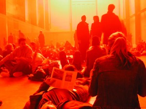
Two win­ters ago, I trav­eled to Lon­don for work. It was cold as hell, as a witch's tit, as the blood that runs in Dwyane Wade's veins dur­ing the fourth quar­ter. The sky was deep gray, hard, heavy and for­bid­ding, and it felt as if it wasn't more than 10 or 12 feet above my head, ready to come crash­ing down at any moment. One after­noon, in a jet-lagged haze, I wan­dered over to the Tate Mod­ern, where it seems they always have some thought-pro­vok­ing instal­la­tion (for instance, Anish Kapoor's gigan­tic lev­i­tat­ing horn which blew my mind for a while), and as I descend­ed the ramp into the muse­um, I was struck by the absolute inver­sion of win­try, out­door Lon­don. I took lots of pho­tos, but none could real­ly com­mu­ni­cate the immer­sive aspect of Ola­fur Elias­son's work, called "The Weath­er Project." It was all reds and oranges, all warmth and mist, envelop­ing you in a hap­py, gauzy glow. Cyn­thia Zarin recent­ly pro­filed Elias­son for the New York­er, and she com­ments that the Weath­er Project cement­ed Eliasson's rep­u­ta­tion in the art world … (Unfor­tu­nate­ly, I can't find a link to the arti­cle online, but by all means dig through back issues of the mag­a­zine at the laun­dro­mat, if you get a chance. The arti­cle pro­vides inter­est­ing insight into Eliasson's process, and includes some fun­ny anec­dotes relat­ing to his impulse to immerse the view­er in an envi­ron­ment. For instance, in mid-long-dis­tance-phone-con­ver­sa­tion with Cyn­thia Zarin, he places his cell phone on the lug­gage con­vey­er belt at the air­port, lets it go around the carousel once, then picks it up and asks her what the expe­ri­ence was like. Hmm.).

Categories
inside art law & order visual

Art / CIA HQ

Out­side CIA head­quar­ters, there's an instal­la­tion called "Kryp­tos," a large met­al sheet con­tain­ing a series of char­ac­ters that has per­plexed puz­zlers since it was unveiled 10 years ago. Today, the NYT reports that the artist mis­tak­en­ly omit­ted a char­ac­ter.

Categories
inside art reviews san francisco visual

Art / Richard Misrach slays 49 Geary

Hazardous waste

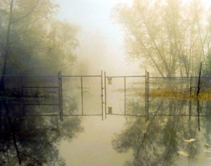
First Thurs­days at 49 Geary can be over­whelm­ing, peo­ple-wise, and under­whelm­ing, art-wise, and this month was dif­fer­ent only in that the over­whelm­ing­ness was crammed into one place: the Fraenkel Gallery. Packed with peo­ple, it also dis­played a face-melt­ing col­lec­tion of Richard Mis­rach photos.

When I first saw Misrach's pho­tos, I thought imme­di­ate­ly of Sebas­tiao Sal­ga­do. Both guys address big themes — civ­i­liza­tions, sea­sons, land­scapes, human endeav­ors — but they do so in vast­ly dif­fer­ent ways. Sal­ga­do frames his work around human action; his sub­jects are migrants, activi­tists, labor­ers. Mis­rach works with earth, light, space; he works with dunes, strangers, cars, pow­er plants. Salgado's work is tied to cur­rent events, polit­i­cal move­ments, regimes, defin­able moments and rec­og­niz­able things; Mis­rach works with more anony­mous objects and land­scapes. There are much more sig­nif­i­cant dif­fer­ences between them, but they share a social aware­ness that invests the best of their work with real intrigue and importance.