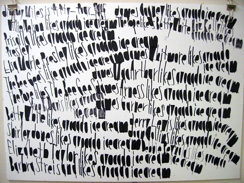
Categories
inside art reviews san francisco visual

Art / Oakland is special in other ways

Flickr photo

Last night we checked out the Oak­land Art Mur­mur. Actu­al­ly, we didn't even know that such a thing exist­ed, and drove over the Bridge intend­ing to see Jason Munn's open­ing at Bloom Screen Print­ing. So it was a pleas­ant sur­prise to see that lit­tle stretch of Tele­graph goin off when we got there. Jason's stuff was the best of the art stuff, by far, but the action on the street was out front of Rock Paper Scis­sors.That's where we saw a guy burn an Amer­i­can flag. It took him rough­ly 10 min­utes of false starts to light it with a Bic, but just after I took this pic­ture, an ambu­lance raced up the street, sirens blar­ing, on its way to some emer­gency, but it abrupt­ly slowed down when the dri­ver saw the burn­ing flag, and we could see the faces of the oth­er para­medics star­ing at the guy as they crawled by. It was one of those only-in-Oak­land moments. Holla!

Categories
inside art new york visual

Art / Jesus drives Satan from his toy room

A cou­ple of weeks ago, Mara and Jonathan and I went to the Frick, where we saw this paint­ing by Duc­cio. It's called "The Temp­ta­tion of Christ on the Moun­tain," but I vast­ly pre­fer Jonthan's title (hint: it's the sub­ject of this post). Inci­den­tal­ly, how great is the Frick? Ghost­ly Whistlers, mul­ti­ple Ver­meers, "St. Fran­cis in the Desert," an excel­lent sculp­ture of a dead bird (was it a bird?). One might say: Frickin awesome.

Categories
inside art san francisco visual

Art / Marcel Dzama, bats, root beer, Canada

The Roy­al Art Lodge snuck up on me. I wan­dered into a show of theirs at the Pow­er Plant, a gallery in Toron­to in 2003. In a fair­ly small space, they'd crammed a wall full of col­lab­o­ra­tive paint­ings, Polaroids, home­made musi­cal instru­ments, and many paint­ings by Mar­cel Dza­ma and Neil Far­ber. It was all very … hard to describe: thrown togeth­er, prim­i­tive, whim­si­cal, charm­ing, dark, strange, hilar­i­ous. A paint­ing of debu­tantes sit­ting in a row on the back of an alli­ga­tor, smok­ing cig­a­rettes. Bats. Root beer syrup. A grid of Polaroids, each of which was com­posed of a per­son in a strange, home­made mask pok­ing his/her head out of a win­dow of an insti­tu­tion­al building.I couldn't quite believe it and I loved it. It would be hard for any art show to rival serendip­i­tous dis­cov­ery like that, but last week, I checked out Yer­ba Buena's show of some new­er Roy­al Art Lodge stuff: Peer Plea­sures 1. Worth see­ing, like many recent YBCA shows. Not spec­tac­u­lar, but solid.See also:

  • Lists of inter­est­ing stuff that Neil Far­ber and Michael Duomon­tier will swap paint­ings for (Neil: Micro­nauts from the 70's. Michael: self-released Joan­na New­som albums).
  • Mar­cel Dza­ma inter­view with Sarah Vow­ell: "If there is a Cana­di­an fac­tor in our togeth­er­ness, per­haps it is borne out of the iso­la­tion of liv­ing in a small city like Win­nipeg, and the cold weath­er. We are not able to go out­side too often because right now your skin will freeze with­in minutes."
Categories
inside art the ancient past visual

Art / Robert Adams at SFMOMA

Flickr photo

I'd nev­er heard of Robert Adams before I saw his show at SFMOMA. Called "Turn­ing Back," the pho­tos doc­u­ment the destruc­tion of the old-growth forests that Lewis & Clark passed through on their jour­ney west­ward. The title refers to the impli­ca­tions and com­pli­ca­tions of west­ward advance­ment. When Lewis and Clark reached the West Coast, they turned back and head­ed east; the vast dev­as­ta­tion in Adams's pho­tos con­veys the sense that — these days — there's no turn­ing back."Turning Back" is bound to strike a chord with peo­ple. It evokes indeli­ble Amer­i­can ideals and icons — the nat­ur­al beau­ty of Amer­i­ca, the promise inher­ent in the West, the brav­ery of Lewis & Clark — and presents it in a for­mat and style eeri­ly reminscent to anoth­er pho­tog­ra­ph­er named Adams — Ansel. Where­as Ansel's clas­sic pho­tos endeav­or to com­mu­ni­cate the vast­ness and beau­ty of Amer­i­ca, the best of Robert's man­age to con­vey an equal­ly vast devastation.While I walked through the show, I thought a lot about my hike on the PCT, which took me through a few of the same forests fea­tured in the show. As I approached the north­ern part of the west coast, I was pret­ty curi­ous about the clear cuts. Of course I knew that it would be depress­ing, but real­ly I had no idea what to expect. I imag­ined a sort of Lorax‑y land­scape of smooth hills dot­ted with lit­tle stumps.As I hiked through the vast clear cuts of North­ern Cal­i­for­nia, Ore­gon and Wash­ing­ton, I was stunned *not* by the absence of trees, but the obvi­ous bru­tal­i­ty sur­round­ing their removal. In the new­er clear-cut areas, there was upturned earth every­where, huge mounds of soil, man­gled stumps — I've nev­er been on a bat­tle­field, but there's prob­a­bly more a few sim­i­lar­i­ties between the two. In some places, the dirt mounds and fall­en trees com­plete­ly oblit­er­at­ed the trail, and we had to do some pret­ty thor­ough route-find­ing before we made it through.In the areas that had been clear-cut years before, the trees grew in thick clumps. One didn't so much hike through them as swim, or claw, or climb. The small trees were them­selves fight­ing for space, and their branch­es were so dense­ly inter­wo­ven that the ground was invis­i­ble for hun­dreds of yards around. In the morn­ings, before the dew evap­o­rat­ed, one could eas­i­ly get soaked in the space of twen­ty yards while push­ing through the branches.Adams's pho­tos con­vey the bru­tal­i­ty and upheaval well, though I real­ly wished that con­text had been pro­vid­ed along with each pho­to — where was it tak­en? when? what used to be there? I want­ed to con­nect with specifics of geog­ra­phy and fit the pieces together.

Categories
flickr inside art street art visual

Art / LACMA garage RIP

Flickr photo


Soon, the garage out­side the LA Coun­ty Muse­um of Art is get­ting torn down to make way for some big new build­ing. Unfor­tu­nate­ly, it's got some real­ly excel­lent murals by Bar­ry McGee and Mar­garet Kil­gallen that I checked out when I was there a cou­ple of sum­mers ago.The LA Week­ly says:

Now's the time to check out the cel­e­bra­tion of street art it has become since Octo­ber 2000, when hus­band and wife team Bar­ry McGee and Mar­garet Kil­gallen were com­mis­sioned to bomb the sec­ond floor of the struc­ture in com­mem­o­ra­tion of the show "Made in California."Over the last five years, Kilgallen's smok­ing, trudg­ing, scowl­ing women and McGee's sig­na­ture sad-sack faces and metic­u­lous­ly drawn mes­sages have inspired unco­erced homages from sev­er­al local­ly and inter­na­tion­al­ly known artists: N.Y.-based graf­fi­ti trio FAILE's col­lage sten­cils; Span­ish tag­ger PEZ's bub­bly alien fig­ures, and Obey Giant guru Shep­ard Fairey's loom­ing wheat-paste policeman.

It wouldn't be as sad if Mar­garet K. was still around to bomb anoth­er garage, but the fact that she's not makes the dis­ap­pear­ance of this free and pub­lic place even hard­er to take. Sucks.The whole sto­ry: "Oil on Con­crete".UPDATE: An excel­lent cri­tique of LACMA's deci­sion to tear down the garage, writ­ten by art crit­ic and blog­ger Tyler Green.

Categories
flickr inside art san francisco visual

Art / Muhammad Ali likes soul food

Flickr photo


One of my favorite neigh­bor­hood art spots is called Cre­ativ­i­ty Explored, "a non­prof­it visu­al arts cen­ter where artists with devel­op­men­tal dis­abil­i­ties cre­ate, exhib­it, and sell art." Or so it says on its web­site.At first, I felt con­flict­ed about Cre­ativ­i­ty Explored. Much of the art is geni­une­ly impres­sive, and a few of the artists are quite tal­ent­ed and pro­duce tru­ly beau­ti­ful work. But the great­ness is com­pli­cat­ed by the artists' dis­abil­i­ties. So many works seem tru­ly unique, yet you can't shake the feel­ing that you're admir­ing the prod­uct of the very thing that pre­vents the artist from liv­ing a "nor­mal" life.The fact is that I real­ly like a lot of it, espe­cial­ly the handwriting/drawings of John Patrick McKen­zie. John's hand­writ­ing is bold and jaun­ty in a way that, at first, makes it look like a cross between graf­fi­ti and first-grade. But then beyond the ini­tial impres­sion, it becomes clear that the page is often orga­nized very pre­cise­ly. As he tends to col­or in the enclosed areas of each let­ter — the inte­ri­or of an R, D, P, etc — the page takes on a heav­ier graph­ic dimension.Content-wise, each work of John's works is the­mat­ic, though "the­mat­ic" may be too fan­cy a term for it. Each con­tains a set of words or phras­es that is shuf­fled in a vari­ety of ways through­out the work, though some oth­ers just con­tain seem­ing­ly ran­dom indi­vid­ual words writ­ten again and again. Humor (prob­a­bly unin­ten­tion­al) often aris­es from his selec­tion of the names of stars of the 60's and 70's in his work, as well as fel­low Cre­ativ­i­ty Explored artists.Generally, he'll pick a sub­ject — for instance, the 1964 Chevy Impala — and he'll write a series of state­ments about how cer­tain peo­ple feel about the sub­ject. "Bruce Lee likes the 1964 Chevy Impala. Doris Toku­da likes the 1964 Chevy Impala," etc. The work above has a slight­ly dif­fer­ent arrange­ment: "Sylvester Stal­lone likes Chef Boyardee … Muham­mad Ali likes soul food."Sometimes, the sub­ject of the work veers away from the lit­er­al. John has devel­oped a sort of code for refer­ring to all sorts of sub­jects, so you'll see phras­es like "red­neck piz­za sher­iff," "spring chick­en," "cold turkey," "avo­ca­do ice cream," and many oth­ers used in strange con­texts. Some­times they're code, some­times they're just what they are. Some­one once told me that "avo­ca­do ice cream" is code, but recent­ly a teacher at CE the­o­rized that John had recent­ly eat­en at Mitchell's.Like much out­sider art, John's work is exot­ic — the and it's hard to admire and dis­cuss it with­out fetishiz­ing the con­di­tion that con­tributes to it. But you could also say that John's work makes this less of an issue because it is so visu­al­ly appeal­ing, and often so poetic.The SF Week­ly wrote an arti­cle about John in 2002: "Osama bin Laden dis­likes kel­log­gs frost­ed mini wheats"

Categories
inside art tip visual

Fresh Air interview w/ Mike Mills

Mike Mills is a graph­ic design­er, direc­tor of many excel­lent music videos (among them: "Kel­ly Watch the Stars," by Air, the one with the 70's‑looking slow-motion ping-pong play­ers), and all-around aes­thet­ic bad-ass. Ter­ry Gross inter­viewed him on Fresh Air a cou­ple of weeks ago, and you can check out the archived ver­sion on the NPR web­site. It includes a fun­ny anec­dote about his expe­ri­ence as an appren­tice for a well-known Scot­tish artist — at the risk of giv­ing away the end­ing, Mills didn't assist in the cre­ation of the work as much as he cre­at­ed the work for the artist, who was too hun­gover to do it him­self. Here's a real­ly com­pre­hen­sive col­lec­tion of his video work, includ­ing "Kel­ly Watch the Stars."Incidentally, when I was grow­ing up, a dif­fer­ent Mike Mills was the bassist for my favorite rock band c. 1985–88 — REM. You can hear his thin, poignant har­mo­niz­ing on Mur­mur, Reck­on­ing, Fables of the Recon­struc­tion, Life's Rich Pageant, Dead Let­ter Office, and Doc­u­ment. (Don't both­er with any­thing after Doc­u­ment; it's all down­hill from there). Let's hear it for all Mike Millses!