It's kinda strange (and thrilling) to browse through the many alleyways and avenues of Flickr and suddenly unearth a photo of … yourself. Just now I came across this picture of myself and a shadowy figure, who I suspect is UX it-guy Jan Chipchase taken last summer during UX Week. My hazy recollection: We met and hung out during a late-night trek through the Mall to the Washington Monument, a epic walk that included UX Week speakers, the entire event staff, and the multi-talented Maggie Mason of Mighty Goods (and, more recently it seems, Mighty Junior), who recorded the journey here. We left late, got back *really* late, and somehow Jan looked none the worse for wear during his keynote the next morning; epic, indeed.
Category: ixd
Interaction design! Making the world an easier place to interact with. It's what I do for a living.
I've followed Khoi Vinh's excellent blog, Subtraction, for a long time. A couple of years ago, he became the Design Director of the New York Times website, and in the meantime the site has really changed, for the better, mostly, I'd say. This week he's doing a Q&A about his work, the NYT, design, and all of that.As I've always been curious about what he does in his role, and the structure of the NYT.com UX department, I was glad to see that someone went there right off the bat:
As the design director, my responsibility is to oversee the creative aspects of these continual improvements. Each one is a project of its own with some range in scope, from very short and discrete to long and drawn out over many months. And each project requires one or more of the members on my team: information architects (who are charged with organizing the features and the flow of information so that people can make use of them most intuitively), design technologists (who do the actual coding of many of these sites, using HTML, CSS, JavaScript, Flash, etc.) and/or visual designers (who handle the overall look and feel, including layout, typography, color, proportion, etc.).You could say that all put together, the final product of our efforts is the user experience, or the sum total of the content and the framework as it's used by visitors to the site. Of course, it's not true that my design group is the only team responsible for creating this experience; it's really the result of contributions across the board, from editors and reporters to project managers and software engineers and many more.
Jan Chipchase seems to be the "it" guy1 of user experience these days. He lives in Tokyo, works at Nokia, and plays this kind of swashbuckling, Indiana-Jones-ish role in researching mobile technologies in developing cultures. He keeps an intriguing blog called Future Perfect, where he documents UX-related nuggets from the shantytowns of Lagos, the markets of Accra, the Singapore airport, and so on. This week's NYT Sunday mag has an article about him — "Can the Cellphone End World Poverty" — which, aside from having a somewhat puzzling title, provides an interesting perspective on the field of UX in general.

My own person Jan Chipchase experience: Walking through a back alley in Bombay, from my trip there to deliver design training to GE engineers.
First, what's the title all about?
It's called "Can the Cellphone End World Poverty," but it's really a profile of a researcher rather than an economic analysis of the effect of mobile technologies. And Jan's research — if his blog and conference keynotes are any indication — focuses on the ways in which people in developing cultures *use* and *adapt* the technology, not about the ways in mobile technology can effect macroeconomic change. It's a quibble, really, but it seems strange to describe market research as an effort to "end world poverty," and to cast Nokia in an altruistic light when what they're doing is really identifying and understanding a unserved market and potential customers:
… No company churns out phones like Nokia, which manufactures 1.3 million products daily. Forty percent of the mobile phones sold last year were made by Nokia, and the company's $8.4 billion profit in 2007 reflects as much. Chipchase seems distinctly uncomfortable talking about his part as a corporate rainmaker, preferring to see himself as a mostly dispassionate ethnographer …
I also sympathize with Jan. It would be impossible to do the kind of research he does without a higher purpose, and I know I've spent a lot of time rationalizing some our client work (which is always about the benjamins) with what I imagine the greater good to be. It's easy to say that Nokia's stock will benefit from tapping the billions of people below the poverty line, but it also seems possible that mobile technologies and connectedness in general could effect positive change. Nevertheless, I really think that the article should be called something like, "How the developing world sees technology," or "What the developing world tells us about technology," or something way less catchy than ending world poverty.
What methods are used to gather input from folks in developing nations?
I was most curious to hear anecdotes of what exactly he was asking people, how exactly he was gathering information, whether he was simply observing or conducting surveys, or what. (He has a number of interesting entries on "field research" on his blog, but none that give much insight into his methods). The article has an interesting description of the outcome of an exercise in which people around the world were asked to draw their ideal mobile phone:
[Jan's researching cohorts] said they'd found … [that] the phone represents what people are aspiring to. "It's an easy way to see what's important to them, what their challenges are," [a cohort] said. One Liberian refugee wanted to outfit a phone with a land-mine detector so that he could more safely return to his home village. In the Dharavi slum of Mumbai, people sketched phones that could forecast the weather since they had no access to TV or radio. Muslims wanted G.P.S. devices to orient their prayers toward Mecca. Someone else drew a phone shaped like a water bottle, explaining that it could store precious drinking water and also float on the monsoon waters. In Jacarèzinho, a bustling favela in Rio, one designer drew a phone with an air-quality monitor. Several women sketched phones that would monitor cheating boyfriends and husbands. Another designed a "peace button" that would halt gunfire in the neighborhood with a single touch.
Hmm. I can see how some of this stuff could be helpful in aggregate. People see the phone as a platform — and perhaps there's a sense that it's somewhat magical — a "peace" button, a landmine detector, a cheating boyfriend monitor, etc. (Maybe?) But does the person in Liberia really want a phone, or does he want a land-mine detector? I wonder about this.1 Not I.T. guy. It guy, like it girl. It's sort of amusing to me that it's totally clear what is meant by the words "it girl" but that the words "it guy" just seem to relate to the guy who fixes your internets.
A few nights ago, I was watching the Warriors on TNT, when out of the blue appeared a commercial that featured interface design (!!!!). As my man Baron Davis would say: Ya dig?! It was a car ad — for the Lincoln MKZ — and it featured Microsoft Sync, a voice-activated technology for use in the various limos, grandpa-mobiles and ghetto sleds produced by Lincoln. The voice-over assured us that when Microsoft and Lincoln "join forces," "all things are possible." From what I saw, though, the only thing that was clearly possible was the GUI being ugly as hell. Maybe the whole point is the voice-activation, but I'll say this: It better damn well be usable by voice, because it does not appear to be usable by brain and finger.
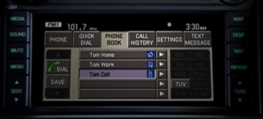 It's true: I haven't actually used Sync yet. So I really shouldn't talk. I'm just disappointed that this interface gets prime time.
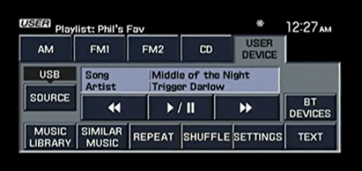 Is it safe to assume that the R&D money was spent on the voice activation part rather than the GUI-specific interaction design part?
 My question: Why would Lincoln feature the GUI in the commercial? Have the people who made the commercial seen the iPhone? What about software interfaces like, say, Office 2007? Do they not realize that there are standards here? Expectations? I guess there's a remote possibility that some marketing consultants found that Lincoln customers have very little overlap with people who desire elegance (related to technology anyway), or that some some stodgy federal body regulates console interfaces (NTSA?), preventing the implementation of elegance in the interface. My suspicion: Lincoln just doesn't know or care about interface design, and that Microsoft bickered internally and churned out the lowest common denominator.(Lastly, I'm not trying to lay on the Windows Hatorade. Every computer I own runs Windows. My phone runs Windows. I'm up to my ears in the stuff.)

Yes, I appreciate Flickr. After all, it allows me to store my photos online, share them with others, and display them on my website. Yay. Thanks for that. Still, it frustrates me daily. Here's why:
Sequence of photo display is set in stone
If I drag a dozen pictures into the Flickr Uploadr, God only knows the order in which they'll appear on the site. But I care about the order in which they appear on the site, because the LAST photo uploaded ends up being at the top of my Flickr homepage, and in that position of prominence it says something about me. It annoys me that I can't control this more.1
Little control over homepage layout; no way to make stuff sticky
So, if I can't control the order of uploading, can I control what's displayed on my Flickr page? No. Can I make a set sticky, so that it stays at the top of the list? No. Can I display only sets? No. Of course, Flickr has introduced new layouts, but all of them are simply ways of arranging the most recent stuff. Not helpful to me.
No concept of new-to-a-user
I'm thinking of my grandparents here. Wouldn't it be nice if a meta-set (or something) was created of stuff that's new to the viewer? I could just create a bookmark here, and they could check for new stuff.
Tagging is a royal nightmare.
Maybe no one has totally solved this yet, but here's something that would work for me: I usually upload multiple related pictures at a time, and these pictures tend to share a lot of the same tags. So I'd like to create small groups of tags for a groups of pictures, and then quickly drag and drop, or multi-select and apply, a tag to a subset of those pictures. del.icio.us's tagging interface is rudimentary, but it's vastly more helpful than Flickr's:
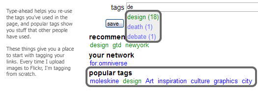
The navigation confuses everyone except geeks and experts
Collections? Sets? Archives? What's the diff? As my mom once asked me, "Where are the albums?" At the risk of sounding irretrievably old-school, this particular set of grouping concepts is a frustration to cognition. (Also, if the distinction is made in this navigation area, why aren't the things (sets) in the right column labeled as such?)

No record of blogged pictures?
When I create a blog entry from a picture, why isn't there some kind of record that the image has been blogged? A link? This just seems so basic to me. 1 Interesting side note: I bumped into some Flickr people at CHI, and I asked them about this. Their rationale: The photostream is what Flickr is all about, and the strictness of the sequence is a useful governing principle. Umm, yeah. Flickr people may think of uploading as a continual stream, but I upload photos in clumps — I don't always think about my photos in the terms of the last photo uploaded, I often think in terms of the last group. I feel like I should have control over the way those clumps are displayed. If you force me to always show the most recently uploaded individual photo, shouldn't you also give me some control over the order of upload in your Uploadr?
I attended (and spoke at) my first UX Week last week in Washington DC, and it lived up to its billing as a good ol' time. I met many amazing people, stayed out too late, and yet was still motivated to get up early every morning to see the keynotes. That's saying something. Most conferences can be considered successes if just one of those things happens.
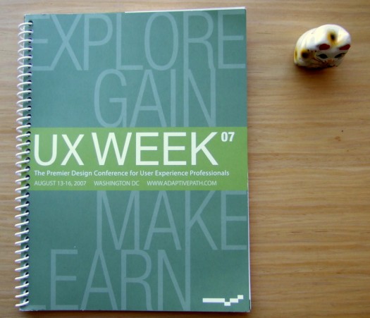 The UX Week program with my lucky cat.
Breaking it down
The sessions came in three varieties: (1) products and interface implementations; (2) design tools and processes; and (3) ideas and inspirations. Sarah Nelson at Adaptive Path organized the conference, and she recruited speakers who were not the usual talking heads.2 The mix of backgrounds, experience, and subject matter kept things lively. I especially appreciated the discussions of process by AP folks like Indi Young, Kate Rutter, and Jesse James Garrett during the panel discussion of CNN.com. All of these opened my eyes to new design tools and techniques, and exposed the fact that there is a lot of innovation going on out there. In terms of the flashy products on display, I'm inherently too inquisitive and skeptical to believe what people tell me during product demoes — I need to get immersed in them myself, and ask: How did you get there? Where did that come from? What need is that addressing? How did the design evolve? Because I'm a nerd.3
Design is story-telling
As Leisa Reichelt pointed out during our panel, a lot of speakers addressed the topic of story-telling in one way or another. Kevin Brooks of Motorola Labs led a workshop on storytelling techniques; the folks behind the recent redesign of CNN.com described the way in which they crafted the story that they told their internal stakeholders; people from BestBuy.com and Sachs discussed the use of videotaped customer stories to make a case for a redesign. Of course, story-telling and design are intimately intertwined — two strands of a businessy double-helix. I was inspired by the variety of ways in which designers are telling stories about the problems to be solved, and the techniques and nuances involved in their approaches.
UX is real
I go to fewer conferences than I should (so I may be a bit sheltered), but I'll say this anyway: at the conference, I got the feeling that UX was much further along to becoming an actual profession. UX practices are no longer outposts in the Wild West of digital products; our work is now identifiable territory in the business landscape. Not long ago, there were very few things that wouldn't be considered within the purview of user experience; now, the boundaries of our problems are a little more clear, and our experiences as practitioners have more commonalities than differences. I feel like Tom Hanks in Big. Now, if only I could explain what I do to my parents … 1 From one of my favorite movies of all-time, Freaks, i.e., one of us, one of us, we accept you, one of ux.2 Okay, except Jared Spool, but it's always good to hear what he's thinking. 3 I admit: The interface for One Laptop Per Child is elegant and intriguing, but I'm politically ambivalent about the project itself. I'm fascinated by the possibilities of creating an information pipeline the developing world, but I guess I'm not enough of a tech evangelist to believe in the idea that distributing laptops is better than distributing more immediate aid. Maybe I'm not thinking big enough.
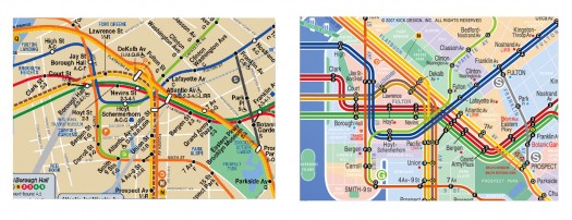
A graphic designer named Eddie Jabbour has proposed an alternative design for NYC subway maps. The New York Times wrote about it last week, and since then blogs have been blowing up over it. 37 signals evaluated it, and applauds the effort to increase usability at the expense of geographic accuracy: "Subway map readers want to know how to get from A to B a lot more than they want to know the exact curve of the tracks along the way. Sometimes truth is less important than knowledge." If points A & B are always subway stations, I wholeheartedly approve. As seen in snippet form below, the redesign much more clearly presents information that is relevant on the subway.
Eddie Jabbour's proposed redesign trades geographical accuracy for readability But a subway trip is always part of a bigger logistical process. You're not just trying to get from Atlantic Avenue Station to Astor Place Station. You're trying to get from an apartment on President Street to the place where your friend cooks near Washington Square Park. And often the optimal subway route is not available to you; the line you want to take is extremely delayed; another line is not running; another is express past 9pm; another only runs to this station on Sundays; etc; etc. The reality is that you need to be able to improvise when you're in the subway system, and a map that is not geographically accurate inhibits your ability to adjust to the realities of the system.Which brings me to the London A‑Z. London can get away with a representative subway map because it has a companion book that allows you to figure out stuff like that. So the Circle line isn't running? Trusting the Tube map to go to the next nearest station may be disastrous, but you can always find your destination in your trusty A‑Z, scan for another station nearby, etc. Moreover, magazines and newspapers often place the A‑Z grid location next to an event listing. Removing geographical context from the NYC map may make it easier to scan, but at this point, I feel like it's perhaps prematurely reductive. On the other hand, a reduction of information on the subway map may simply underscore and highlight (and italicize and capitalize) the need for a NYC A‑Z. Or perhaps the MTA itself just needs to be more predictable. Or maybe everything should stay the same so every traveler can have that special scary feeling of being stranded in Brooklyn at 2am on a weeknight.UPDATE: My friend Jonathan Gabel, a New York resident for the last 13 years, had some interesting thoughts on the matter:
The current map is a total fabrication of geography anyway — Manhattan is made fat and short, and Brooklyn and Queens lose all of their length. In fact, the L line through Williamsburg and Bushwick is actually more accurate in the changed map, as it makes a radical zig-zag through the area. For instance, the L train runs: Lorimer, Graham, Grand, Montrose. From Niki's house, 8 blocks north of the Graham stop, to meet our friends who's live 4 blocks East of the Montrose stop, we often walk to Manhattan Ave, one block West of the Lorimer stop because it is half way between our houses. Figure that one out. I have never seen the London A‑Z but I looked at one of the NFT (not for tourists) guides to New York and found it wasn't really helpful, specifically because it doesn't really help you find addresses. Even the addresses of things it is telling you about — like restaurants. Say you want to find Snacky's in Williamsburg. It shows you a map of the general area, and listings of all the restaurants and other things by street address, next to the map of the area. The map is bullet-riddled with little icons to tell you where all bars/ restaurants/ laundromats/ clubs/ sweatshops/ motorcycle-repair-shops are — but every bar/restaurant/laundromat/club/sweatshop/motorcyclerepairshop is only labeled with the sign for b/r/lc/ds/mrs and no number. So to find your Snacky's you have to look at 20 r's and try to figure out which one it is, and ignore 40 b's, 20 l's, 5 c's 50 s's that are covering all the names of the streets. It's like that interface you described for the New Yorker — it takes all the pleasure out of cartography. I would like to see a guidebook that makes discovering one's way pleasurable.
Amen to pleasure.
ESPN.com / March (information) madness
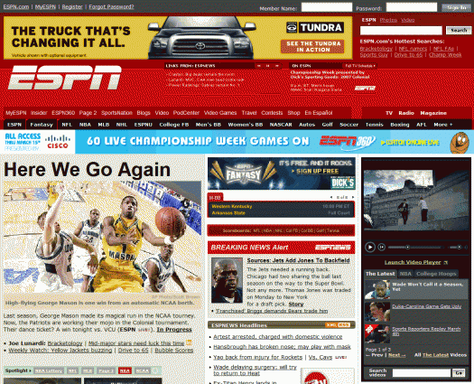
To the editors of ESPN.com,I visit your site every day, multiple times a day. Today, I decided that I've had enough. You need to stop. Whatever you're doing, just STOP. Years ago, ESPN.com was a useful collection of online sports information. It was relatively easy to navigate, scan and read. Today, it is a dark, sprawling information apocalypse — the Blade Runner cityscape of websites. Remember that early scene in Blade Runner, where Deckard is reading the newspaper while the ad blimp circles overhead, repeating the words: "A new life awaits you in the Off-World colonies"? That's how I feel when I'm reading ESPN.com. The barrage of ads, news, tickers, scrolling content widgets, opinion, commentary, analysis, whatever it is that Scoop Jackson writes, and teasers for upcoming events on your cable network is an absolute mess, the kind of mess that makes CNBC seem Tufte-esque in comparison.
Where did you go wrong? Years ago, you plastered that huge banner ad across the top. This was annoying, but plenty of sites (used to) do this and I learned to ignore it. Then there was ESPN Motion — or, as a friend refers to it "ESPN Suck-tion." It's a video player that periodically demands that you stop reading to deal with a video ad or SportsCenter clip it has just begun broadcasting. Over time, you added more and more flashes and distractions — another banner ad above the content, two levels of tab navigation, multiple areas of periodically refreshing content, and links in the masthead (!). Finally, you modified your pop-up ads so that they defy pop-up blocking software (most of it, anyway). I have to ask: DO YOU REALIZE THAT THEY ONLY OTHER WEBSITES THAT DO THIS ARE SELLING EITHER PIRATED SOFTWARE OR PORN? Did you guys raid Astalavista to hire your current online product manager? Actually, maybe it was MySpace or CollegeHumor. To be fair to CollegeHumor, though, it could teach ESPN some things about layout and navigation.Now, for anyone out there who wants to take the first step toward making ESPN readable again, I suggest the following:
- Download and install Firefox.
- Install the Adblock add-on
- Restart Firefox, and subscribe to the first item in the Adblock list of filters
- Navigate to ESPN.com, observe that all ads have been removed. As the SportsCenter anchors would say, "Victo-ree!"
To the editors of ESPN.com, I simply request that you (a) kill the pop-up ads, (b) tear the homepage apart (and re-assemble it with the idea that it should facilitate access to content, rather than prevent it), © take a look at what the NYT has been up to in terms of integrating textual and multimedia content, and (d) don't try to cram every conceivable product onto every page. Simple, right?
I was one of the suckers who pre-ordered The Complete New Yorker magazine. I am a long-long-time New Yorker reader, and the enticement was just too powerful — 8 DVDs filled with 60+ years of cultural commentary, quirky cartoons and cool cover art, all in a distinct highbrow-yet-practical-minded voice and scanned in at super-high-res? For a few extreme dorks, this was intensely exciting. Expectation-wise, it was like the release of a smartypants Playstation 3.Upon arrival, it also resembled Playstation 3, in that it sucked, big-time. My experience improved slightly after The Occasional Scrivener posted a hack that allows you to copy issues from the 8 independent DVDs onto your hard drive. An extreme dork after my own heart. Many thanks.The really big, un-hackable problem: The search tool is a house of horrors. Imagine that you've finally been introduced to a long-time idol, let's say Bob Dylan, and he agrees to come home with you and sit in your living room and tell you anything you want to know. But then when you ask him to tell you the complete story of the "Judas!" show, you realize that he doesn't speak English; he just sits there silently, impassive. That's how this thing makes me feel. The whole point of getting Complete New Yorker is to have your mind blown by the wealth of cool stuff in the older issues. Therefore, the challenge faced by the interaction designers is to facilitate getting at that stuff, i.e. MAKE IT EASY TO SEARCH for what you want. The shot below represents the Procrustean bed on which each searcher must lie.

The really egregious crimes have been documented elsewhere, but I would just like to add:
- Performance that reminds me of the 90's. If this had been released in 1998, I could easily forgive the lag everytime a button is pressed or a search is executed. But really, when I type "white" into the general search field, and it churns for nearly 20 seconds, I don't know, it makes me homicidally mad. Anger at slow performance is like road rage — once you've got it, you can't get rid of it, no matter how much you avoid being in a car.
- Why the cruel and unusual search complexity? Searching is never made easier by surfacing every possible method of doing so right off the bat. Google — the world's most popular search interface — seems like an effective guide here. Start simple, and reveal sophistication when necessary. There aren't really even that many ways I could conceive of searching the Complete New Yorker — author, date article title, date range … That's about it.
- Wasted vertical real estate. Nearly 33% of the vertical space is consumed by tool chrome, those thick gray bars segmenting the screen. Combined with the often bizzare and mostly useless "Abstract" below, this leaves 11 rows for search results, the place where users (I) make decisions on what to launch in the viewer. Unforgiveable.
- What the heck is this thing called?. The fact that the search results do not contain a highly valuable piece of information — umm, the title of the piece — makes it a pain in the butt to scan (for instance) the stories of JD Salinger, the assorted work of EB White. Actually, pretty much every search is complicated by this.
I could go on and on, but I won't. Here's my suggestion for CNY 2.0: Consolidate the existing widgets into one widget with modest dynamic behaviors. The widget would have one simple initial menu that determines how you want to search — keyword, author, issue, department. This selection then determines the filters you'll need — if you choose "keyword," maybe you get "department" and "date" as filters. In doing this, you buy back all of that chrome real estate, allowing more results to be displayed. Win, win, win. Of course none of this matters much if database performance isn't improved, but here it is anyway: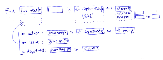
The NYT just rolled out a beta of something they're calling MyTimes. As a daily reader of both the print and online editions, I'm intrigued by new developments and ideas at the NYT, and I've been pleased with their recent site redesign. MyTimes, however, strikes me as somewhat misguided.First off, the name MyTimes sounds like a portal, recalling the confused era when every company wanted to make a my-prefixed version of their site. Unfortunately, it also evokes the subsequent realization that what people really wanted was not control over layout and content, but greater system intelligence — smarter defaults, recognition of the things they normally do, a clever way of pointing them toward related things. The portal-sounding name wouldn't even be so bad if MyTimes didn't look and act like portal. Alas, it's got all sorts of crap to add and move around and modify, allowing the reader to add RSS feeds from anywhere on the web, view movie times, weather, Flickr images, whatever. To me, the problem is that the NYT isn't "whatever." It's the authoritative source. So why all the other stuff?A better question: What problem is MyTimes supposed to be solving? What is the user goal is it addressing? One would do research to answer these questions, but — to be self-referential — my own goals in reading the NYT: Get the authoritative answer, enjoy great writing, forumlate opinions on complex problems. A major problem of MyTimes is that the NYT is trying to be both the authoritative source, and the delivery mechanism of any other source you might want.So, my advice to the New York Times …
- Bring related information to me. Focus my attention to the news of the day, but make it easy to navigate to related things. These things may be within the NYT, or outside. Use what you know about me — from observing my behavior — to point me toward related things. Think Amazon, not Google Homepage or MySpace. Amazon remembers what you like, points you toward related stuff, tells you what other people have looked at, etc. It knows you; you don't HAVE to tell it anything.
- Don't create a separate place that requires configuration and expect that I will go there and wait for the information to start rolling in. The established framework works: Start at the homepage, drill to the detail. Why create another starting place?
- Integrate the good things from MyTimes — the journalist pages, for instance, are a cool idea, and they are most appropriately accessed within the existing framework. Localized content like weather and movie listings are fine, but I don't understand why this needs to be separate from the existing framework of the NYT pages. Basically: Integrate the reader into the NYT, don't create a separate place for him/her. Learn my zip code, remember it, push relevant local content to me. End of story. (And just because Flickr has an RSS feed doesn't mean it's worthy of your brand. You're the New York Times! You've got the best photojournalists in the world! Get rid of it!)
While I'm on the subject, two additional things I'd like to see …
- More exposure to the Times' excellent archival journalism. Why not plumb the back catalog, and expose some of it to the readers? Many articles about current events refer to past events. Why not provide a list of related links to previous articles more often? Of course, I'd expect that this content would be free — not only because I'm a cheapskate — but because I would think it would pique people's interest in seeing more of it, which would of course cost money.
- More journalist blogs and discussion. The Public Editor's column has become one of my favorite parts of the paper, and he blogs about interesting journalistic issues as well.Here's a great one about Nicholas Lemann's article about citizen journalism in the New Yorker.
In any case, there are roughly one thousand web sites offering up customizable info widgets, web-wide RSS feed aggregation, and so forth. The NYT should continue to focus on the content, and leave the aggregation to someone else.
