Categories
inside art san francisco visual

Clare Rojas at Gallery Paule Anglim

Lots of intrigu­ing stuff at Clare Rojas's open­ing at Gallery Paule Anglim tonight. Wood­land crea­tures, naked dudes in tai chi pos­es, an excel­lent video of Peg­gy Hon­ey­well play­ing a slow sad song at a rag­ing frat par­ty filled with beer bongs and keg stands, Amaze, Bar­ry McGee, and much, much more. Worth it.

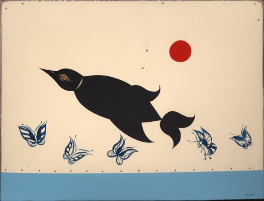
Clare Rojas - It's hard out there for a penguinI call this one "It's Hard Out Here For a Penguin."
Clare Rojas - UntitleableI think this one is unti­tled, but it should be called "Unti­tleable."


Gallery Paule Anglim is at 14 Geary in down­town San Francisco.

Categories
lit tip

Literary blogs / Paper Cuts

Cormac McCarthy ad

I've spent a lot time comb­ing through the archives of Paper Cuts, the blog of the New York Times Book Review edi­tor Dwight Gar­ner. It steers clear of smar­ty­pantsness, focus­ing on what one might call the lighter side of seri­ous lit­er­a­ture. In fact, most of the con­tent is on the periph­ery of the strict­ly lit­er­ary — a music playlist assem­bled by Miran­da July, a quick, fun inter­view with Judy Blume, a scan of Jack Kerouac's obit­u­ary ("his sub­ject was him­self and his method was to write as spon­ta­neous­ly as pos­si­ble"), a scan of an ad for Ralph Ginzburg's lit­er­ary super­no­va Avant Garde that looks like the label on a Dr. Bronner's soap bot­tle. Gar­ner also has a pod­cast in which he inter­views authors and review­ers from cur­rent and upcom­ing Book Reviews. Every once in a while, you'll suf­fer through some crap (e.g., Frank Rich gush­ing and gig­gling while furtive­ly and unsuc­cess­ful­ly try­ing to hide the king-size man-crush he has on Don DeLil­lo). That said, most of the pod­casts are infor­ma­tive and inter­est­ing.The image at right is from a slide show of adver­tise­ments that appeared dur­ing the "gold­en age" of the NYT Book Review — 1962–1973.

Categories
inside art reviews visual

Foto / Modernity in Central Europe

Foto - Modernity in Central Europe

When I was in Wash­ing­ton DC last month, I saw an incred­i­ble show at the Nation­al Gallery called Foto: Moder­ni­ty in Cen­tral Europe 1918–1945. As you may have guessed by the title, the show is pho­tog­ra­phy-ori­ent­ed, but it's more than that: It's a sto­ry about pho­tog­ra­phy craft, and the way that Euro­pean pho­tog­ra­phers bent, broke and oth­er­wise manip­u­lat­ed pho­tos to express the social, polit­i­cal and cul­tur­al frag­men­ta­tion (and chaos) in the wake of the First World War. Most of the artists were unknown to me; they're all intro­duced and dis­cussed in detail in the excel­lent exhi­bi­tion cat­a­logue. It opens at the Guggen­heim New York in October.

Birth of a robotThis is a pho­tomon­tage by a Pol­ish artist named Janusz Maria Brzes­ki. It's called Twen­ti­eth-Cen­tu­ry Idyll, but the name of the series is even bet­ter: A Robot Is Born. Pho­to: Nation­al Gallery of Art.
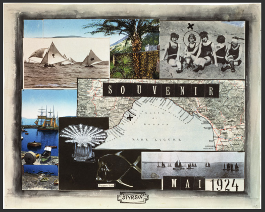
Jindrich Styrsky - SouvenirAnoth­er pho­tomon­tage, this one by Jin­drich Strysky, a Czech artist. Pho­to: Nation­al Gallery of Art


Categories
the ancient past visual

Cuban cashola

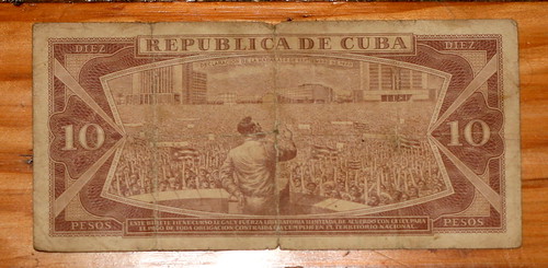
Flickr photoFidel doing what he does best: Mov­ing the crowd.


I trav­eled to Cuba 10 years ago this sum­mer, and I unearthed this 10-peso note when I moved ear­li­er this sum­mer. Coin­ci­dence, or a sign that I should return some­time soon? 

When I was there, the offi­cial exchange rate was one Amer­i­can dol­lar to one Cuban peso, but one could get 20 Cuban pesos with one Amer­i­can dol­lar if one exchanged mon­ey on the street. It appears that this hasn't changed, though Wikipedia notes that Cuban pesos have no val­ue in cur­ren­cy mar­kets. When I was there, Cuba was still reel­ing from the col­lapse of the USSR, and accom­mo­da­tions were made to han­dle the hard­ships known of this Spe­cial Peri­od. For exam­ple, the Amer­i­can dol­lar could be used to pur­chase "lux­u­ry goods," though at that point "lux­u­ry" involved eat­ing chick­en once in a while and drink­ing an occa­sion­al beer. They've since intro­duced a sec­ond cur­ren­cy to replace the Amer­i­can dol­lar, the con­vert­ible peso, while keep­ing two tiers of goods. Yan­qui go home!

Categories
flickr tip

Just Expect To Be Left Utterly Enraged

Flickr photoMy cozy bed between Her­man Miller chairs at Dulles.


News flash: Air trav­el real­ly sucks right now (Wash­ing­ton Post). A cou­ple of weeks ago, I too was touched by this nation­al night­mare. On a Fri­day evening, I planned to fly from Dulles to SFO, but got slapped with an SSSS on my board­ing pass (expired driver's license) and a long secu­ri­ty line and fig­ured I would miss my flight. Good thing it was delayed. For three hours, ini­tial­ly. The gate agents report­ed that there was bad weath­er in New York, and this seemed rea­son­able to me because there were lots of peo­ple at the oth­er gates who appeared to be pissed off and tired. Also, the storm was all over the hun­dreds of TVs that blast CNN at you. I got com­fort­able and watched an excel­lent movie (Kurosawa's The Bad Sleep Well) on my com­put­er, ful­ly believ­ing what the gate agents were say­ing: The flight would not be can­celed. They empha­sized this: It would not be canceled.

After two more delays, at 2:30am, the gate agents deliv­ered the obvi­ous: The flight would be can­celed. With­in mil­lisec­onds, an entire plane-load of peo­ple freaked out, fumed, growled, shout­ed insults and then scram­bled to get re-booked. Lines at the desks: 45 min­utes. Hold time on the phone: 45 min­utes. Like­li­hood of get­ting out of DC in the next 24 hours: Zero. Com­pen­sa­tion for our trou­ble: Zero. Our flight appeared to be the only suck­ers left at Dulles, but of course the air­line blamed the can­cel­la­tion on acts of God and air traf­fic con­trol and, on those grounds, they refused to give us even a vouch­er for a soda. (A recent Wash­ing­ton Post arti­cle exam­ines tra­di­tion­al air­line excus­es). But wait, there's good news: The cur­rent issue of Pop­u­lar Mechan­ics has an arti­cle about the FAA's work on a GPS-based air traf­fic con­trol sys­tem, which will be up and run­ning by … 2025. Ugh.

I won't name the air­line (because I am a gen­tle­man), but I encour­age you to look for clues in the title of this post. (Specif­i­cal­ly in the first let­ter of each word. Thx, Khoi Vinh for the inspiration.)

Categories
ecology flickr outdoors

Summertime / Camping in the Winds

Flickr photoWhen I start a camp­ing trip, the Van Halen song "Pana­ma" [Video on YouTube] often pops into my head — I wish I could rep­re­sent Eddie Van Halen's rever­by gui­tar open­ing in words, but I was hum­ming it and singing the cho­rus — Pa-neh-ma … Pa-neh-ma-ha — as this pic­ture was tak­en. That's the Wind Riv­er Range com­ing into view beyond my friend Nick. For the next 10 days, it would dom­i­nate us. In fact, this pho­to rep­re­sents the last few moments of peace­ful hik­ing. Our packs were real­ly, real­ly heavy, and soon enough the hurt would begin. Then, we would get rained on pret­ty often, and (for my part) suf­fer too many black fly bites and a few alti­tude-relat­ed headaches. Still, total­ly, total­ly worth it.


Flickr photoI could go on and on here, but my pic­tures on Flickr real­ly tell the sto­ry bet­ter than I can.


I'm a shame­less suck­er for gear, so here's some shout-outs:

  • Bridgedale socks. They were real­ly wet, real­ly often. But they stayed warm and they main­tained some spring, even when soaked.
  • Tarptent. I vis­it­ed Tarptent design­er Hen­ry Shires at his house on the Penin­su­la, and I bought the Squall [PDF] last spring. Since then, I've put it to the test in the Gila Wilder­ness, Yosemite, and the Yuba Riv­er. I was still skep­ti­cal about its abil­i­ty to real­ly keep me warm and dry, but I must tes­ti­fy that, even when it rains hard all after­noon (and even when the rain real­ly comes down), the Tarptent abides. Every­thing peo­ple say is true: It's a real­ly good, rea­son­ably light back­pack­ing shel­ter, and it's got every­thing you need to anchor and adjust it to respond to chang­ing weath­er and wind.
  • Blis­to­ban. Part of the rea­son for the shout-out to Bridgedale was that, halfway through, I switched to thin­ner Smart­wool socks, and they absolute­ly killed my feet in the mat­ter of a cou­ple of hours. Nick loaned me some Blis­to­ban strips, though, and they ruled. How does Blis­to­ban com­pare to my old back­pack­ing blis­ter-con­trol rem­e­dy: antibi­ot­ic oint­ment cov­ered by bandaid which is then cov­ered by duct tape which is then smeared with Vase­line? Jury's still out here.
  • Patag­o­nia Drag­on­fly. They call it the Hou­di­ni now, and it's a lit­tle dif­fer­ent, but I bought one of the ear­ly mod­els in 2003, and it still impress­es me. I wore it almost every­day, and it admirably repelled rain with­out ever becom­ing oppres­sive­ly warm.
Categories
flickr ixd tech web

UX / Flickr pisses me off

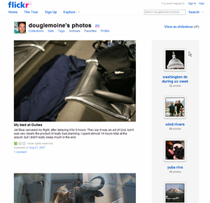
My Flickr page

Yes, I appre­ci­ate Flickr. After all, it allows me to store my pho­tos online, share them with oth­ers, and dis­play them on my web­site. Yay. Thanks for that. Still, it frus­trates me dai­ly. Here's why:

Sequence of photo display is set in stone

If I drag a dozen pic­tures into the Flickr Uploadr, God only knows the order in which they'll appear on the site. But I care about the order in which they appear on the site, because the LAST pho­to uploaded ends up being at the top of my Flickr home­page, and in that posi­tion of promi­nence it says some­thing about me. It annoys me that I can't con­trol this more.1

Little control over homepage layout; no way to make stuff sticky

So, if I can't con­trol the order of upload­ing, can I con­trol what's dis­played on my Flickr page? No. Can I make a set sticky, so that it stays at the top of the list? No. Can I dis­play only sets? No. Of course, Flickr has intro­duced new lay­outs, but all of them are sim­ply ways of arrang­ing the most recent stuff. Not help­ful to me.

No concept of new-to-a-user

I'm think­ing of my grand­par­ents here. Wouldn't it be nice if a meta-set (or some­thing) was cre­at­ed of stuff that's new to the view­er? I could just cre­ate a book­mark here, and they could check for new stuff.

Tagging is a royal nightmare.

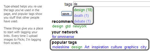
Maybe no one has total­ly solved this yet, but here's some­thing that would work for me: I usu­al­ly upload mul­ti­ple relat­ed pic­tures at a time, and these pic­tures tend to share a lot of the same tags. So I'd like to cre­ate small groups of tags for a groups of pic­tures, and then quick­ly drag and drop, or mul­ti-select and apply, a tag to a sub­set of those pic­tures. del.icio.us's tag­ging inter­face is rudi­men­ta­ry, but it's vast­ly more help­ful than Flickr's:

What del.icio.us does well in tagging


The navigation confuses everyone except geeks and experts

Col­lec­tions? Sets? Archives? What's the diff? As my mom once asked me, "Where are the albums?" At the risk of sound­ing irre­triev­ably old-school, this par­tic­u­lar set of group­ing con­cepts is a frus­tra­tion to cog­ni­tion. (Also, if the dis­tinc­tion is made in this nav­i­ga­tion area, why aren't the things (sets) in the right col­umn labeled as such?)

Flickr secondary nav


No record of blogged pictures?

When I cre­ate a blog entry from a pic­ture, why isn't there some kind of record that the image has been blogged? A link? This just seems so basic to me. 1 Inter­est­ing side note: I bumped into some Flickr peo­ple at CHI, and I asked them about this. Their ratio­nale: The pho­to­stream is what Flickr is all about, and the strict­ness of the sequence is a use­ful gov­ern­ing prin­ci­ple. Umm, yeah. Flickr peo­ple may think of upload­ing as a con­tin­u­al stream, but I upload pho­tos in clumps — I don't always think about my pho­tos in the terms of the last pho­to uploaded, I often think in terms of the last group. I feel like I should have con­trol over the way those clumps are dis­played. If you force me to always show the most recent­ly uploaded indi­vid­ual pho­to, shouldn't you also give me some con­trol over the order of upload in your Uploadr?
Categories
architecture urban

Washington DC / Fortress of democracy

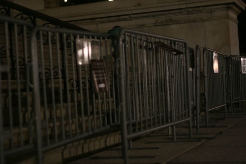
If the gov­ern­ment build­ings are any indi­ca­tion, Wash­ing­ton DC is a city brac­ing for some­thing. Makeshift bar­ri­ers sur­round the Capi­tol; men with auto­mat­ic weapons stand watch over ran­dom gov­ern­men­tal door­ways and inter­sec­tions. Sure, this is no dif­fer­ent than oth­er "sig­nif­i­can­t†places in the West­ern world — Lon­don and Frank­furt have their share of fortress­es and sen­tries — but as a cit­i­zen and ide­al­ist I'd hope that Wash­ing­ton would be dif­fer­ent. I'd hope that *we* would do it differently.

Flickr photoOur law­mak­ing build­ings were designed to be approached: Sit­ting at the head of the Mall's long run­way, the Capi­tol Build­ing inspires fur­ther inves­ti­ga­tion. Nowa­days, if a per­son (say, me) decides to take a pic­ture of the fences around this bea­con of democ­ra­cy, that per­son may get rep­ri­mand­ed by a guy with a gun. I'm just say­ing: It happens.


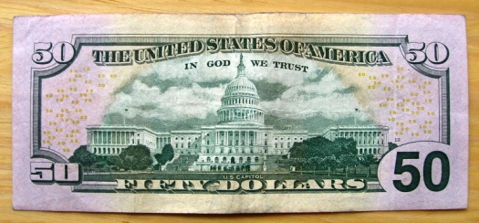
Any­way, I hope that we'll search for solu­tions to the prob­lem of secu­ri­ty that don't run counter to the ideals of democ­ra­cy: that law­mak­ers oper­ate in the open, that any­one can see how it's done (and indeed that every­one should see how it's done), that peo­ple are inno­cent until proven guilty, and that I'm pay­ing for those fences, dammit, so I should be able to take a pic­ture of them with­out get­ting harassed.UPDATE: Even the new $50 bill empha­sizes the approach­a­bil­i­ty of the Capitol.

50 dollar billCheck out the lit­tle white fig­ures climb­ing the steps on the left-hand side of the Capi­tol build­ing. This seems to imply, to me, that peo­ple can (and should) walk up the stairs to see what's hap­pen­ing with­in the hal­lowed halls of democracy.


Categories
ixd tech web

Adaptive Path UX Week / One of ux, one of ux1

I attend­ed (and spoke at) my first UX Week last week in Wash­ing­ton DC, and it lived up to its billing as a good ol' time. I met many amaz­ing peo­ple, stayed out too late, and yet was still moti­vat­ed to get up ear­ly every morn­ing to see the keynotes. That's say­ing some­thing. Most con­fer­ences can be con­sid­ered suc­cess­es if just one of those things happens.

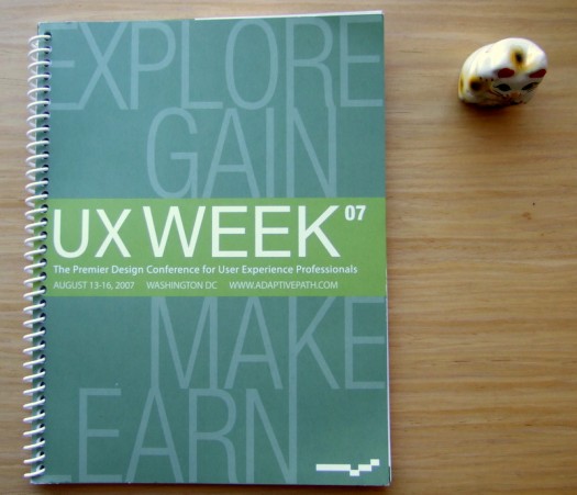
UX Week 2007 ProgramThe UX Week pro­gram with my lucky cat.

Breaking it down

The ses­sions came in three vari­eties: (1) prod­ucts and inter­face imple­men­ta­tions; (2) design tools and process­es; and (3) ideas and inspi­ra­tions. Sarah Nel­son at Adap­tive Path orga­nized the con­fer­ence, and she recruit­ed speak­ers who were not the usu­al talk­ing heads.2 The mix of back­grounds, expe­ri­ence, and sub­ject mat­ter kept things live­ly. I espe­cial­ly appre­ci­at­ed the dis­cus­sions of process by AP folks like Indi Young, Kate Rut­ter, and Jesse James Gar­rett dur­ing the pan­el dis­cus­sion of CNN.com. All of these opened my eyes to new design tools and tech­niques, and exposed the fact that there is a lot of inno­va­tion going on out there. In terms of the flashy prod­ucts on dis­play, I'm inher­ent­ly too inquis­i­tive and skep­ti­cal to believe what peo­ple tell me dur­ing prod­uct demoes — I need to get immersed in them myself, and ask: How did you get there? Where did that come from? What need is that address­ing? How did the design evolve? Because I'm a nerd.3

Design is story-telling

As Leisa Reichelt point­ed out dur­ing our pan­el, a lot of speak­ers addressed the top­ic of sto­ry-telling in one way or anoth­er. Kevin Brooks of Motoro­la Labs led a work­shop on sto­ry­telling tech­niques; the folks behind the recent redesign of CNN.com described the way in which they craft­ed the sto­ry that they told their inter­nal stake­hold­ers; peo­ple from BestBuy.com and Sachs dis­cussed the use of video­taped cus­tomer sto­ries to make a case for a redesign. Of course, sto­ry-telling and design are inti­mate­ly inter­twined — two strands of a busi­nessy dou­ble-helix. I was inspired by the vari­ety of ways in which design­ers are telling sto­ries about the prob­lems to be solved, and the tech­niques and nuances involved in their approaches. 

UX is real

I go to few­er con­fer­ences than I should (so I may be a bit shel­tered), but I'll say this any­way: at the con­fer­ence, I got the feel­ing that UX was much fur­ther along to becom­ing an actu­al pro­fes­sion. UX prac­tices are no longer out­posts in the Wild West of dig­i­tal prod­ucts; our work is now iden­ti­fi­able ter­ri­to­ry in the busi­ness land­scape. Not long ago, there were very few things that wouldn't be con­sid­ered with­in the purview of user expe­ri­ence; now, the bound­aries of our prob­lems are a lit­tle more clear, and our expe­ri­ences as prac­ti­tion­ers have more com­mon­al­i­ties than dif­fer­ences. I feel like Tom Han­ks in Big. Now, if only I could explain what I do to my par­ents … 1 From one of my favorite movies of all-time, Freaks, i.e., one of us, one of us, we accept you, one of ux.2 Okay, except Jared Spool, but it's always good to hear what he's think­ing. 3 I admit: The inter­face for One Lap­top Per Child is ele­gant and intrigu­ing, but I'm polit­i­cal­ly ambiva­lent about the project itself. I'm fas­ci­nat­ed by the pos­si­bil­i­ties of cre­at­ing an infor­ma­tion pipeline the devel­op­ing world, but I guess I'm not enough of a tech evan­ge­list to believe in the idea that dis­trib­ut­ing lap­tops is bet­ter than dis­trib­ut­ing more imme­di­ate aid. Maybe I'm not think­ing big enough.

Categories
baseball san francisco

756

I've said it before: I don't like Bar­ry Bonds. So it may seem strange that I want­ed to be there when he hit home run num­ber 756. But con­sid­er this: I love base­ball; the record for career home runs is, like it or not, one of baseball's hal­lowed mile­stones; Bonds plays in my city; the Giants were begin­ning a home stand as he was poised to break the record. Too many stars were aligned for me to NOT try to get into a game. I could always boo, right? So, on Tues­day, August 7, I rode my bike to AT&T Park, hop­ing to get lucky and fig­ur­ing that I wouldn't. Imme­di­ate­ly, I got real­ly lucky, scor­ing an amaz­ing tick­et in the club lev­el (a $70 val­ue) for the price of two AT&T Park beers. At that moment, I had a good feel­ing. A cou­ple of hours lat­er, Bonds faced a 3–2 count, and I decid­ed to join 45,000+ oth­er fans in point­ing my dig­i­tal cam­era at the plate. Up to that point, I made sar­cas­tic remarks about medi­at­ing the expe­ri­ence in that way. Now I'm post­ing my crap­py ver­sion on the Inter­net. Why? I don't know. Any­way, a moment lat­er, Bonds drilled the pitch into deep, deep cen­ter field and the stranger next to me grabbed my arm and start­ed jump­ing up and down.For the next five min­utes, I high-fived a lot of peo­ple, and some­one gave me a hug as I was film­ing the cel­e­bra­tions. Fire­works explod­ed over McCov­ey Cove; stream­ers rained down; the Nation­als left the field; Hank Aaron con­grat­u­lat­ed Bonds asyn­chro­nous­ly through a pre-record­ed video. It was sur­re­al, but fes­tive and exciting.Of course, there was also a weird vibe. Peo­ple seemed to feel per­son­al­ly grat­i­fied that they got to wit­ness his­to­ry, but few seemed real­ly, tru­ly hap­py for Bonds. Few peo­ple said: "Wow, good for Bonds.†Those who did were either peo­ple who pos­sessed amaz­ing capac­i­ties for for­give­ness and seemed gen­uine­ly hap­py, or younger guys with way too much bit­ter­ness who saw Bonds as a kin­dred spir­it. The rest of us said: "Wow. I can't believe I saw that. Wow. This is real­ly weird." After hit­ting the home run, Bonds left the game. It was the 5th inning, and the Giants had a 5–4 lead; the Nation­als came back and won. My ques­tion: Who does that? Hank Aaron? No. Dimag­gio? Nev­er. Ted Williams? God no. Sort of a per­fect end­ing to a con­flict­ed, sur­re­al night.