An article in yesterday's NYT House & Garden section extolled the virtues of clutter. Kristen summed it up nicely: Maximalism is the new minimalism.
"Minimalism is easy to copy," Ms. de Lorme said at her unabashedly messy desk on a recent morning. "Everybody can do it."
Nevertheless, maximalism isn't as easy as it sounds. The author visits a Barry McGee exhibition at Deitch Projects in New York and finds that clutter must be as carefully arranged as non-clutter if it is to work:
Op-art panels on the walls. Graffiti everywhere. And one wall I stared at for a long time was covered with small, framed pictures densely hung at odd angles, some layered on top of one another. Like the whole massive installation, it looked random. Of course, it wasn't.
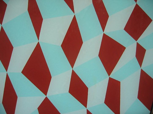
The thing is, Barry McGee was maximal so long ago — Bay-Area-Now-1996 long ago — that it's strange to use him as an example of a current maximal trend. I guess well-executed maximalism is timeless.The photo above is from Barry McGee's maximal mural at the Museum of Victoria (fall, 2004).
