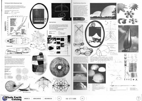
When the Whole Earth Catalog (WEC) was published in late 60s and early 70s, the idea was to create a finely curated list of everything "useful, relevant to independent education, high quality or low cost, not already common knowledge, and easily available by mail."
 The Dymaxion World of Buckminster Fuller, Fall 1968. From Arts & Ecology.
Steve Jobs once referred to the WEC as "the bible" of his generation, and it's no wonder that he admired it: Each issue of the catalog was sprawling, ambitious, smart, lovingly crafted, and very much in keeping with the best of Northern California's innovative spirit — progressive, irreverent, and (in its own way) ruthless.The title of this post refers to a (perhaps apocryphal) account of the user experience considerations of the WEC. Reportedly, the catalog's design editor, J. Baldwin, said that the catalog was an attempt to bring everything (of value) in the world to within two1 phone calls for any reader. Which was undoubtedly great at the time, but not quite good enough to escape the development of the one-call solution — the dial-up modem. Doh! And the no-call solution — broadband!And yet, when you compare the infinite variety of the web to the refined encapsulation of the WEC, it's easy to see the value of expert curation. Doesn't it seem like the great opportunities for progress in web content is to become more like the WEC — reliable, readable, smart? And even reader-supported? (After all, the WEC cost $5 in the 60s; $31.85 today. As one of the Whole Earth editors wrote, people will pay for authenticity and findability).1 For the record, I'm not exactly sure what the significance of "two" is, rather than "six" or "three." Would the first call would be the Whole Earth Catalog, and the second would be to … the product creator? Or the first would be to the product creator, and the second would be to … someone else?