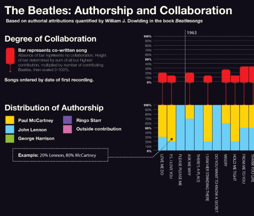
I've love infographics, and I've gone on and on about collaboration and the Beatles before, so when I heard that someone had created an infographic displaying the degree to which Beatles collaborated on songs — well, "interested" would be hugely understating my emotions at the time. (Thanks, Dan, for the tip).
"The Beatles: Authorship & Collaboration" is a nicely composed graphic, clearly breaking down the contributors to each song, Beatle and non-Beatle. The songs are laid out chronologically, and the overall effect clearly reveals that the Beatles collaborated less as they progressed in their careers. (If anything is true of the Beatles, it's that they grew apart over time). The chart's data is drawn from Beatlesongs, which quantifies the degree to which each Beatle contributed to the writing of a song, using a scale of 0–100%.

I can't quibble with the desire to understand and visualize the degree to which each Beatle shaped each song, but I find the quantification bit a little — well — falsely precise. It makes for a nice infographic, but a mere skim through The Official Abbey Road Studio Session Notes, 1962–1970 makes it clear that there was quite a lot of collaboration among the four Beatles — not to mention the various "fifth Beatles," the "Black Beatle," and their producer, George Martin. Perhaps there's a difference between "collaboration" and "authorship?" In the example to the right, "Octopus's Garden," is said to be 100% Ringo? Yes, Ringo does receive sole credit for "authorship," but it is widely known that George had a significant role in shaping it. In fact, George works out the song on a piano in the Let It Be movie. How to represent this softer sort of collaboration? Good question. Shapes? Sizes? Colors? Dimensions? Whatever it is, it should fairly communicate the organic nature of creative collaboration. And dispense with the too-neat round numbers.
 Author: