Categories
architecture california ecology

Everything useful, two phone calls away

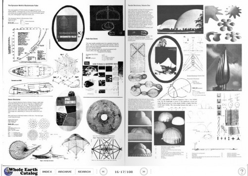
When the Whole Earth Cat­a­log (WEC) was pub­lished in late 60s and ear­ly 70s, the idea was to cre­ate a fine­ly curat­ed list of every­thing "use­ful, rel­e­vant to inde­pen­dent edu­ca­tion, high qual­i­ty or low cost, not already com­mon knowl­edge, and eas­i­ly avail­able by mail."

Whole Earth Catalog - J BaldwinThe Dymax­ion World of Buck­min­ster Fuller, Fall 1968. From Arts & Ecol­o­gy.

Steve Jobs once referred to the WEC as "the bible" of his gen­er­a­tion, and it's no won­der that he admired it: Each issue of the cat­a­log was sprawl­ing, ambi­tious, smart, lov­ing­ly craft­ed, and very much in keep­ing with the best of North­ern California's inno­v­a­tive spir­it — pro­gres­sive, irrev­er­ent, and (in its own way) ruthless.The title of this post refers to a (per­haps apoc­ryphal) account of the user expe­ri­ence con­sid­er­a­tions of the WEC. Report­ed­ly, the catalog's design edi­tor, J. Bald­win, said that the cat­a­log was an attempt to bring every­thing (of val­ue) in the world to with­in two1 phone calls for any read­er. Which was undoubt­ed­ly great at the time, but not quite good enough to escape the devel­op­ment of the one-call solu­tion — the dial-up modem. Doh! And the no-call solu­tion — broadband!And yet, when you com­pare the infi­nite vari­ety of the web to the refined encap­su­la­tion of the WEC, it's easy to see the val­ue of expert cura­tion. Doesn't it seem like the great oppor­tu­ni­ties for progress in web con­tent is to become more like the WEC — reli­able, read­able, smart? And even read­er-sup­port­ed? (After all, the WEC cost $5 in the 60s; $31.85 today. As one of the Whole Earth edi­tors wrote, peo­ple will pay for authen­tic­i­ty and find­abil­i­ty).1 For the record, I'm not exact­ly sure what the sig­nif­i­cance of "two" is, rather than "six" or "three." Would the first call would be the Whole Earth Cat­a­log, and the sec­ond would be to … the prod­uct cre­ator? Or the first would be to the prod­uct cre­ator, and the sec­ond would be to … some­one else?

Categories
architecture the ancient past

Maps / North Korea's Hotel of Doom

Hotel of doom

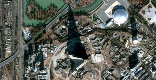
Last night, Mara and I were mess­ing around with Google Maps, check­ing out giant Japan­ese bud­dhas from the air. [Check out this one in Kamaku­ra, near Tokyo]. Then we decid­ed to see what North Korea looked like, and we raced over the Pyongyang and sud­den­ly found this crazy thing with a giant tri­an­gu­lar shad­ow. What the?Turns out that it's the Ryu­gy­ong Hotel. It has 105 sto­ries, and it is indeed shaped like an arrow­head, with a broad base that tapers steeply to a pointy top. The cra­zi­est thing: It was aban­doned in the mid-80's, dur­ing con­struc­tion; hence its moniker: the Hotel of Doom. (Appar­ent­ly, North Korea had already sunk 2% of its GDP into it when they decid­ed to pull the plug. Ouch.)Esquire calls it worst-designed build­ing in the world, which seems a lit­tle harsh. Would the world's worst-designed build­ing inspire this: An ani­mat­ed short pre­sent­ing a sort of Blade-Run­ner-meets-Dis­ney-meets-Shin­juku vision for how the Ryu­gy­ong will be adapt­ed in the future? Actu­al­ly, maybe it would.See it for your­self here.

Categories
architecture new york travel urban

New Yorks, new museums, new coffees

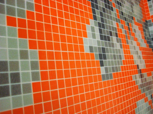
Flickr photoThis is an incred­i­ble mosa­ic in the bath­room of the New Muse­um of Con­tem­po­rary art in New York. It is also EASILY the most impres­sive thing in the whole museum.


New York was filled with good times, as usu­al, but a cou­ple of the things that total­ly blew my mind (and that are link-friend­ly) were Jamaican beef pat­ties at a place called Christie's in Flat­bush and an off­shoot of San Francisco's Blue Bot­tle jug­ger­naut that recent­ly opened in New York, Abra­co [a nice NY mag review]. Yoshi insist­ed that we stop at Christie's even though we'd just eat­en a big brunch, and we got a cou­ple of warm, spicy pat­ties to share on a walk through chilly Prospect Park. The first thing I noticed is that they're not real­ly "pat­ties" in the sense of ham­burg­er pat­ties. They're like hot pock­ets, but fresh­ly baked, with an amaz­ing crust and filled with super-spicy beef. Pret­ty much the per­fect walk­ing food.

On an unre­lat­ed note, last week's This Amer­i­can Life was the best I've heard in a long time. Every seg­ment is good, but the third is about what hap­pens to chim­panzees after they "retire" from movies, and it reveals that Chee­ta — the chimp from the 40's‑era Tarzan movies — is still alive, liv­ing in Palm Springs, enjoys drink­ing Diet Iced Tea, and was once quite fond of beer and cig­ars. There's more in this fun­ny Nation­al Geo piece from 2003, awk­ward­ly titled Tarzan's Cheeta's Life as a Retired Movie Star.

Categories
architecture ideas lit

Readings / Design, westerns, obsolete vernaculars

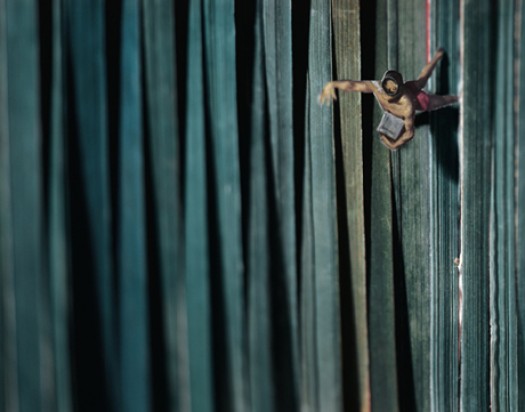
Thomas Allen - Fathom
This is a pho­to by Thomas Allen. I first noticed his stuff when I saw the cov­ers of Vin­tage reis­sues of James Ellroy's nov­els (like this one for Sui­cide Hill). The pho­to above is from a series of dio­ra­mas that Allen cre­at­ed from cut-outs of 50's pulp nov­els. I love the use of the book-ends as tex­tured under­wa­ter scenery here. Genius. Pho­to: Foley Gallery.


A lot of what I've been read­ing seems to res­onate with my 9‑to‑5 work. Last night, I was read­ing archi­tect Witold Rybczynski's account of a shed-build­ing exer­cise that turns into a much, much more — The Most Beau­ti­ful House in the World, and this pas­sage jumped out at me, most­ly because it spoke so elo­quent­ly of the stuff I val­ue in design work:

The psy­chol­o­gist Bruno Bet­tel­heim once char­ac­ter­ized children's play as an activ­i­ty "char­ac­ter­ized by free­dom from all but per­son­al­ly imposed rules (which are changed at will), by free-wheel­ing fan­ta­sy involve­ment, and by absence of any goals out­side the activ­i­ty itself" …

Bet­tel­heim quotes a four year-old who asks, "Is this a fun game or a win­ning game?" The soli­tary build­ing game is a fun game–there is no oppo­nent. The con­cept of fun is elu­sive and resists easy def­i­n­i­tion, but it is an undis­put­ed element–perhaps the element–of play. In the present con­text, it is enough to note that fun does not imply fol­ly or lack of seriousness–quite the oppo­site … What keeps [the archi­tect] involved for such long peri­ods of time is that the out­come of the design process is unpre­dictable: it is the result of chance, as in play. He does not know ahead of time exact­ly what the result will be. He could save him­self a lot of time and look for a sim­i­lar build­ing to repro­duce exact­ly; but this would make as lit­tle sense as build­ing the same house of cards again and again, or solv­ing the same cross­word puz­zle. The issue here is not orig­i­nal­i­ty but fun.

The empha­sis in that para­graph is mine. This week­end, I was read­ing a New York Times fea­ture on my man Robert Irwin, and I found myself smil­ing at this:

A favorite term is "par­tic­i­pa­tion." [Irwin] cites, for exam­ple, his 1997 trans­for­ma­tion of a room that over­looks the Pacif­ic at the La Jol­la branch of the San Diego muse­um. Rea­son­ing that he could not com­pete with the sweep­ing view, Mr. Irwin cut three rec­tan­gles — squares almost — into the exist­ing win­dows. "At first I didn't real­ize the glass was tint­ed," he said. "So not only did my holes let in air and sound, adding anoth­er dimen­sion to the expe­ri­ence, but they made every­thing seen through them appear in greater focus." You might say he opened the win­dow, that age-old pic­to­r­i­al device, let­ting in a cool rush of reality.

Once upon a time, I wrote a long post about Irwin's biog­ra­phy, See­ing Is For­get­ting the Name of the Thing One Sees by Lawrence Wech­sler; when I say that it blew my mind, I mean that the book expand­ed my mind, made me real­ly think about the way I rec­og­nize, inter­pret and under­stand the things I see. Final­ly: Cor­mac McCarthy. I'm reach­ing back in time, back to 1994, back to the night I dis­gust­ed­ly flung my copy of All the Pret­ty Hors­es out the win­dow of my apart­ment. (Lat­er that night, I saw the same copy for sale at 16th and Mis­sion BART). Any­way, I'm will­ing to recon­sid­er my judg­ment that McCarthy is no more than a smar­ty­pants Zane Grey writ­ing for arm­chair gau­chos. The Road stuck with me, real­ly deeply upset me, and I respect that. So I'm giv­ing him anoth­er try, and so far, so good: I got a nice copy of The Bor­der Tril­o­gy, and was quick­ly trans­port­ed by the prose, though of course I was remind­ed of Owen Wilson's char­ac­ter Eli Cash, in The Roy­al Ten­an­baums. His book, Old Custer, was writ­ten in what he char­ac­ter­ized as an "obso­lete ver­nac­u­lar," exhib­it­ed in this excel­lent bit:

The crick­ets and the rust-bee­tles scut­tled among the net­tles of the sage thick­et. "Vámonos, ami­gos," he whis­pered, and threw the bust­ed leather flint­craw over the loose weave of the sad­dle­cock. And they rode on in the frisca­lat­ing dusk­light. [More quotes from the Roy­al Ten­an­baums]

Damn, that's good.

Categories
architecture urban

Washington DC / Fortress of democracy

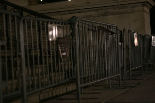
If the gov­ern­ment build­ings are any indi­ca­tion, Wash­ing­ton DC is a city brac­ing for some­thing. Makeshift bar­ri­ers sur­round the Capi­tol; men with auto­mat­ic weapons stand watch over ran­dom gov­ern­men­tal door­ways and inter­sec­tions. Sure, this is no dif­fer­ent than oth­er "sig­nif­i­can­t†places in the West­ern world — Lon­don and Frank­furt have their share of fortress­es and sen­tries — but as a cit­i­zen and ide­al­ist I'd hope that Wash­ing­ton would be dif­fer­ent. I'd hope that *we* would do it differently.

Flickr photoOur law­mak­ing build­ings were designed to be approached: Sit­ting at the head of the Mall's long run­way, the Capi­tol Build­ing inspires fur­ther inves­ti­ga­tion. Nowa­days, if a per­son (say, me) decides to take a pic­ture of the fences around this bea­con of democ­ra­cy, that per­son may get rep­ri­mand­ed by a guy with a gun. I'm just say­ing: It happens.


Any­way, I hope that we'll search for solu­tions to the prob­lem of secu­ri­ty that don't run counter to the ideals of democ­ra­cy: that law­mak­ers oper­ate in the open, that any­one can see how it's done (and indeed that every­one should see how it's done), that peo­ple are inno­cent until proven guilty, and that I'm pay­ing for those fences, dammit, so I should be able to take a pic­ture of them with­out get­ting harassed.UPDATE: Even the new $50 bill empha­sizes the approach­a­bil­i­ty of the Capitol.

50 dollar billCheck out the lit­tle white fig­ures climb­ing the steps on the left-hand side of the Capi­tol build­ing. This seems to imply, to me, that peo­ple can (and should) walk up the stairs to see what's hap­pen­ing with­in the hal­lowed halls of democracy.


Categories
architecture san francisco the ancient past urban

San Francisco / Maps and earthquake shacks

San Francisco in Maps: 1797 - 2006

This week­end I got an incred­i­ble book about San Fran­cis­co called San Fran­cis­co in Maps & Views. I usu­al­ly avoid glossy cof­fee-table his­tor­i­cal books because they're so often filled with dis­ap­point­ments — bad col­or, bad print­ing, messy lay­out, unin­spired writ­ing, PLUS they're real­ly expen­sive. But THIS ONE. This one is dif­fer­ent. The maps are very well-repro­duced, high-res and col­or­ful, and all are sup­port­ed by detailed and sur­pris­ing­ly engag­ing com­men­tary. After I got over the ini­tial thrill of using it like a flip-book and watch­ing my neigh­bor­hood evolve, I start­ed to notice small­er trends in land-use evo­lu­tion — a plot labeled "orphan asy­lum" became "hos­pi­tal;" many things labeled "cemetary" became "park" or "civic cen­ter." "Dunes" become "the Sun­set." I was also intrigued by the use of pub­lic places as refugee camps after the big one hit in 1906. Appar­ent­ly, SF car­pen­ters sprang into action and built thou­sands of makeshift cot­tages for the earthquake/fire refugees, turn­ing many well-known SF pub­lic spaces into refugee camps, includ­ing South Park, Dolores Park, and Precita Park, and lots of the then-out­ly­ing, unde­vel­oped areas, like the Rich­mond and the Sunset. 

Earthquake_shacks_in_Dolores_ParkA shack on Biki­ni Ridge would have been puh-ret­ty sweet. (This is Dolores Park, believe it or not). Pho­to: West­ern Neigh­bor­hoods Project

As the city began to return to nor­mal a year lat­er, a few of the refugees decid­ed to use the cot­tages — or, "shacks" as they were com­mon­ly known — as more per­ma­nent res­i­dences. Some indus­tri­ous peo­ple com­bined mul­ti­ple shacks into one res­i­dence. Incred­i­bly, a few shacks are still around, and nat­u­ral­ly folks have orga­nized to pre­serve them. (Here's a 2002 Chron­i­cle arti­cle about efforts to save some shacks in the out­er Sun­set).

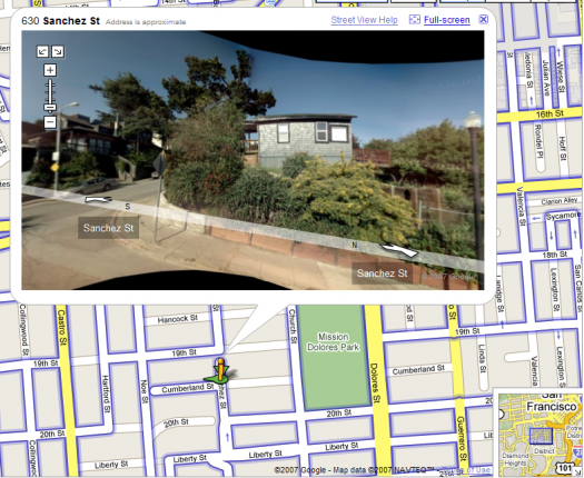
Cumby_shackI believe that this is the house that is list­ed as 300 Cum­ber­land on the West­ern Neigh­bor­hood Project's list of known shacks. The crazy thing is that this is at the top of an insane­ly steep hill, like un-bike-ably steep and long, so it must have been built there rather than trans­port­ed from Dolores Park. On the oth­er hand, who knows? Peo­ple were crafty back then, right?

Final­ly, here's a map of the loca­tions of the known exist­ing earth­quake shacks. Seems like a good project for a week­end afternoon.

Categories
architecture ecology urban

Architecture / Teddy Cruz's urban acupuncture

teddy cruz - tijuana river

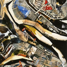
Last night, I saw archi­tect Ted­dy Cruz deliv­er a fast-paced, idea-rich pre­sen­ta­tion at the San Fran­cis­co Art Insti­tute. In a lit­tle over an hour, he tore through a slide show cov­er­ing his recent work on the social, cul­tur­al, polit­i­cal, and eco­nom­ic forces at work in com­mu­ni­ties along the US-Mex­i­co bor­der. The slide show itself was pret­ty impres­sive — a blend of research pho­tog­ra­phy, sim­ple Pow­er­Point ani­ma­tion, and pho­to col­lages (like the ones shown in this post, cour­tesy of UCSD, where Cruz teach­es) that looked some­what like maps but also some­what like actu­al pho­tos of urban density.I'd first heard of Cruz in the NYT Mag­a­zine fea­ture from last spring, Shan­ty­towns as a New Sub­ur­ban Ide­al. It details "Liv­ing Rooms at the Bor­der," his pro­posed project to turn a lot in the bor­der com­mu­ni­ty of San Ysidro into a mul­ti-use dwelling/community center/market. He dis­cuss­es it in more detail in "Urban acupunc­ture", an arti­cle he wrote for Res­i­den­tial Archi­tect Online:

Hous­ing and den­si­ty need to be seen not as an amount of units but as dwelling in rela­tion­ship to the larg­er infra­struc­ture of the city, which includes trans­porta­tion, eco­log­i­cal net­works, the pol­i­tics and eco­nom­ics of land use, and par­tic­u­lar cul­tur­al idio­syn­crasies of place … In a par­cel where exist­ing zon­ing allows only three units of hous­ing, the project pro­pos­es (through nego­ti­at­ed den­si­ty bonus­es and by shar­ing kitchens) 12 afford­able hous­ing units, a com­mu­ni­ty cen­ter result­ing from the adap­tive reuse of an exist­ing 1927 church, offices for Casa Famil­iar in the church's new attic, and a gar­den under­pin­ning the community's non­con­form­ing micro-economies, such as street mar­kets and kiosks. In a place where cur­rent reg­u­la­tion allows only one use, we pro­pose five dif­fer­ent uses that sup­port each other.

Cruz dis­cuss­es his archi­tec­tur­al mis­sion in this arti­cle at the Amer­i­can Insti­tute of Architecture's site: Bor­der Post­card: Chron­i­cles from the Edge.

Categories
architecture inside art visual

Art / Robert Irwin, BS, and the importance of questions

Flickr photo

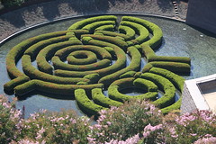
My nom­i­na­tion for All-Time Best Moment In An Art Doc­u­men­tary has to be the "Bull­shit!" scene in Con­cert Of Wills: Mak­ing The Get­ty Cen­ter. Abstract-artist-turned-land­scape-design­er Robert Irwin lit­er­al­ly calls bull­shit on archi­tect Richard Meier dur­ing an impor­tant Get­ty Cen­ter plan­ning ses­sion. [The object of their dis­agree­ment is Irwin's gar­den design, pic­tured at right. Thx, brew­books.] Design Observ­er's Michael Bierut sums it up nice­ly in an arti­cle called "On (Design) Bullshit:"

The [Get­ty Foun­da­tion], against Meier's advice, has brought in artist Robert Irwin to cre­ate the Center's cen­tral gar­den. The film­mak­ers are there to record the unveil­ing of Irwin's pro­pos­al, and Meier's dis­taste is evi­dent. The artist's bias for whim­si­cal organ­ic forms, his dis­re­gard for the architecture's rig­or­ous orthonog­ra­phy, and per­haps even his Detroit Tigers base­ball hat all rub Richard Meier the wrong way, and he and his team of archi­tects begin a rea­soned, strong­ly-felt cri­tique of the pro­posed plan. Irwin, sens­ing (cor­rect­ly, as it turns out) that he has the client in his pock­et, lis­tens patient­ly and then says, "You want my response?"His response is the worst accu­sa­tion you can lodge against a design­er: "Bull­shit."

If I recall cor­rect­ly, Meier is speech­less, and the mood of the doc­u­men­tary shifts quite sig­nif­i­cant­ly. Meier's per­son­al­i­ty and view­point had dom­i­nat­ed (is "dom­i­neered" a word?) ear­li­er scenes, he main­tains a sort of icy dis­tance in sub­se­quent scenes. (Dis­clo­sure: While I respect Meier, I'm not a fan of his work, espe­cial­ly the Get­ty, and the doc­u­men­tary makes clear that he is, umm, a dick). Irwin, on the oth­er hand, I've always loved, espe­cial­ly his dot paint­ings. I'm cur­rent­ly read­ing Lawrence Weschsler's biog­ra­phy of Irwin, See­ing Is For­get­ting the Name of the Thing One Sees, and it con­tains some use­ful back­ground and con­text to the "Bull­shit!" scene. It also com­pli­cates it; the more I read, the more Irwin and Meier seem to have quite a lot in com­mon. I'd always assumed that Irwin's vision was the irra­tional, organ­ic coun­ter­point to Meier's ratio­nal, geo­met­ric forms. The book makes clear that Irwin has quite a lot of the ratio­nal geom­e­try on the brain him­self. Per­haps they were just too sim­i­lar to get along.A large por­tion of the book is ded­i­cat­ed to Irwin's dis­cus­sion of his own process … My favorite pas­sage involves Irwin's expla­na­tions of the fits and starts that char­ac­ter­ized his out­put, espe­cial­ly dur­ing the dot paint­ing phase:

"Most of the time, I didn't have any idea where it was going; I had no intel­lec­tu­al clar­i­ty as to what it was I thought I was doing … Maybe I was just grad­u­al­ly devel­op­ing a trust in the act itself, that some­how, if it were pur­sued legit­i­mate­ly, the ques­tions it would raise would be legit­i­mate and the answers would have to exist some­where, would be worth pur­su­ing, and would be of consequence."Actually, dur­ing those years in the mid­six­ties," he dou­bled back on his for­mu­la­tion, "the answers seemed to mat­ter less and less: I was becom­ing much more of a ques­tion per­son than an answer per­son … The thing that real­ly struck me as I got into devel­op­ing my inter­est in the area of ques­tions," Irwin con­tin­ued, "is the degree to which as a cul­ture we are geared for just the oppo­site. We are past-mind­ed, in the sense that all of our sys­tems of mea­sure are devel­oped and in a sense depen­dent upon a kind of phys­i­cal res­o­lu­tion. We tag our renais­sances at the high­est lev­el of per­for­mance, where­as it's fair­ly clear to me that once the ques­tion is raised, the per­for­mance is some­what inevitable, almost just a mop­ping-up oper­a­tion, mere­ly a mat­ter of time."

Categories
architecture

Architecture / Front porches, refuge and prospect

Last sum­mer, NPR did a series on one of my favorite archi­tec­tur­al ele­ments — the front porch. An install­ment from late July cov­ered the use of the porch in con­tem­po­rary home-build­ing, specif­i­cal­ly in New Urban­ist (wikipedia entry) devel­op­ments, such as Sea­side, Flori­da and oth­er pseu­do-quaint "towns". (More on my prob­lems with New Urban­ism anoth­er time). The most intrigu­ing part of the show, for me, was an allu­sion to the psy­chol­o­gy of the home, and the fact that a large part of recent home-build­ing has focused on the home as a fortress, a defen­si­ble space, rather than a van­tage from which to observe and inter­act with the world. This was my intro­duc­tion to the prospect-refuge con­cept; prospect rep­re­sent­ing the abil­i­ty to sur­vey the sur­round­ing land­scape, and refuge serv­ing as a hide­away from the world. It's sim­plis­tic, but I like it and I believe it, inso­far as I can believe any the­o­ret­i­cal con­cept can describe the fun­da­men­tal needs of every­day life. Uni­ver­sal Prin­ci­ples of Design has a good overview, with lots of inter­est­ing relat­ed mate­r­i­al as well.

Categories
architecture ixd new york urban visual

Architecture / Daniel Libeskind's sauna

A few months ago, the NYT Sun­day mag­a­zine ran a pro­file of archi­tect Daniel Libe­skind and his Tribeca loft. (Inci­den­tal­ly, check out that link to his web­site; there's some pret­ty hot flout­ing of web con­ven­tions. For exam­ple, when you mouse over a link, almost every­thing on the screen dis­ap­pears, except a few stray words and the oth­er links. Hmm.) Any­way, the most mem­o­rable part of the mag­a­zine arti­cle was a pho­to of the inte­ri­or of his sauna. In it was a very small win­dow, per­haps 18 inch­es high by 4 inch­es wide, and through that win­dow the saun-ee could achieve a com­pact­ly framed view of the Chrysler Build­ing. How cool is that? The image here shows the architect's ren­der­ing of the dif­fer­ent land­marks vis­i­ble from van­tages with­in the loft. Neato.