Question: What happens when a young college basketball team without a proven low-post presence somehow manages to secure a high national ranking then faces a really hungry, experienced team? The Hawks found out two nights ago, getting their rear-ends tanned by an unheralded and obviously hungry Oral Roberts team.Where does this rank among the hardest-to-swallow losses in recent memory? I don't want to go overboard here; it's not as crushing as the two NCAA Tournament early exits. It also wasn't as demoralizing as losing to K‑State (at home) and Missouri (after leading by 7 with a little over a minute left) last year. It's most reminscent of the 2004 home loss to Richmond, when the entire sporting nation could turn on ESPN to see the Hawks implode on their home floor to a team that wasn't even playing that well. ESPN didn't carry the ORU game on Wednesday night, THANK GOD, but the loss rippled through the sports press in a way that always seemed to emphasize the Hawks simply failed to look, umm, good. SI said simply: "Oral Roberts outplayed No. 3 Kansas the whole way."Question: How in the world does SI rank KU above a team like Florida, the defending national champions who returned every starter from last year? Did they want to avoid jinxing Florida for some reason? (SI added KU to its list of cover jinxes). Maybe they settled on this arrangement before Sasha Kaun got hurt, and before CJ Giles pulled a Lawrence Phillips and got himself kicked off the team?[1] Even so, how does any front line arrangement compete with Gator paint-dominators Al Horford and Joakim Noah? We'll find out soon enough, I guess, since the teams will meet a week from tomorrow in Vegas. Gulp.[1] Wikipedia's abstract on Lawrence Phillips: "Lawrence Phillips (b. May 12, 1975 in Little Rock, Arkansas), is a former professional American football and Canadian football running back who has had numerous conflicts with law enforcement." Sorta says it all.
Author: Doug LeMoine
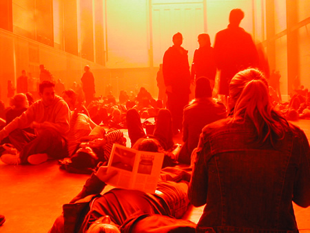

Two winters ago, I traveled to London for work. It was cold as hell, as a witch's tit, as the blood that runs in Dwyane Wade's veins during the fourth quarter. The sky was deep gray, hard, heavy and forbidding, and it felt as if it wasn't more than 10 or 12 feet above my head, ready to come crashing down at any moment. One afternoon, in a jet-lagged haze, I wandered over to the Tate Modern, where it seems they always have some thought-provoking installation (for instance, Anish Kapoor's gigantic levitating horn which blew my mind for a while), and as I descended the ramp into the museum, I was struck by the absolute inversion of wintry, outdoor London. I took lots of photos, but none could really communicate the immersive aspect of Olafur Eliasson's work, called "The Weather Project." It was all reds and oranges, all warmth and mist, enveloping you in a happy, gauzy glow. Cynthia Zarin recently profiled Eliasson for the New Yorker, and she comments that the Weather Project cemented Eliasson's reputation in the art world … (Unfortunately, I can't find a link to the article online, but by all means dig through back issues of the magazine at the laundromat, if you get a chance. The article provides interesting insight into Eliasson's process, and includes some funny anecdotes relating to his impulse to immerse the viewer in an environment. For instance, in mid-long-distance-phone-conversation with Cynthia Zarin, he places his cell phone on the luggage conveyer belt at the airport, lets it go around the carousel once, then picks it up and asks her what the experience was like. Hmm.).
Last summer, NPR did a series on one of my favorite architectural elements — the front porch. An installment from late July covered the use of the porch in contemporary home-building, specifically in New Urbanist (wikipedia entry) developments, such as Seaside, Florida and other pseudo-quaint "towns". (More on my problems with New Urbanism another time). The most intriguing part of the show, for me, was an allusion to the psychology of the home, and the fact that a large part of recent home-building has focused on the home as a fortress, a defensible space, rather than a vantage from which to observe and interact with the world. This was my introduction to the prospect-refuge concept; prospect representing the ability to survey the surrounding landscape, and refuge serving as a hideaway from the world. It's simplistic, but I like it and I believe it, insofar as I can believe any theoretical concept can describe the fundamental needs of everyday life. Universal Principles of Design has a good overview, with lots of interesting related material as well.
Categories
Lit / Fall reading list
Somehow a recent NYT Book Review convinced me that I needed to read this season's hott new thing, Special Topics in Calamity Physics by a much-blogged-about literary debutante, Marisha Pessl. It's no Secret History, if that's what you're looking for. It's not bad, but on the other hand it's not especially delicious, nor smart, nor scary. It also contains a few drawings done by the author, none of which are very interesting; the drawings are randomly scattered, not especially revealing, and actually in these regards, they sum up my ambivalence about the book. Also on the list: Nothing If Not Critical, a collection of art criticism by Time critic Robert Hughes. In general, I dislike "criticism" as a genre because it so frequently comes across as insulated from, I guess, reality. The very few successful critics succeed because their writing exposes the object of criticism to new light, a fresh perspective — and the list is short: Lester Bangs and Robert Hughes, maybe Anthony Lane. Hughes's review of Julian Schnabel's autobiography made me laugh out loud, repeatedly, even as I awaited a dentist appointment: "Schnabel is to painting what Stallone is to acting — a lurching display of oily pectorals — except that Schnabel makes bigger public claims for himself." Ziing! Now that's criticism! In 2003, the UK's Guardian published an interesting bit on Schnabel's endeavors to resurrect his career. Post Office by Charles Bukowski is both better and worse than I remembered it. I read it in my early 20's, a time when I could identify (or thought I could, anyway) with being down and out, so I admired the cranky tone, the disdain for the "straight" world and all the "suckers" who buy into it. Nowadays, I would probably qualify as a sucker, and I can confirm that the straight world really is as boring and soul-crushing as Bukowski presents it. As I was reading it, I kept thinking: What would Bukowski do in my situation? At the very least, he would stash a bottle of booze in his desk. And probably duck out for a stiff drink or two in between meetings.Finally, the best of the lot is Eric Newby's (mis)adventure classic A Short Walk in the Hindu Kush. What happens when two refined British gentlemen with no moutaineering experience decide (on a lark) to climb an 18,000-foot mountain in Nuristan, a warlord-controlled region of Afghanistan? The book chronicles this mid-1950's boondoggle, including Newby's means of traveling to Afghanistan — an automotive journey through Europe and the Middle East. [A sad note: Newby recently passed away. The BBC obit.]
In 1978, Philip K Dick published an essay called "How to Build a Universe That Doesn't Fall Apart Two Days Later." The title sort of says it all; it's about how to envision the world of a story in a way that lasts. He cuts right to chase, too, confronting the hard question that most writing how-to's like to gloss over: What is worth writing about? Where to start? How to make a statement that doesn't age badly?
… I ask, in my writing, What is real? Because unceasingly we are bombarded with pseudo-realities manufactured by very sophisticated people using very sophisticated electronic mechanisms. I do not distrust their motives; I distrust their power. They have a lot of it. And it is an astonishing power: that of creating whole universes, universes of the mind. I ought to know. I do the same thing. It is my job to create universes, as the basis of one novel after another. And I have to build them in such a way that they do not fall apart two days later. Or at least that is what my editors hope. However, I will reveal a secret to you: I like to build universes which do fall apart. I like to see them come unglued, and I like to see how the characters in the novels cope with this problem. I have a secret love of chaos. There should be more of it.
It just gets better from there, really.
After all my trash talk about Bonds and how he should just fess up to the roids, I saw him hit a dinger last Saturday, and I actually cheered. Like, I stood up as it left the bat, and maybe even jumped in the air when it went out, all the while clapping my hands. It was irresistible. He hit the thing a mile. It was awesome.
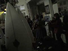
Being car-less keeps me (mostly) around the southeastern neighborhoods of San Francisco, but every once in a while I'll venture out to the frontiers. Last Friday, we went out to Mollusk, the arty surf shop on 46th-ish Avenue and Irving, (i.e. WAY Outer Sunset), for an art opening and a performance by Peggy Honeywell, i.e. local art star and beautiful loser Clare Rojas. The surf shop setting was informal and cozy; the acoustics actually weren't bad; there were dogs walking around; all in all, it makes me wish that I got out there more. This intimate setting was lots better than the cavernous, loud, obnoxious-people-filled place I saw her perform last, Barry McGee's opening in Melbourne, Australia a couple of years ago.

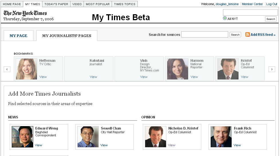
The NYT just rolled out a beta of something they're calling MyTimes. As a daily reader of both the print and online editions, I'm intrigued by new developments and ideas at the NYT, and I've been pleased with their recent site redesign. MyTimes, however, strikes me as somewhat misguided.First off, the name MyTimes sounds like a portal, recalling the confused era when every company wanted to make a my-prefixed version of their site. Unfortunately, it also evokes the subsequent realization that what people really wanted was not control over layout and content, but greater system intelligence — smarter defaults, recognition of the things they normally do, a clever way of pointing them toward related things. The portal-sounding name wouldn't even be so bad if MyTimes didn't look and act like portal. Alas, it's got all sorts of crap to add and move around and modify, allowing the reader to add RSS feeds from anywhere on the web, view movie times, weather, Flickr images, whatever. To me, the problem is that the NYT isn't "whatever." It's the authoritative source. So why all the other stuff?A better question: What problem is MyTimes supposed to be solving? What is the user goal is it addressing? One would do research to answer these questions, but — to be self-referential — my own goals in reading the NYT: Get the authoritative answer, enjoy great writing, forumlate opinions on complex problems. A major problem of MyTimes is that the NYT is trying to be both the authoritative source, and the delivery mechanism of any other source you might want.So, my advice to the New York Times …
- Bring related information to me. Focus my attention to the news of the day, but make it easy to navigate to related things. These things may be within the NYT, or outside. Use what you know about me — from observing my behavior — to point me toward related things. Think Amazon, not Google Homepage or MySpace. Amazon remembers what you like, points you toward related stuff, tells you what other people have looked at, etc. It knows you; you don't HAVE to tell it anything.
- Don't create a separate place that requires configuration and expect that I will go there and wait for the information to start rolling in. The established framework works: Start at the homepage, drill to the detail. Why create another starting place?
- Integrate the good things from MyTimes — the journalist pages, for instance, are a cool idea, and they are most appropriately accessed within the existing framework. Localized content like weather and movie listings are fine, but I don't understand why this needs to be separate from the existing framework of the NYT pages. Basically: Integrate the reader into the NYT, don't create a separate place for him/her. Learn my zip code, remember it, push relevant local content to me. End of story. (And just because Flickr has an RSS feed doesn't mean it's worthy of your brand. You're the New York Times! You've got the best photojournalists in the world! Get rid of it!)
While I'm on the subject, two additional things I'd like to see …
- More exposure to the Times' excellent archival journalism. Why not plumb the back catalog, and expose some of it to the readers? Many articles about current events refer to past events. Why not provide a list of related links to previous articles more often? Of course, I'd expect that this content would be free — not only because I'm a cheapskate — but because I would think it would pique people's interest in seeing more of it, which would of course cost money.
- More journalist blogs and discussion. The Public Editor's column has become one of my favorite parts of the paper, and he blogs about interesting journalistic issues as well.Here's a great one about Nicholas Lemann's article about citizen journalism in the New Yorker.
In any case, there are roughly one thousand web sites offering up customizable info widgets, web-wide RSS feed aggregation, and so forth. The NYT should continue to focus on the content, and leave the aggregation to someone else.
Categories
Street art / Swoon

So it seems I'm a couple of years late to this particular artist, but some recent conversation on the Book Arts list turned me on to Swoon, a NYC street artist. Her medium is the cutout — from paper, wood, linoleum — and she attaches these to walls all over NYC. The paper ones are the most amazing to me; they're like those snow flakes you make in grade school, but life-sized and really elaborate and of people. Check out this Flickr cluster to get a sense of the way that the paper ages on the wall, and the way that this fragility and sense of impermanence reacts with the rest of the wall. This interview in the Morning News has some good detail about her process:
There's something particular to the images that make me choose that material … A lot has to do with the limitations of the material. The linoleum you can get so much more detail from. Everything that has more nuances, I use linoleum. The wood is rougher, but a good roughness. The paper is really hard to think about, and so it tends to be simpler. With paper, you'd choose simple subjects because it's hard to create an expression. The challenge is to make the cutout so that it can get on the wall as a solid unit in two minutes or less.
Thanks to howmuchlongerkillmenow for the photo.

A few months ago, the NYT Sunday magazine ran a profile of architect Daniel Libeskind and his Tribeca loft. (Incidentally, check out that link to his website; there's some pretty hot flouting of web conventions. For example, when you mouse over a link, almost everything on the screen disappears, except a few stray words and the other links. Hmm.) Anyway, the most memorable part of the magazine article was a photo of the interior of his sauna. In it was a very small window, perhaps 18 inches high by 4 inches wide, and through that window the saun-ee could achieve a compactly framed view of the Chrysler Building. How cool is that? The image here shows the architect's rendering of the different landmarks visible from vantages within the loft. Neato.