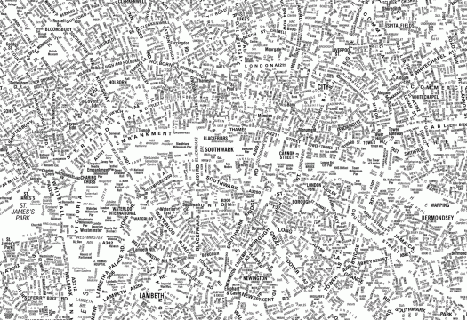
This amazing typographic map, cheekily called "London's Kerning," was designed by NB: Studio, a London graphic design concern. It's a pretty excellent demonstration of type's ability to communicate size, shape, relationship, the list goes on. I also love the homage (via typeface) to the London A‑Z, an indispensable companion, interpreter and guide for any navigator of London. They're taking orders for them. [Thx, kottke].
Categories
