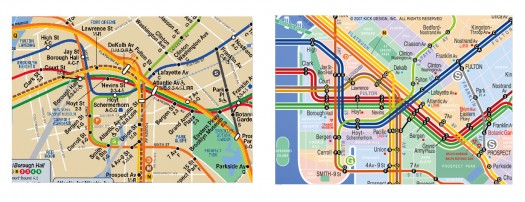
A graphic designer named Eddie Jabbour has proposed an alternative design for NYC subway maps. The New York Times wrote about it last week, and since then blogs have been blowing up over it. 37 signals evaluated it, and applauds the effort to increase usability at the expense of geographic accuracy: "Subway map readers want to know how to get from A to B a lot more than they want to know the exact curve of the tracks along the way. Sometimes truth is less important than knowledge." If points A & B are always subway stations, I wholeheartedly approve. As seen in snippet form below, the redesign much more clearly presents information that is relevant on the subway.
Eddie Jabbour's proposed redesign trades geographical accuracy for readability But a subway trip is always part of a bigger logistical process. You're not just trying to get from Atlantic Avenue Station to Astor Place Station. You're trying to get from an apartment on President Street to the place where your friend cooks near Washington Square Park. And often the optimal subway route is not available to you; the line you want to take is extremely delayed; another line is not running; another is express past 9pm; another only runs to this station on Sundays; etc; etc. The reality is that you need to be able to improvise when you're in the subway system, and a map that is not geographically accurate inhibits your ability to adjust to the realities of the system.Which brings me to the London A‑Z. London can get away with a representative subway map because it has a companion book that allows you to figure out stuff like that. So the Circle line isn't running? Trusting the Tube map to go to the next nearest station may be disastrous, but you can always find your destination in your trusty A‑Z, scan for another station nearby, etc. Moreover, magazines and newspapers often place the A‑Z grid location next to an event listing. Removing geographical context from the NYC map may make it easier to scan, but at this point, I feel like it's perhaps prematurely reductive. On the other hand, a reduction of information on the subway map may simply underscore and highlight (and italicize and capitalize) the need for a NYC A‑Z. Or perhaps the MTA itself just needs to be more predictable. Or maybe everything should stay the same so every traveler can have that special scary feeling of being stranded in Brooklyn at 2am on a weeknight.UPDATE: My friend Jonathan Gabel, a New York resident for the last 13 years, had some interesting thoughts on the matter:
The current map is a total fabrication of geography anyway — Manhattan is made fat and short, and Brooklyn and Queens lose all of their length. In fact, the L line through Williamsburg and Bushwick is actually more accurate in the changed map, as it makes a radical zig-zag through the area. For instance, the L train runs: Lorimer, Graham, Grand, Montrose. From Niki's house, 8 blocks north of the Graham stop, to meet our friends who's live 4 blocks East of the Montrose stop, we often walk to Manhattan Ave, one block West of the Lorimer stop because it is half way between our houses. Figure that one out. I have never seen the London A‑Z but I looked at one of the NFT (not for tourists) guides to New York and found it wasn't really helpful, specifically because it doesn't really help you find addresses. Even the addresses of things it is telling you about — like restaurants. Say you want to find Snacky's in Williamsburg. It shows you a map of the general area, and listings of all the restaurants and other things by street address, next to the map of the area. The map is bullet-riddled with little icons to tell you where all bars/ restaurants/ laundromats/ clubs/ sweatshops/ motorcycle-repair-shops are — but every bar/restaurant/laundromat/club/sweatshop/motorcyclerepairshop is only labeled with the sign for b/r/lc/ds/mrs and no number. So to find your Snacky's you have to look at 20 r's and try to figure out which one it is, and ignore 40 b's, 20 l's, 5 c's 50 s's that are covering all the names of the streets. It's like that interface you described for the New Yorker — it takes all the pleasure out of cartography. I would like to see a guidebook that makes discovering one's way pleasurable.
Amen to pleasure.
