I was one of the suckers who pre-ordered The Complete New Yorker magazine. I am a long-long-time New Yorker reader, and the enticement was just too powerful — 8 DVDs filled with 60+ years of cultural commentary, quirky cartoons and cool cover art, all in a distinct highbrow-yet-practical-minded voice and scanned in at super-high-res? For a few extreme dorks, this was intensely exciting. Expectation-wise, it was like the release of a smartypants Playstation 3.Upon arrival, it also resembled Playstation 3, in that it sucked, big-time. My experience improved slightly after The Occasional Scrivener posted a hack that allows you to copy issues from the 8 independent DVDs onto your hard drive. An extreme dork after my own heart. Many thanks.The really big, un-hackable problem: The search tool is a house of horrors. Imagine that you've finally been introduced to a long-time idol, let's say Bob Dylan, and he agrees to come home with you and sit in your living room and tell you anything you want to know. But then when you ask him to tell you the complete story of the "Judas!" show, you realize that he doesn't speak English; he just sits there silently, impassive. That's how this thing makes me feel. The whole point of getting Complete New Yorker is to have your mind blown by the wealth of cool stuff in the older issues. Therefore, the challenge faced by the interaction designers is to facilitate getting at that stuff, i.e. MAKE IT EASY TO SEARCH for what you want. The shot below represents the Procrustean bed on which each searcher must lie.

The really egregious crimes have been documented elsewhere, but I would just like to add:
- Performance that reminds me of the 90's. If this had been released in 1998, I could easily forgive the lag everytime a button is pressed or a search is executed. But really, when I type "white" into the general search field, and it churns for nearly 20 seconds, I don't know, it makes me homicidally mad. Anger at slow performance is like road rage — once you've got it, you can't get rid of it, no matter how much you avoid being in a car.
- Why the cruel and unusual search complexity? Searching is never made easier by surfacing every possible method of doing so right off the bat. Google — the world's most popular search interface — seems like an effective guide here. Start simple, and reveal sophistication when necessary. There aren't really even that many ways I could conceive of searching the Complete New Yorker — author, date article title, date range … That's about it.
- Wasted vertical real estate. Nearly 33% of the vertical space is consumed by tool chrome, those thick gray bars segmenting the screen. Combined with the often bizzare and mostly useless "Abstract" below, this leaves 11 rows for search results, the place where users (I) make decisions on what to launch in the viewer. Unforgiveable.
- What the heck is this thing called?. The fact that the search results do not contain a highly valuable piece of information — umm, the title of the piece — makes it a pain in the butt to scan (for instance) the stories of JD Salinger, the assorted work of EB White. Actually, pretty much every search is complicated by this.
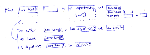
I could go on and on, but I won't. Here's my suggestion for CNY 2.0: Consolidate the existing widgets into one widget with modest dynamic behaviors. The widget would have one simple initial menu that determines how you want to search — keyword, author, issue, department. This selection then determines the filters you'll need — if you choose "keyword," maybe you get "department" and "date" as filters. In doing this, you buy back all of that chrome real estate, allowing more results to be displayed. Win, win, win. Of course none of this matters much if database performance isn't improved, but here it is anyway:

