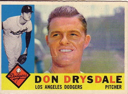
Like lots of stuff, they really don't make baseball cards like they used to. Halftone action thumbnail! Alternating colors in the player names! Don Drysdale's coif!
Anything that can be seen. Stuff with in this category is generally somehow interesting to look at, beautiful, stunning, provocative, silly, crrrrraaaaaazy, intriguing, or inspirational.
Lots of intriguing stuff at Clare Rojas's opening at Gallery Paule Anglim tonight. Woodland creatures, naked dudes in tai chi poses, an excellent video of Peggy Honeywell playing a slow sad song at a raging frat party filled with beer bongs and keg stands, Amaze, Barry McGee, and much, much more. Worth it.
 I call this one "It's Hard Out Here For a Penguin."
 I think this one is untitled, but it should be called "Untitleable."
Gallery Paule Anglim is at 14 Geary in downtown San Francisco.

When I was in Washington DC last month, I saw an incredible show at the National Gallery called Foto: Modernity in Central Europe 1918–1945. As you may have guessed by the title, the show is photography-oriented, but it's more than that: It's a story about photography craft, and the way that European photographers bent, broke and otherwise manipulated photos to express the social, political and cultural fragmentation (and chaos) in the wake of the First World War. Most of the artists were unknown to me; they're all introduced and discussed in detail in the excellent exhibition catalogue. It opens at the Guggenheim New York in October.
 This is a photomontage by a Polish artist named Janusz Maria Brzeski. It's called Twentieth-Century Idyll, but the name of the series is even better: A Robot Is Born. Photo: National Gallery of Art.
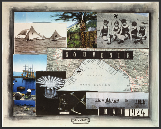 Another photomontage, this one by Jindrich Strysky, a Czech artist. Photo: National Gallery of Art
I traveled to Cuba 10 years ago this summer, and I unearthed this 10-peso note when I moved earlier this summer. Coincidence, or a sign that I should return sometime soon?
When I was there, the official exchange rate was one American dollar to one Cuban peso, but one could get 20 Cuban pesos with one American dollar if one exchanged money on the street. It appears that this hasn't changed, though Wikipedia notes that Cuban pesos have no value in currency markets. When I was there, Cuba was still reeling from the collapse of the USSR, and accommodations were made to handle the hardships known of this Special Period. For example, the American dollar could be used to purchase "luxury goods," though at that point "luxury" involved eating chicken once in a while and drinking an occasional beer. They've since introduced a second currency to replace the American dollar, the convertible peso, while keeping two tiers of goods. Yanqui go home!
Years ago, I tried to make a wallet out of a Fedex Tyvek envelope, based on instructions from the inaugural issue of Readymade magazine. I liked the idea of a super-slim wallet that was (a) really cheap without seeming (b) totally cheapskate. The problem was, as simple as it seemed, making the thing involved a sewing machine, a device that is actually somewhat hard (not to mention scary) to use. So I gave up on the idea of having one until about a year and a half ago when I saw one for sale on Etsy for $5.
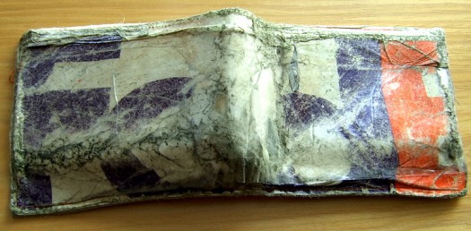 This is my Tyvek wallet after 18 months of use. When I bought it, I figured that it would last for a couple of months before it fell apart, but I was pretty amazed at how well it held up without much outside assistance other than a couple of layers of packing tape now and again.
As long as we're talking about Fedex, here's the cool 70's Fedex logo, and one of those 80's ads with the fast-talking businessman [YouTube]. Next up: a relatively inexpensive wallet from All-Ett that uses silicone-coated ripstop nylon. Doesn't have the cool DIY look of the Fedex wallet, but seems a lot more durable.UPDATE: Just got email from Terrence Kelleman at Dynomighty Design, who designed a wallet made from a thicker, more durable grade of Tyvek and which is held together by gluing and folding rather than stitching. No sewing machines: bonus. Check out his demonstration [You Tube].
Mara and I just moved into the Lower Haight earlier this month, and Google just released a new Maps feature — Street View — that has a picture of our place. If I weren't writing about this, I'd be speechless. Wow.
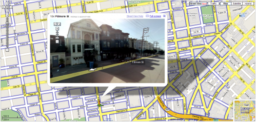 Our place is the yellow two-story walk-up that is bustin out of the top of the frame. I love that it was captured on one of those semi-sunny days where little wisps of fog drift through. So nice to not live in the fog belt. Incidentally, here's the Chronicle's fog forecast. Doesn't look good.
Street Level seems like useful functionality, esp. for fancy mobile devices, which I don't have. The controls are pretty straightforward and easy to use on a desktop, but I wonder about the ease with which one could navigate up and down the streets with those teeny arrows on a Palm or Blackberry. This is really nitpicky, but I think it would be effective to introduce more map navigation into the image, i.e. skipping to the next intersection, returning to the original destination, etc. Future-wise, it would be awesome to be able to do stuff with the images — easily insert them into other things, string them together in connection with directions, etc. What I want to know is: How the heck did they do it? Thx, kottke.
Killer of Sheep is director Charles Burnett's account of life in the LA neighborhood of Watts in the early 1970's. It began life as his senior thesis at UCLA film school and until recently it was never seen outside art houses and museums. Despite all of that, it was among the first 50 films to declared national treasures by the Library of Congress. I saw it earlier this week at the Castro, and it lived up the hype. Burnett's account of his motivations in making the film seems like a good place to start unpacking the stuff that makes it so unique:
I wanted to tell a story about a man who was trying to hold on to some values that were constantly being eroded by other forces, by his plight in the community, and the quality of the job that he had. At the same time he wanted to do right by his family. I didn't want to impose my values on his situation. I just wanted to show his life. And I didn't want to resolve his situation by imposing artificial solutions like him becoming a doctor or a diplomat, when the reality is that most people don't get out. I wanted to show that there is a positive element to his life, and that is that he endures, he's accepted it. [From an excellent interview on Senses of Cinema]
To bring this story to life, he employs a style that seems improvisational, as much documentary as Italian neorealism. But there's also something very new and genuine and particularly American about it — isolation, crumbling buildings, explosions of cruelty and anger, and the constant, chaotic motion of kids leaping across rooftops and crawling under buildings — combined, these things seem to evoke a very American way of poor, urban life.More than anything, the movie makes you wonder at its very improbability: How in the world did he make that? Did he actually plan those moments that seem genuinely serendipitous? Maybe it's that the actors are untrained. The dialogue seems fresh, surprising and authentic even when it's forced. Maybe it's the pacing of the editing. Scenes start abruptly — children emerge from a hole, an entire neighborhood has assembled in a stairwell, kids hide behind a scrap of plywood. Most scenes also tend to end a couple of seconds early, or linger a few seconds longer. Maybe it's the dialogue — it's all mumbles or hollers or growls, with jazz and blues tracks adding rhythmic, sometimes hopeful counterpoints to the imagery. Who knows? What's clear is that it speaks in a true, clear and unique voice. Go see it.
 Rachell Sumpter, Argonauts. From her collection at the Richard Heller Gallery.
Her stuff reminds me of lots of other artists I like — Evah Fan and some aspects of Julianna Bright, for two. Maybe it's something about the West Coast, but they're all simple and light at first glance, but also deeply still, and it's a stillness that reveals something surprising, impossible, or discomforting, but in an amusing way. Usually. Anyway, there's lots more Rachell Sumpter prints and stuff at Little Paper Planes, and some drawings, prints, watercolors and more from a 2006 show at Sixspace.
The Warriors playoff ride is over, the Jazz's ride will come to an end sometime in the next week or so, but Baron's dunk over Kirilenko will live on FOREVER. Let's just sit back and appreciate it for a minute. (It's much better live).
 Baron elevates and elevates; he begins his leap before Kirilenko and is still going up as Kirilenko descends. Mind-bending. To his credit, Kirilenko said after the game that it was an awesome dunk and that "at least I got to be on the poster." Also to Kirilenko's credit, he didn't foul Baron; if anything, it was an offensive foul. More on the stupid NBA officiating later.
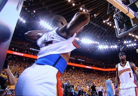 As impressive as the dunk itself was Baron's stomach flash after he landed. Not really sure where this came from. The elementary school playground? An And1 mixtape? Wherever it came from, it was a stroke of genius in that particular setting — Friday night, Oakland Coliseum, Western Conference Semi-final blowout. You could practically feel the Bay Area elevate that moment.
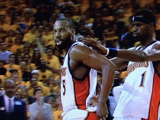 Again, haven't seen this before, outside of a playground game in the Panhandle, but Stephen Jackson appeared to be dusting something off Baron's shoulders. The remains of the rim? Some magic dust from David Blaine?
Incidentally, the best picture of all was not taken off my TV, but by an AP photographer from the other end of the court. It captures Baron as he descends from the dunk.
Like everyone in the NBA universe has already said, the Warriors were hugely fun to watch this post-season, and it was sad to see them go. It would have been nice to see more scrappy, inspired Matt Barnes moments; more Stephen Jackson daggers; more Baron Davis PERIOD. I've always liked Baron, but this post-season he had it all working: his fast-break vision, his high-arcing three-point bombs, his cross-over, his ability to get in the lane and dish out to open shooters. (More of Baron's finest career moments on YouTube.) It was nice to see Monta get his game back in games 4 and 5, and Biedrins had some really strong moments, by which I mean some ridiculous dunks and a few improbable free throw conversions.
At the same time, I admired Utah by the end of the series. Jerry Sloan is an asshole, but he proved in this series that he is an asshole who knows what to do with talented players. The 3‑D guard play (Deron Williams, Dee Brown and Derek Fisher) was unexpectedly solid and impressive. Memo and Boozer were SportsCenter fixtures throughout the season, but I was surprised at how easily Memo was taken out of his game by the quicker Warriors. I was similarly amazed at how great Boozer has become. The guy rose to the occasion, took lots of big shots, frequently changed the momentum of the game and was by any measure a badass among badasses. To say those things about a former Duke player requires a lot of pride-swallowing on my part.In contrast to the uneven, streaky Warriors, every Jazz player was tenacious and gritty while exhibiting a professionalism and character that has been missing from the Western Conference playoffs this year. Why are so many players, especially Warriors, continually trying to draw charges? Play defense. Draw the charge when it comes to you, but don't try to substitute actual defense with stepping in front of a player as they go to the basket. Stephen Jackson! Dude! You were huge in the Dallas series, but against Utah you took yourself out of the game by trying to take charges and then getting pissed that the refs didn't call them! You know this: the refs are not going to give you those calls when the only thing you're doing is trying to draw them. Same goes for Barnes and Harrington. UPDATE: Henry Abbott of TrueHoop has some thoughts on this very subject:
There are a lot of fouls called on players defending against the drive. What occurs to me more and more is that it's smart to do the whole "draw the charge" flop onto the butt, and only in part because you might draw the charge. A bigger reason is that if your hands are up, and you're jumping, and there's contact, you have NO chance of getting the call, and it's likely a foul on you.
An interesting point; perhaps it's all part of an effort to enable slashing and to complicate physical defensive play. On the other hand, superstars seem to get calls even if the defense seems to be legit. Baron obviously drew a lot of charges and hacks, which I think is evidence of a huger problem: THE F%@$$%$ING CONSPIRATORIAL OFFICIATING.
It really seems like the referees go into each game with an agenda. Like, the Jazz got every call in game one. Why? Did they want to even things up from the previous series when it seemed like there were some quick whistles on Josh Howard? The lopsidedness of the calls make you wonder things like that. I mean, even Stephen Jackson had some legit beefs that night! Then in Game 5, Baron got pretty much every call. He literally ran over Deron Williams a couple of times, no whistles. When Williams would so much as touch him, whistle. Did the NBA want to prolong the series? Did they want to give Baron the superstar foul exemption? UPDATE: And don't even get me started on the role of the NBA front office in all this. If the suspensions of Diaw and Stoudemire end up costing the Suns the series, I'm going to … protest. Somehow. How can the NBA be so bad at interpreting their own rules? Every sport in the world functions effectively by implementing the spirit of its rules, not the letter. Why go by the letter in this case? Stoudemire and Diaw didn't escalate anything; they didn't incite further mayhem; what gives?In spite of it all, great players make great playoffs. Thanks Warriors, and go Suns.
A graphic designer named Eddie Jabbour has proposed an alternative design for NYC subway maps. The New York Times wrote about it last week, and since then blogs have been blowing up over it. 37 signals evaluated it, and applauds the effort to increase usability at the expense of geographic accuracy: "Subway map readers want to know how to get from A to B a lot more than they want to know the exact curve of the tracks along the way. Sometimes truth is less important than knowledge." If points A & B are always subway stations, I wholeheartedly approve. As seen in snippet form below, the redesign much more clearly presents information that is relevant on the subway.
Eddie Jabbour's proposed redesign trades geographical accuracy for readability But a subway trip is always part of a bigger logistical process. You're not just trying to get from Atlantic Avenue Station to Astor Place Station. You're trying to get from an apartment on President Street to the place where your friend cooks near Washington Square Park. And often the optimal subway route is not available to you; the line you want to take is extremely delayed; another line is not running; another is express past 9pm; another only runs to this station on Sundays; etc; etc. The reality is that you need to be able to improvise when you're in the subway system, and a map that is not geographically accurate inhibits your ability to adjust to the realities of the system.Which brings me to the London A‑Z. London can get away with a representative subway map because it has a companion book that allows you to figure out stuff like that. So the Circle line isn't running? Trusting the Tube map to go to the next nearest station may be disastrous, but you can always find your destination in your trusty A‑Z, scan for another station nearby, etc. Moreover, magazines and newspapers often place the A‑Z grid location next to an event listing. Removing geographical context from the NYC map may make it easier to scan, but at this point, I feel like it's perhaps prematurely reductive. On the other hand, a reduction of information on the subway map may simply underscore and highlight (and italicize and capitalize) the need for a NYC A‑Z. Or perhaps the MTA itself just needs to be more predictable. Or maybe everything should stay the same so every traveler can have that special scary feeling of being stranded in Brooklyn at 2am on a weeknight.UPDATE: My friend Jonathan Gabel, a New York resident for the last 13 years, had some interesting thoughts on the matter:
The current map is a total fabrication of geography anyway — Manhattan is made fat and short, and Brooklyn and Queens lose all of their length. In fact, the L line through Williamsburg and Bushwick is actually more accurate in the changed map, as it makes a radical zig-zag through the area. For instance, the L train runs: Lorimer, Graham, Grand, Montrose. From Niki's house, 8 blocks north of the Graham stop, to meet our friends who's live 4 blocks East of the Montrose stop, we often walk to Manhattan Ave, one block West of the Lorimer stop because it is half way between our houses. Figure that one out. I have never seen the London A‑Z but I looked at one of the NFT (not for tourists) guides to New York and found it wasn't really helpful, specifically because it doesn't really help you find addresses. Even the addresses of things it is telling you about — like restaurants. Say you want to find Snacky's in Williamsburg. It shows you a map of the general area, and listings of all the restaurants and other things by street address, next to the map of the area. The map is bullet-riddled with little icons to tell you where all bars/ restaurants/ laundromats/ clubs/ sweatshops/ motorcycle-repair-shops are — but every bar/restaurant/laundromat/club/sweatshop/motorcyclerepairshop is only labeled with the sign for b/r/lc/ds/mrs and no number. So to find your Snacky's you have to look at 20 r's and try to figure out which one it is, and ignore 40 b's, 20 l's, 5 c's 50 s's that are covering all the names of the streets. It's like that interface you described for the New Yorker — it takes all the pleasure out of cartography. I would like to see a guidebook that makes discovering one's way pleasurable.
Amen to pleasure.