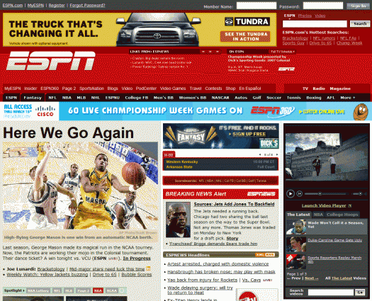
To the editors of ESPN.com,I visit your site every day, multiple times a day. Today, I decided that I've had enough. You need to stop. Whatever you're doing, just STOP. Years ago, ESPN.com was a useful collection of online sports information. It was relatively easy to navigate, scan and read. Today, it is a dark, sprawling information apocalypse — the Blade Runner cityscape of websites. Remember that early scene in Blade Runner, where Deckard is reading the newspaper while the ad blimp circles overhead, repeating the words: "A new life awaits you in the Off-World colonies"? That's how I feel when I'm reading ESPN.com. The barrage of ads, news, tickers, scrolling content widgets, opinion, commentary, analysis, whatever it is that Scoop Jackson writes, and teasers for upcoming events on your cable network is an absolute mess, the kind of mess that makes CNBC seem Tufte-esque in comparison.
Where did you go wrong? Years ago, you plastered that huge banner ad across the top. This was annoying, but plenty of sites (used to) do this and I learned to ignore it. Then there was ESPN Motion — or, as a friend refers to it "ESPN Suck-tion." It's a video player that periodically demands that you stop reading to deal with a video ad or SportsCenter clip it has just begun broadcasting. Over time, you added more and more flashes and distractions — another banner ad above the content, two levels of tab navigation, multiple areas of periodically refreshing content, and links in the masthead (!). Finally, you modified your pop-up ads so that they defy pop-up blocking software (most of it, anyway). I have to ask: DO YOU REALIZE THAT THEY ONLY OTHER WEBSITES THAT DO THIS ARE SELLING EITHER PIRATED SOFTWARE OR PORN? Did you guys raid Astalavista to hire your current online product manager? Actually, maybe it was MySpace or CollegeHumor. To be fair to CollegeHumor, though, it could teach ESPN some things about layout and navigation.Now, for anyone out there who wants to take the first step toward making ESPN readable again, I suggest the following:
- Download and install Firefox.
- Install the Adblock add-on
- Restart Firefox, and subscribe to the first item in the Adblock list of filters
- Navigate to ESPN.com, observe that all ads have been removed. As the SportsCenter anchors would say, "Victo-ree!"
To the editors of ESPN.com, I simply request that you (a) kill the pop-up ads, (b) tear the homepage apart (and re-assemble it with the idea that it should facilitate access to content, rather than prevent it), © take a look at what the NYT has been up to in terms of integrating textual and multimedia content, and (d) don't try to cram every conceivable product onto every page. Simple, right?

One reply on “ESPN.com / March (information) madness”
[…] ESPN.com’s march (information) madness “To the editors of ESPN.com, I simply request that you (a) kill the pop-up ads, (b) tear the home page apart, © take a look at what the NYT has been up to in terms of integrating textual and multimedia content, and (d) don’t try to cram every conceivable product onto the homepage.” […]